Marc Lecerf — Art Direction & Graphic Design
Paris based designer specialized in art direction, graphic design, branding, editorial design, interactive design and the different grey areas in between. I work with a wide range of clients operating in fashion, food, media, industry and technology.
-
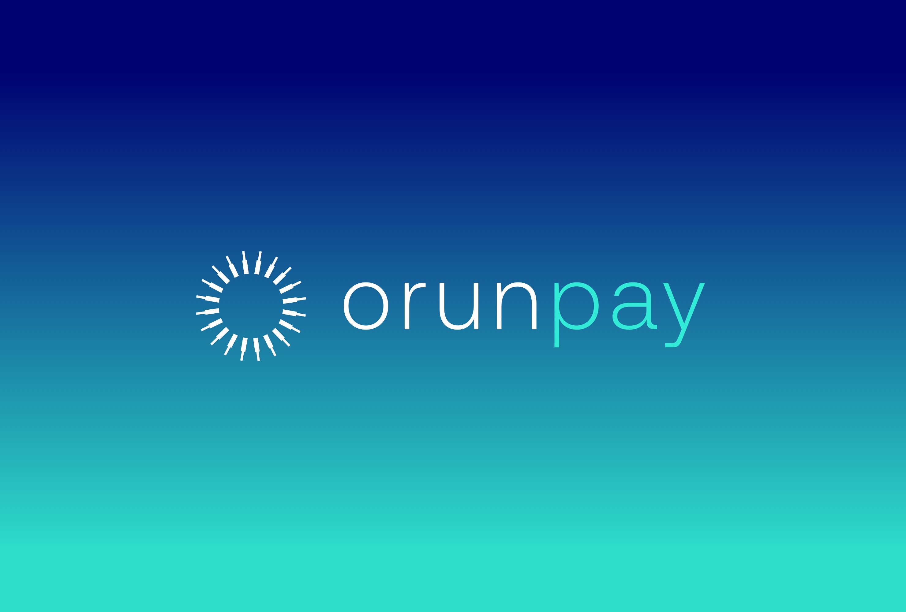
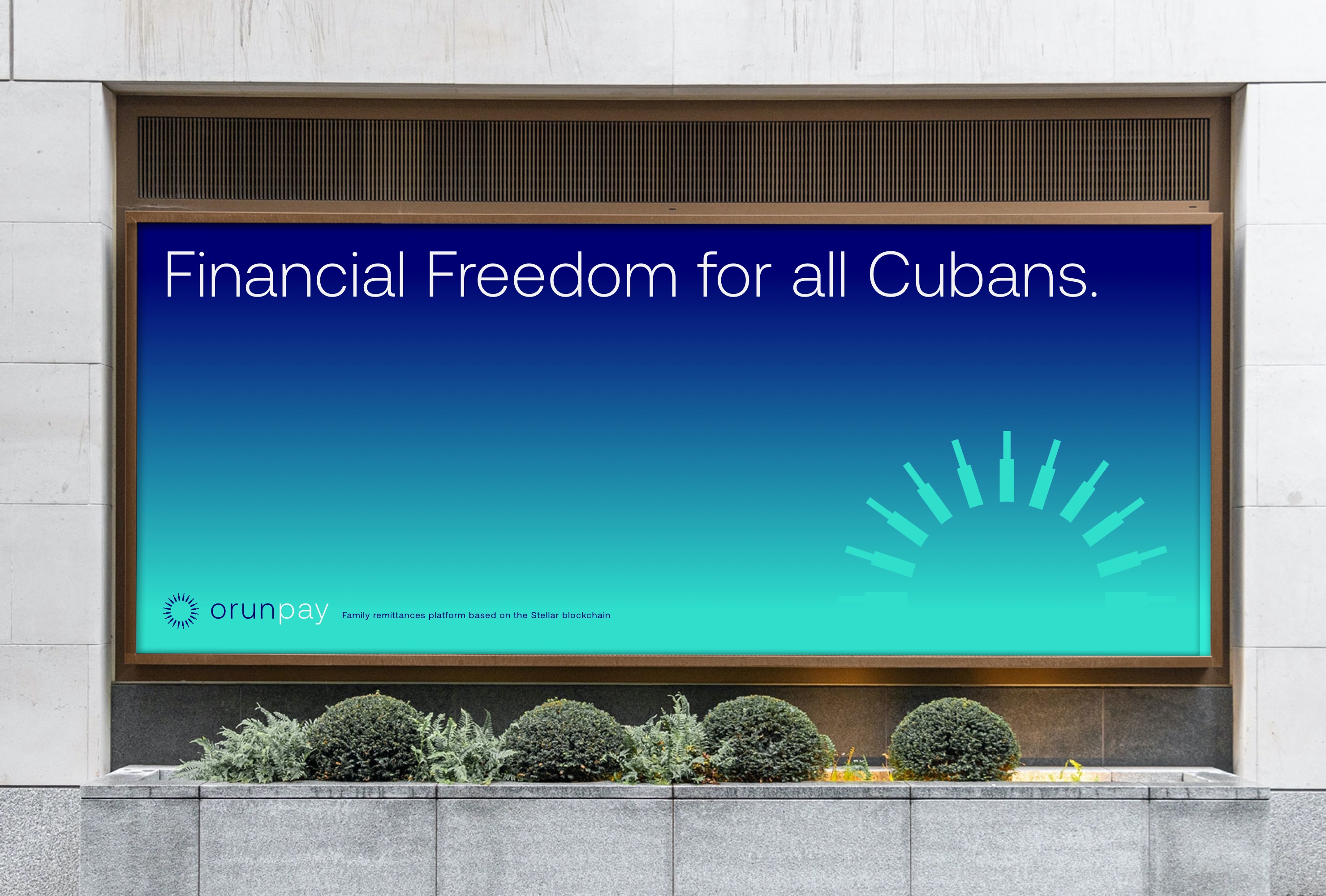
The Exploration Company, 2021 — on going
-
Opus, 2022
-
Citizen, 2020
-
Tumulte, 2020
-
Cogitech, 2017
-
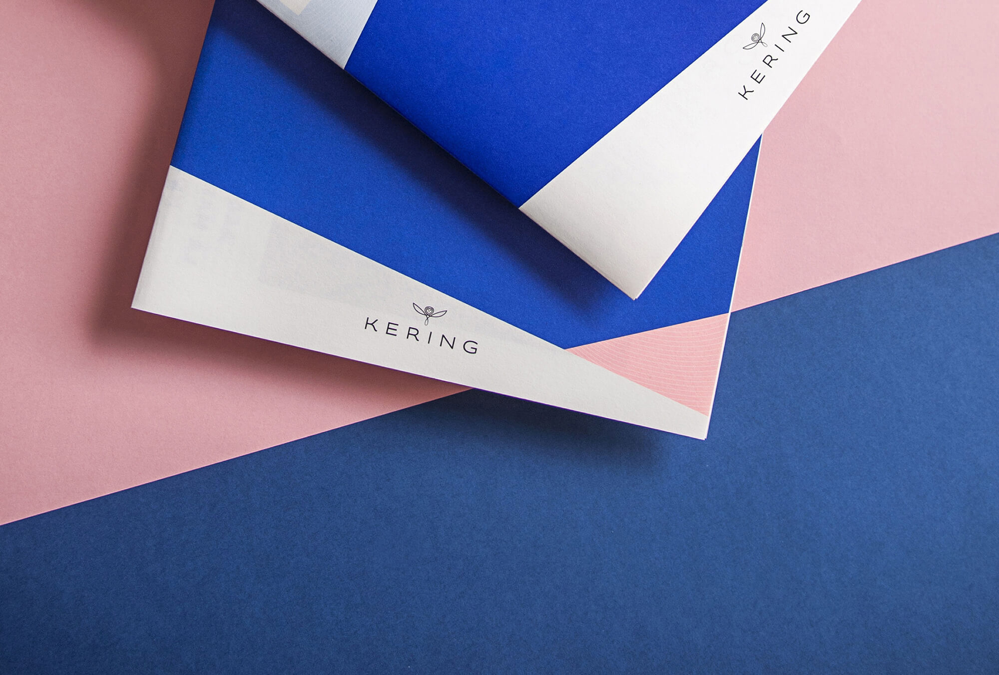
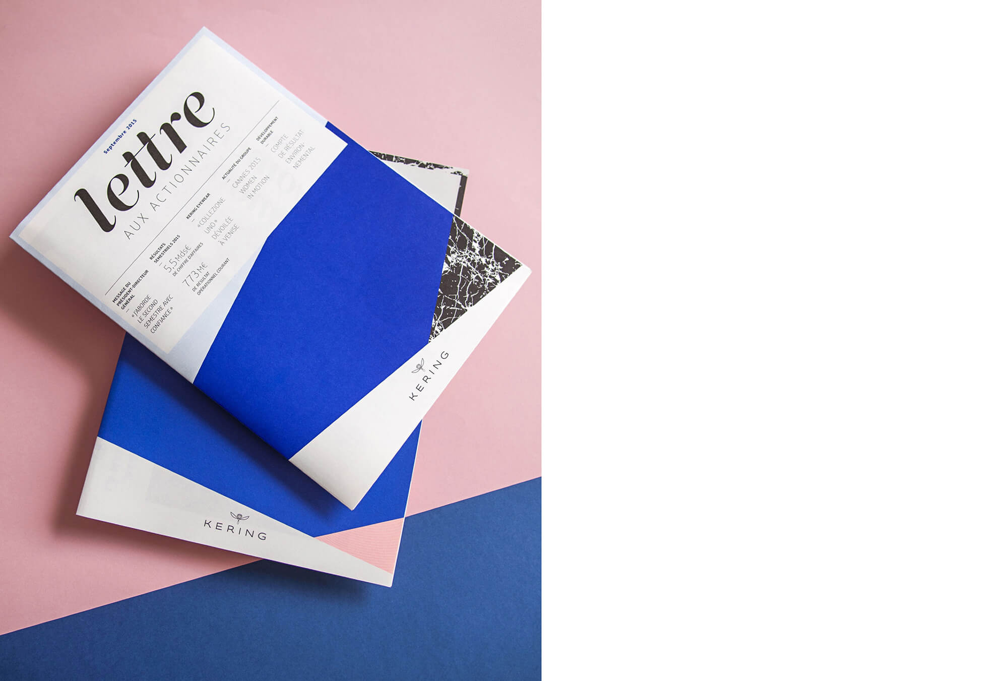
Miscellaneous & Archives, 2013 — on going
-
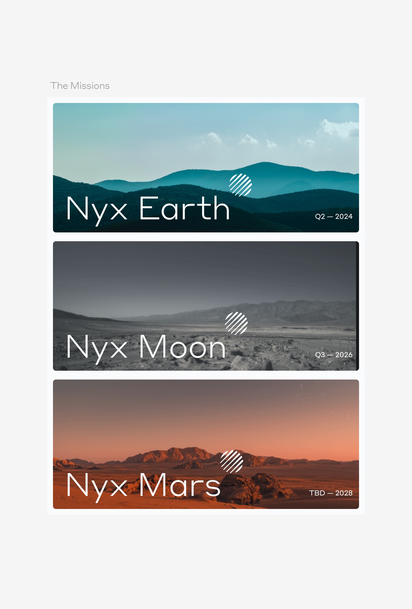
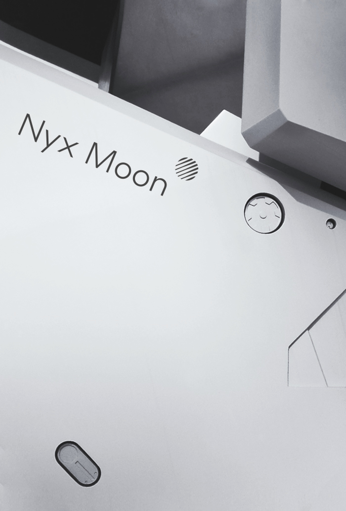
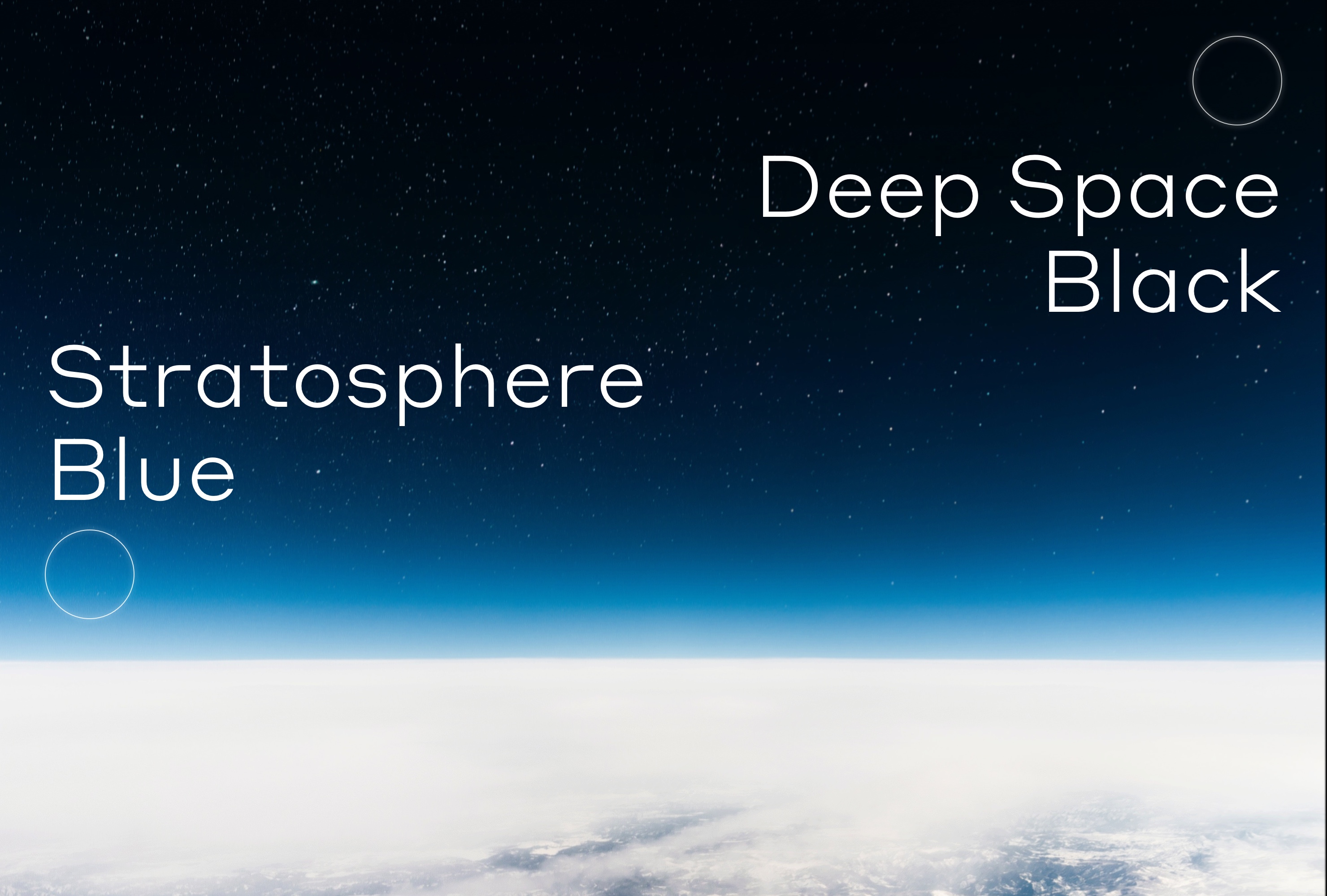
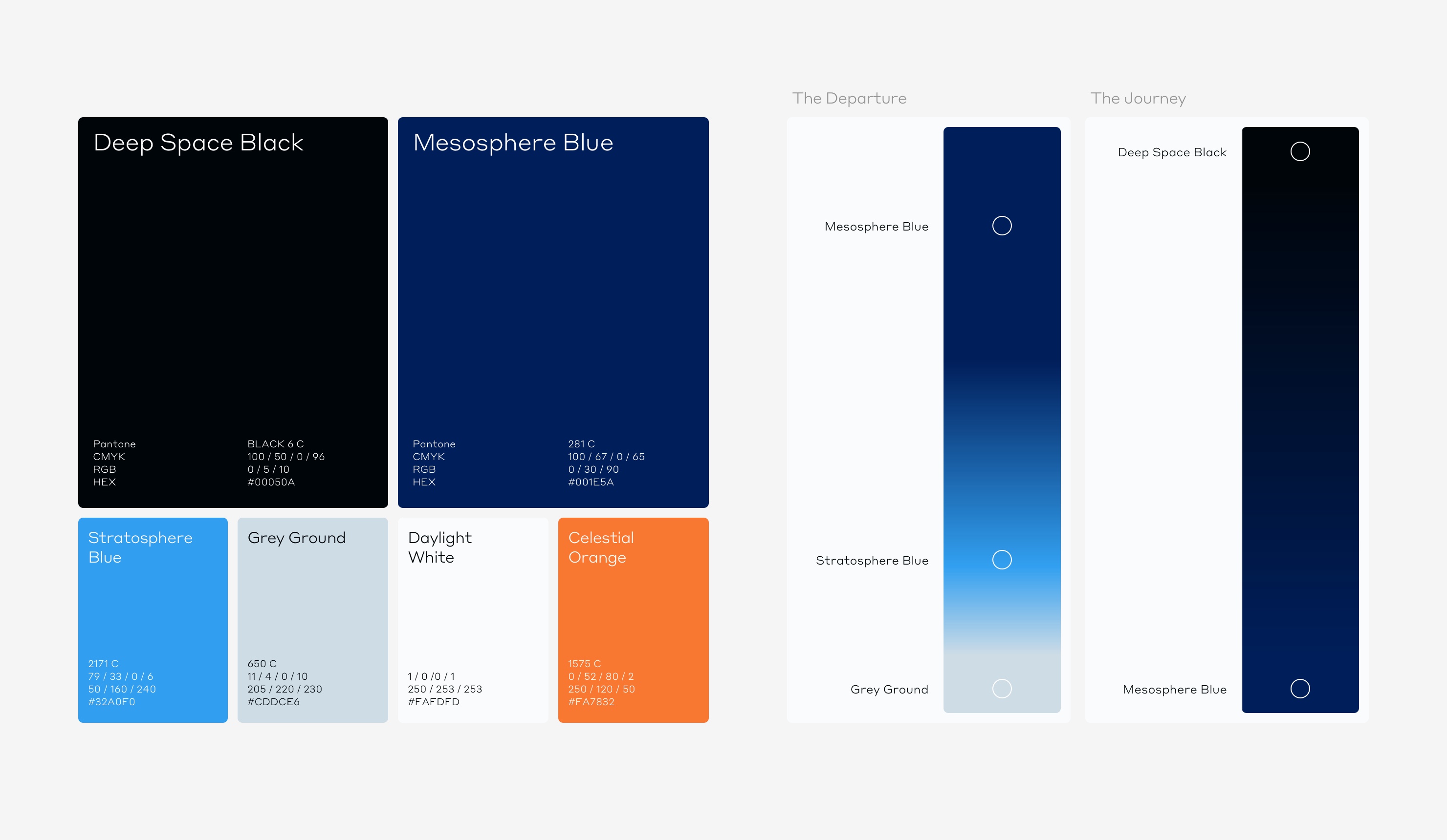
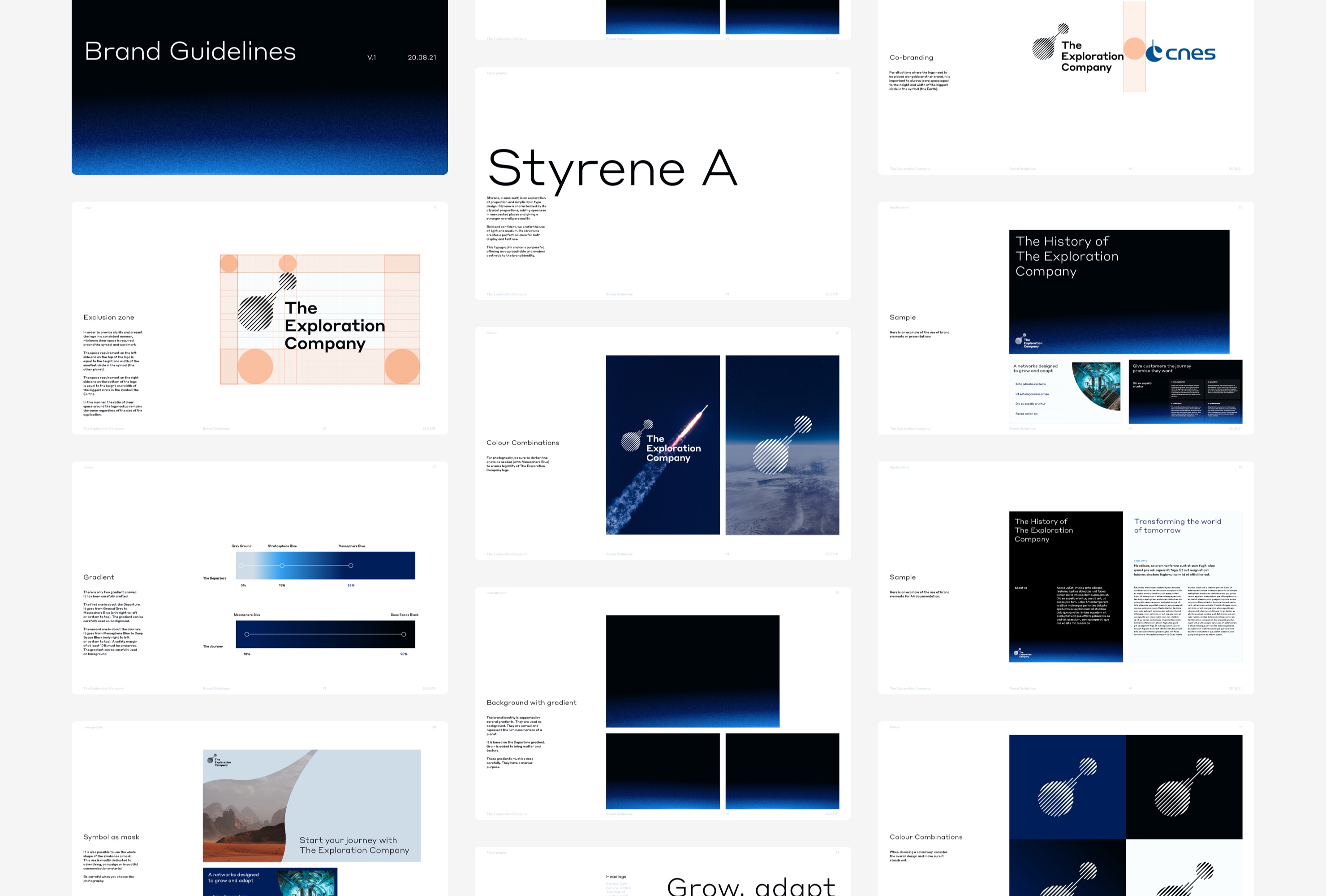
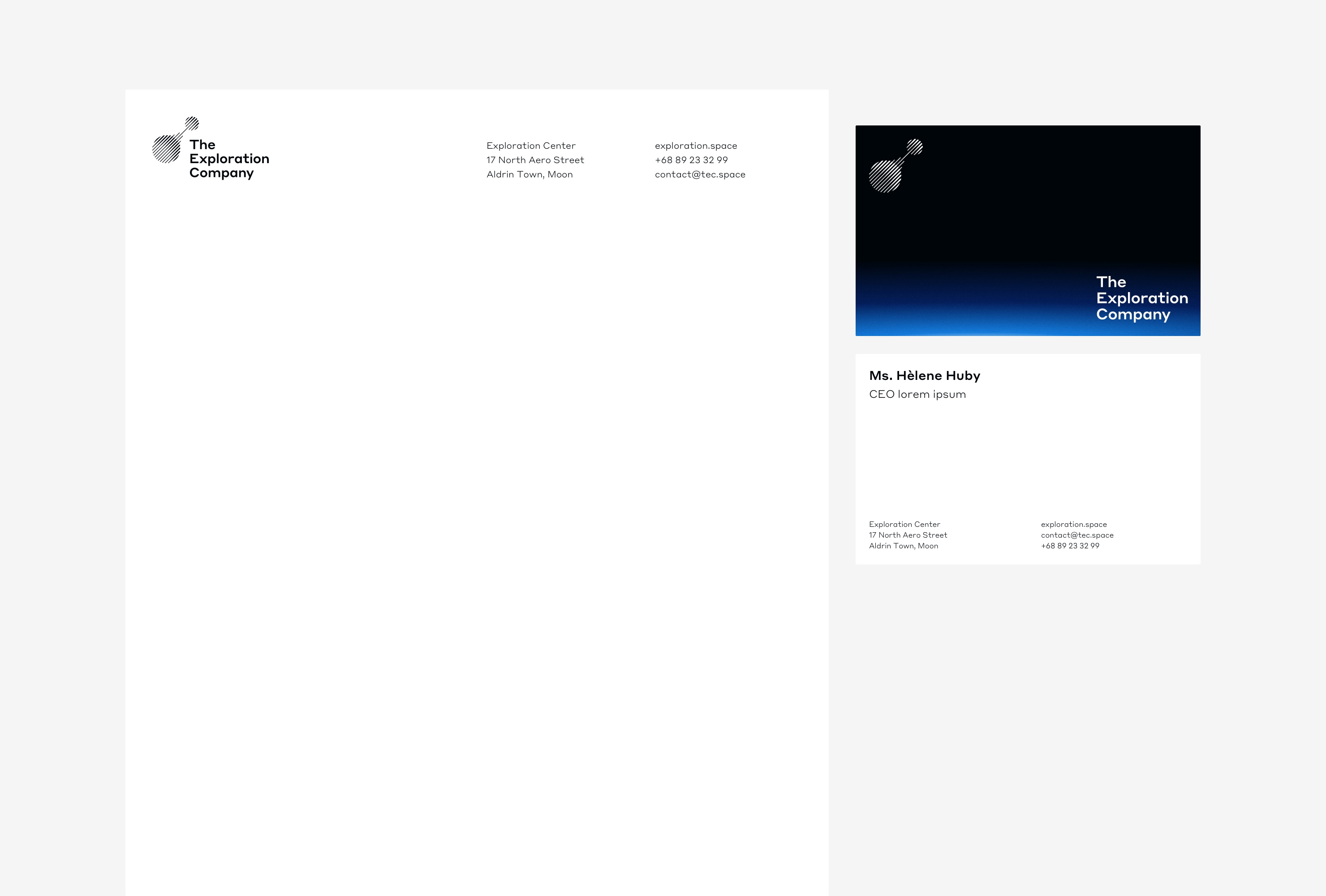
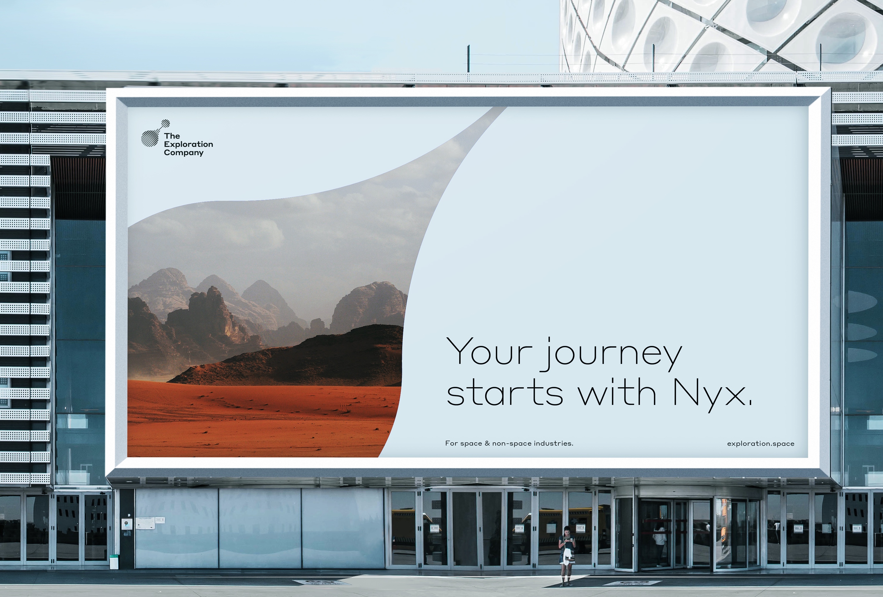
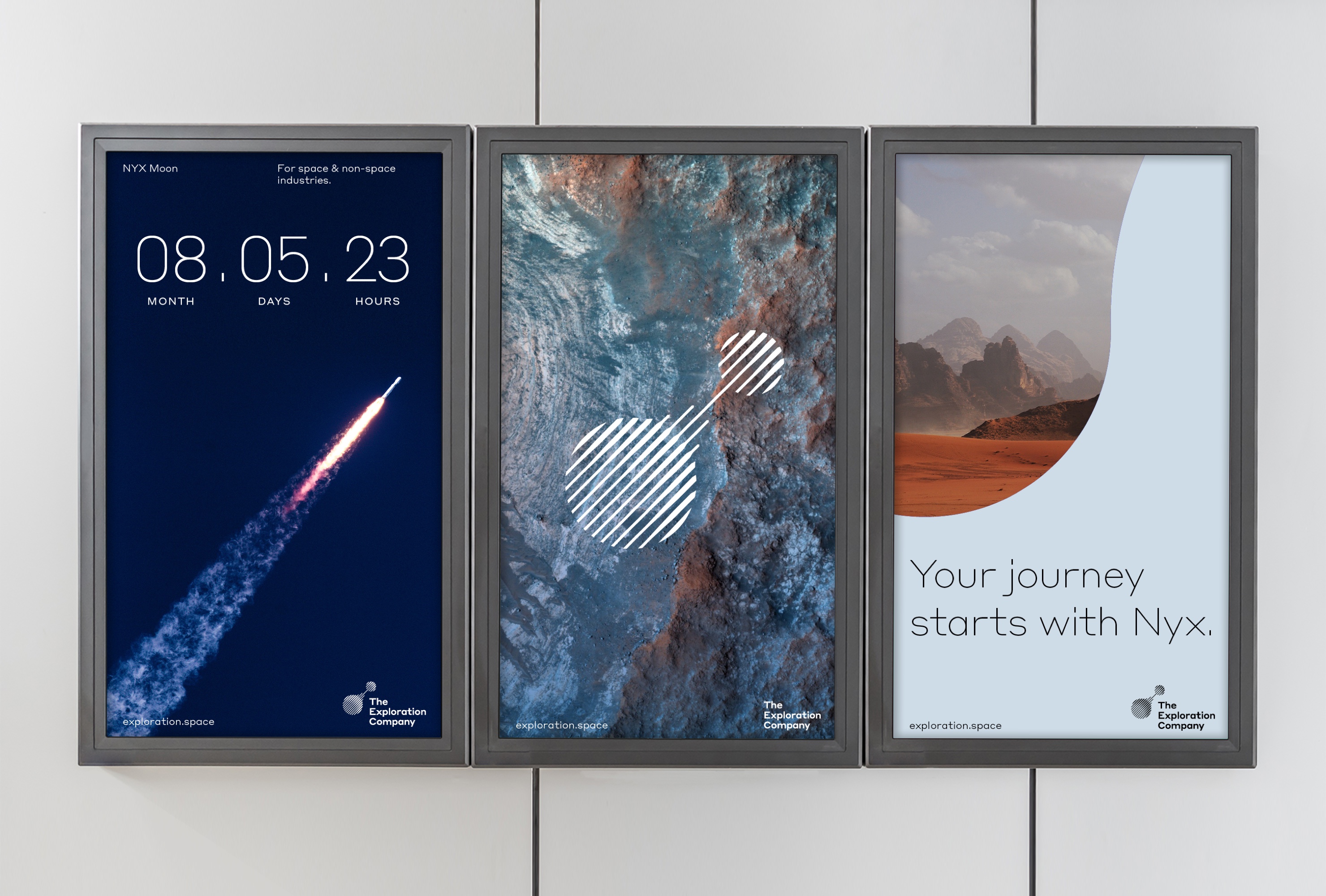
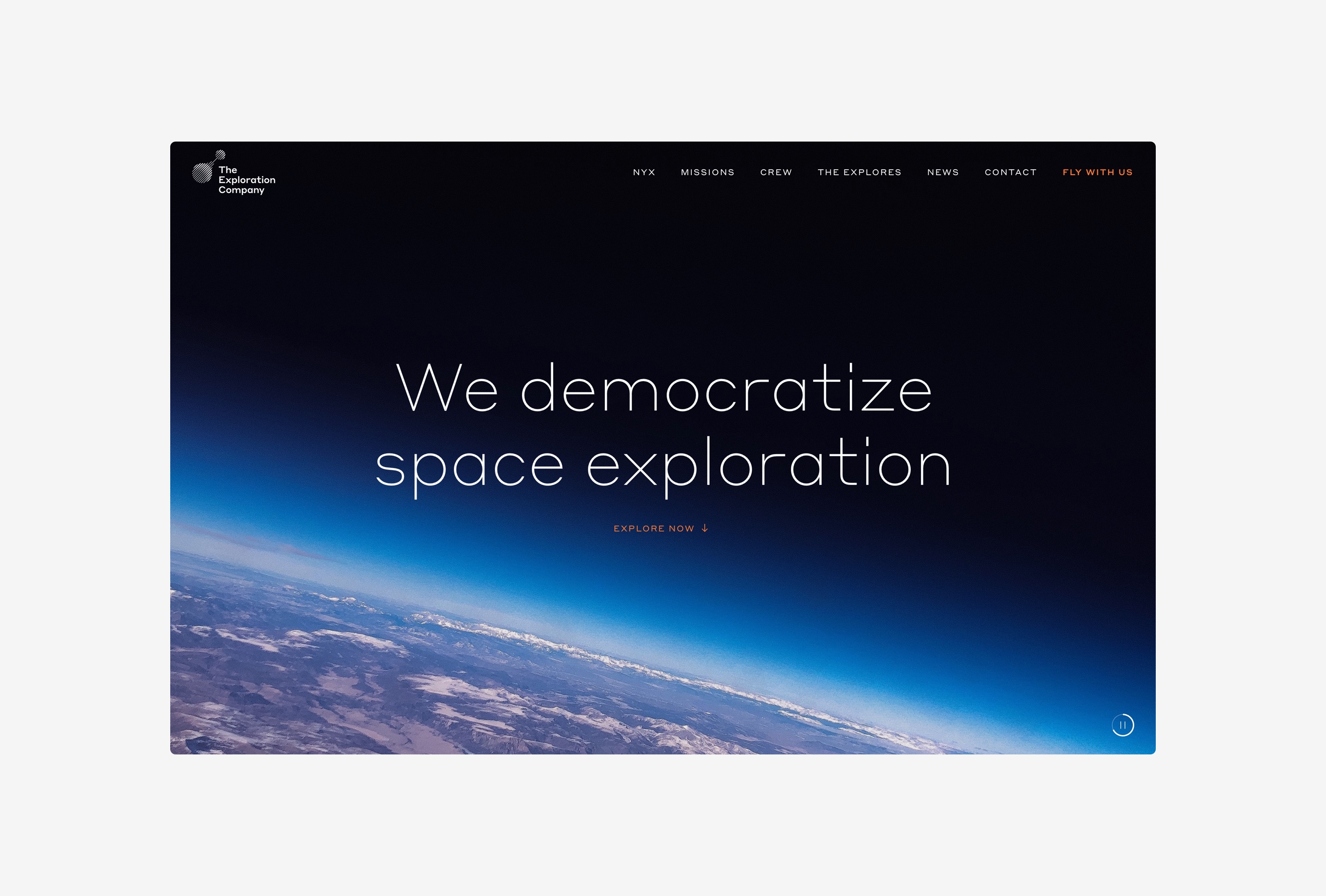
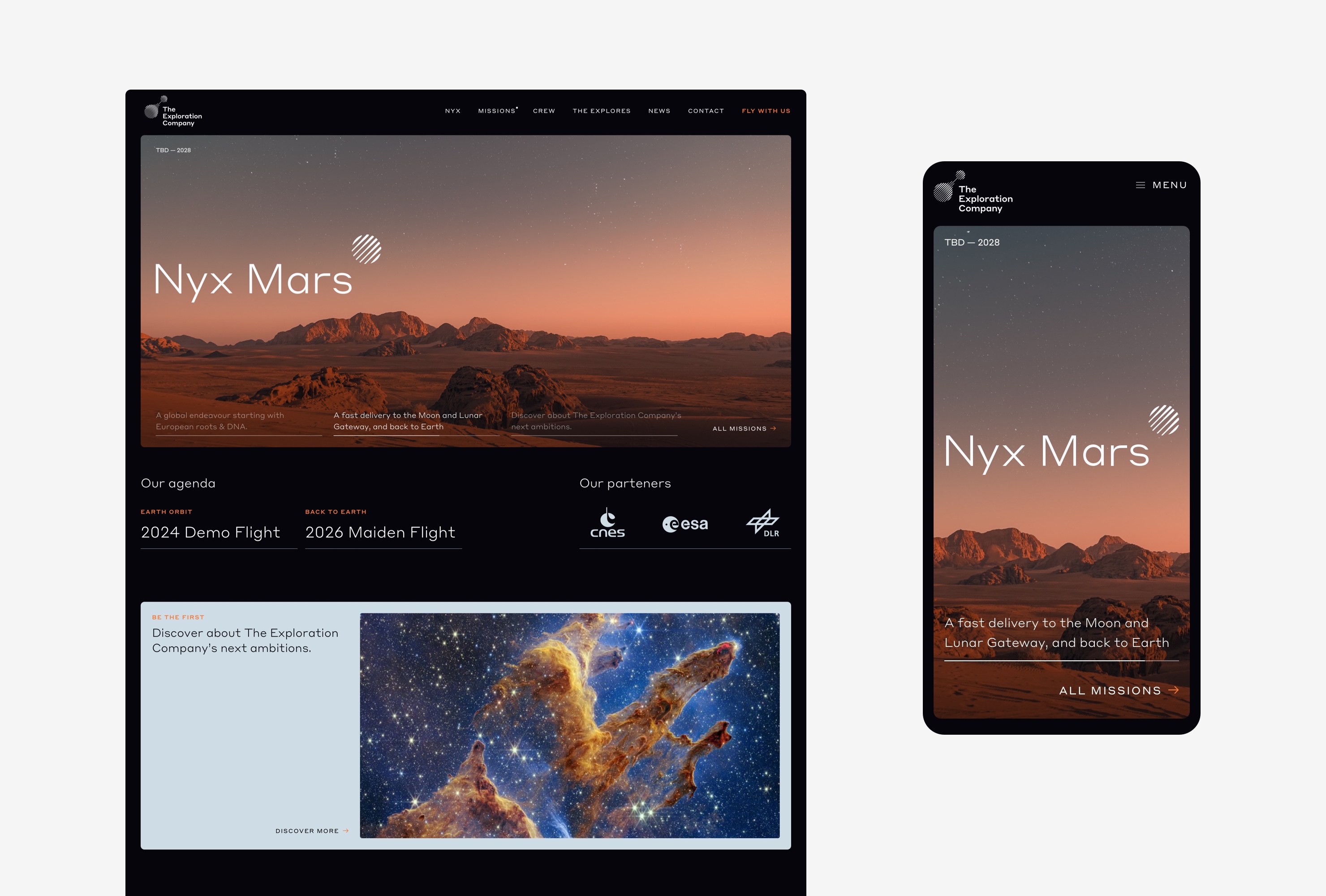
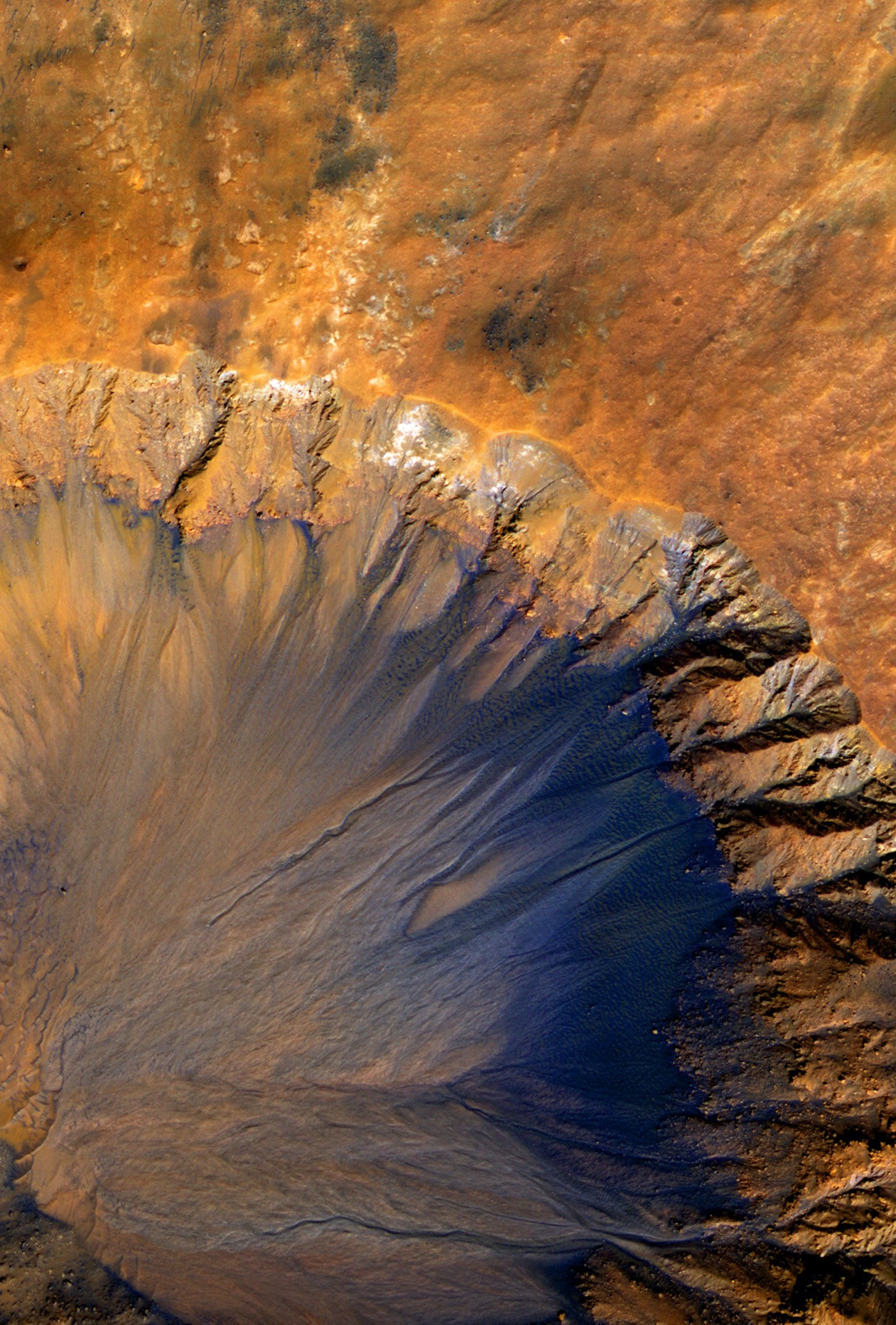
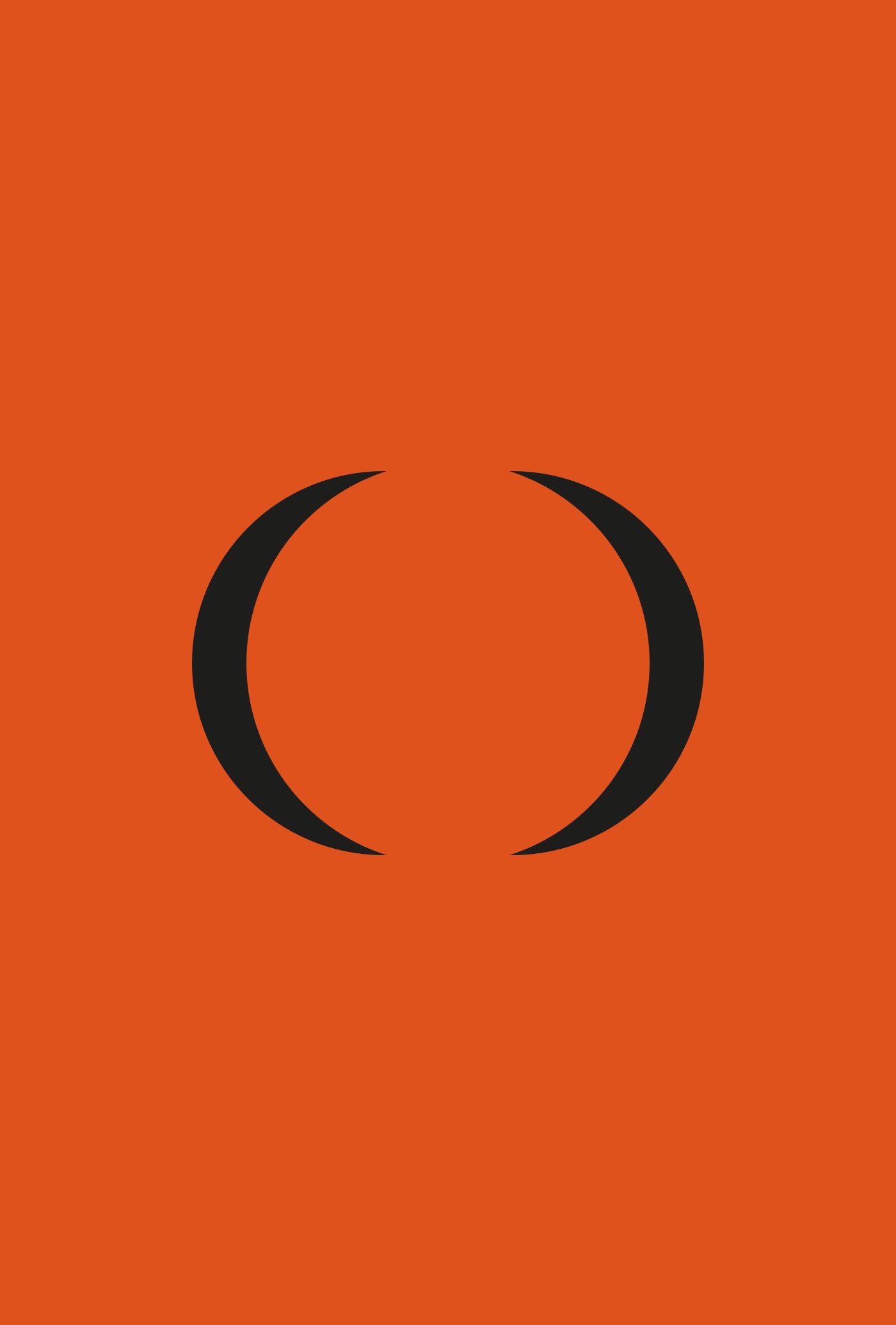
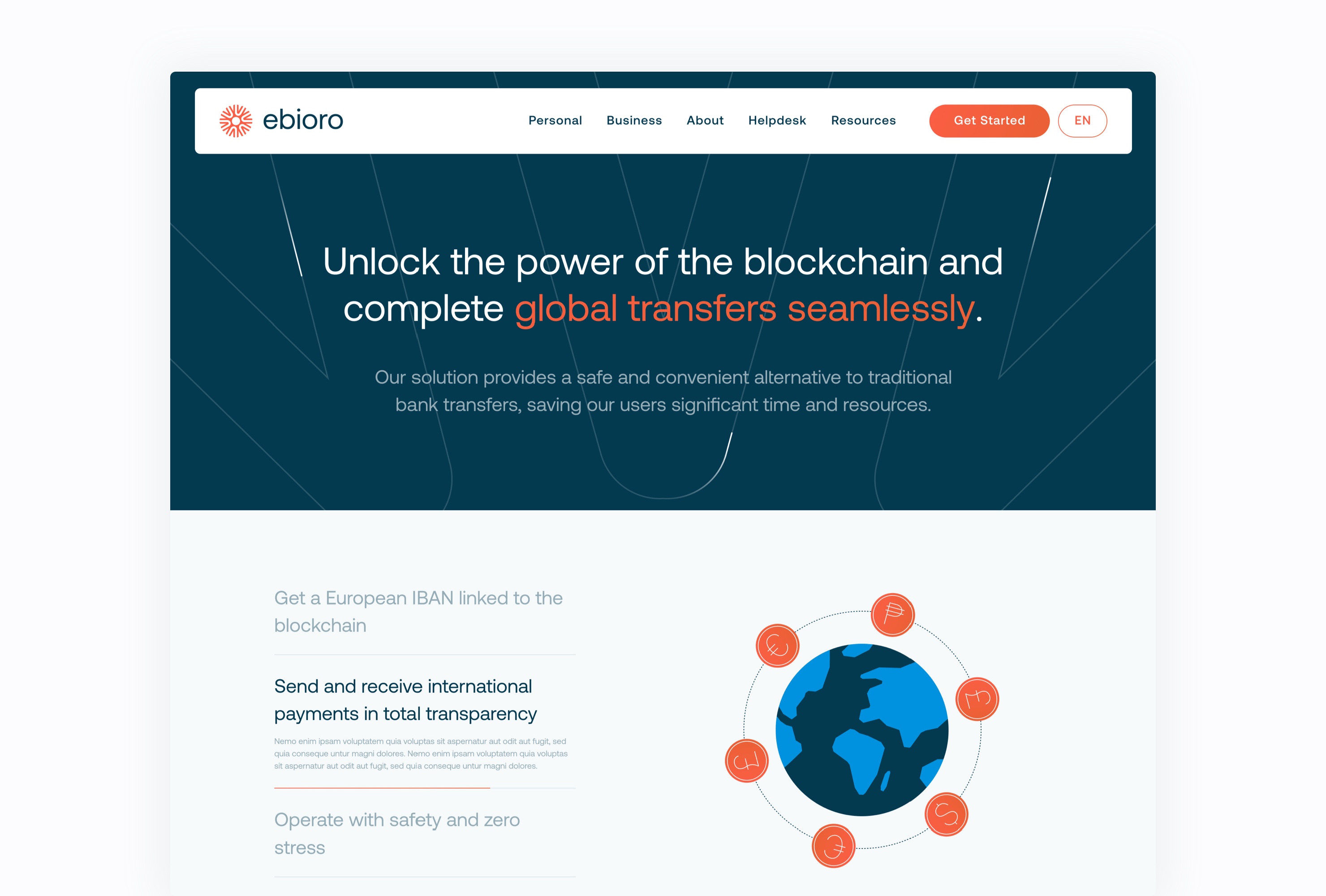
Creation of the branding for The Exploration Company. A company that democratizes access to space for space and non-space industries.
This branding aims to install the image of expertise of the company while adding a dose of imagination around the far journey. In order to bring singularity to this identity in an emerging graphic universe with strong competition, the inspiration around the world of air transport was predominant. This allows to bring a futuristic universe while reassuring on the short-term viability of the company's projects. -
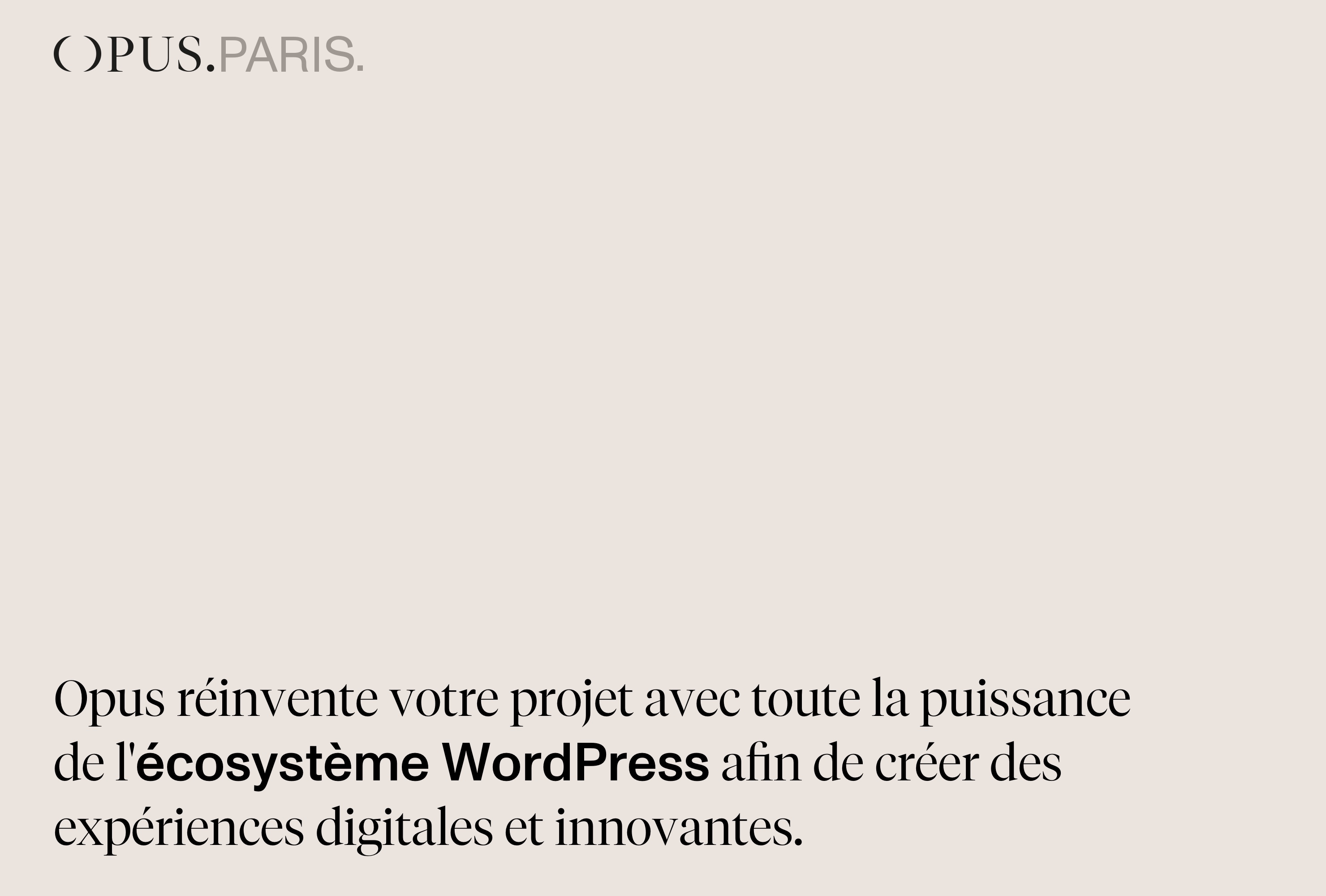
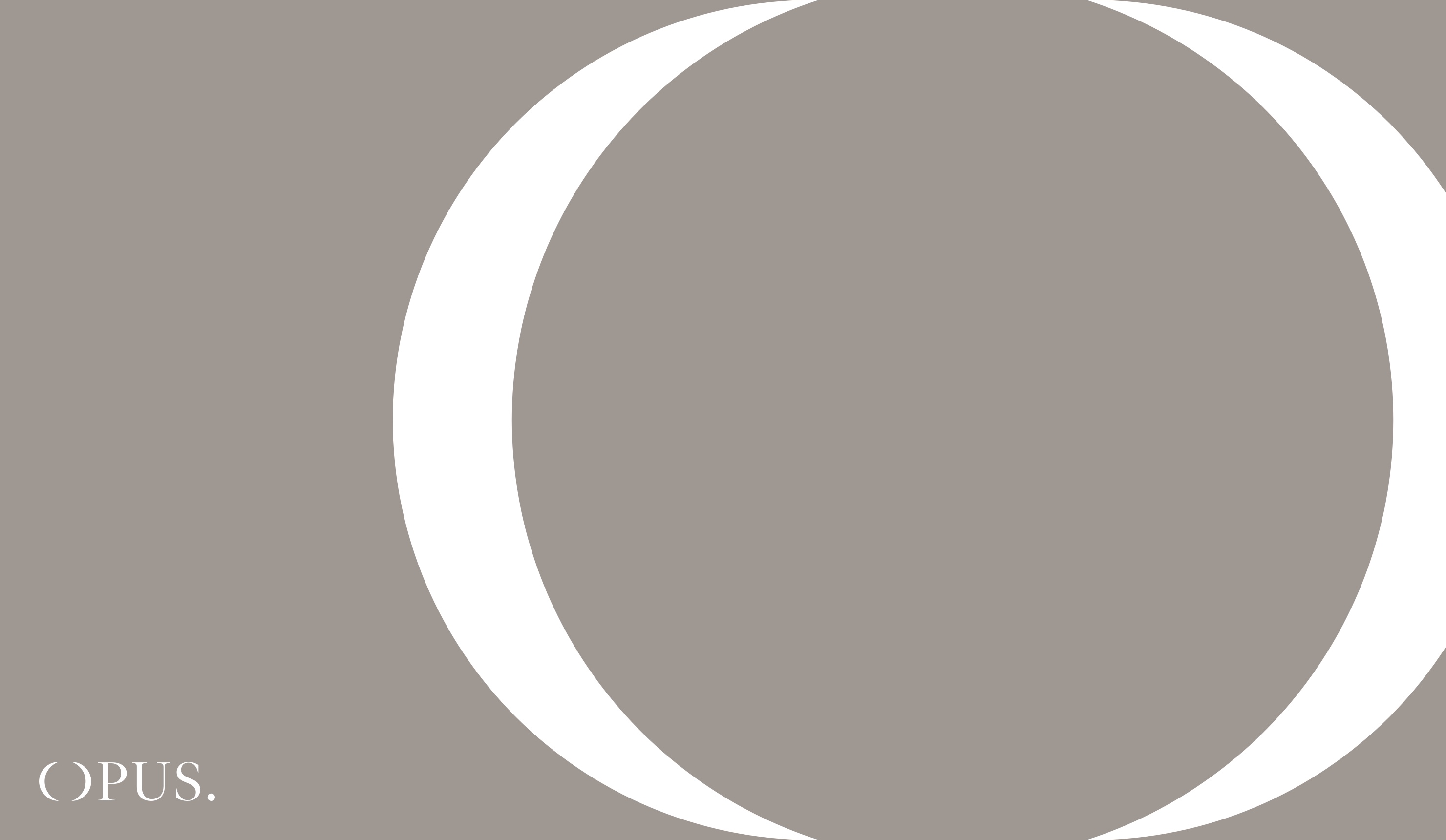
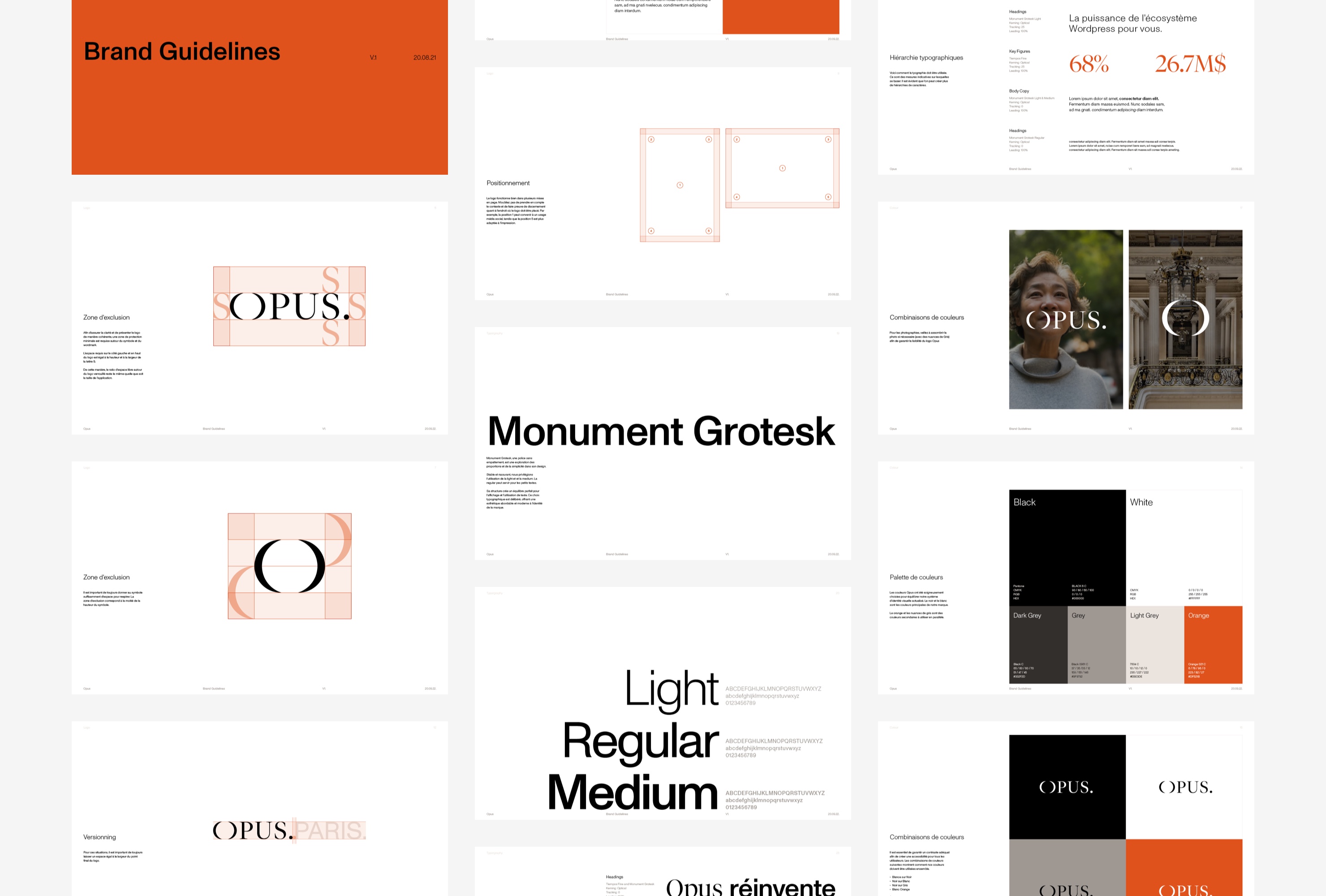
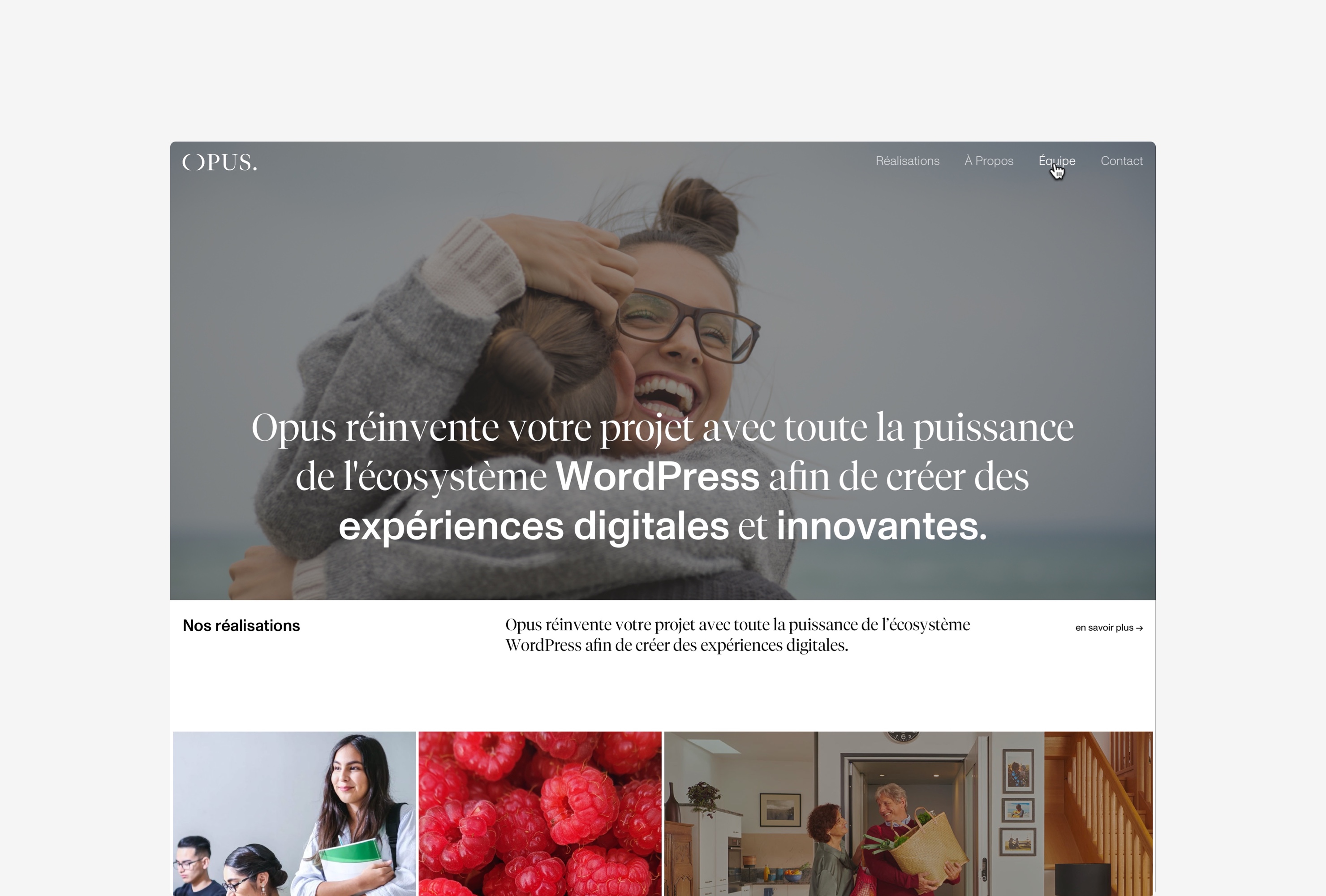
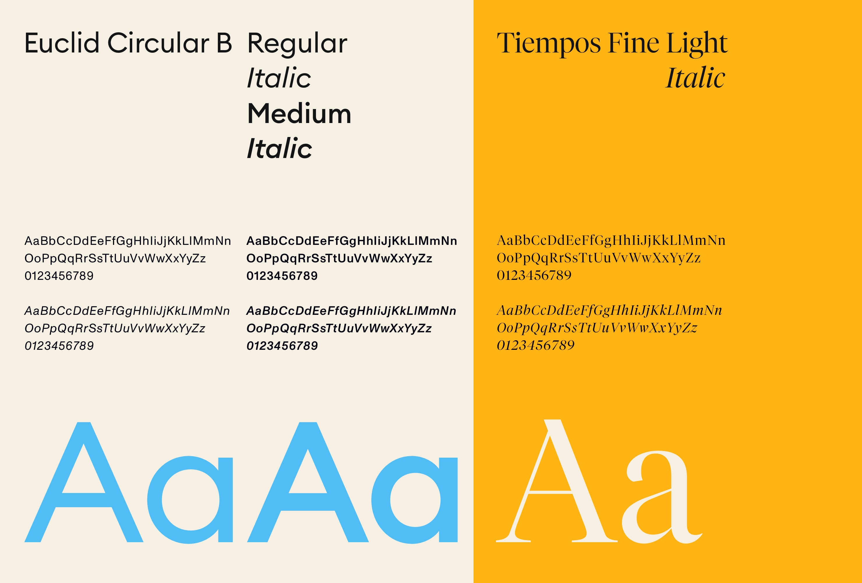
Rebranding and website creation for the Parisian digital agency Opus.
The aim of this rebranding is to move the agency's image towards a more contemporary identity that reflects their expertise in the digital field. Its Parisian roots must also be felt without falling into the trap of an identity that looks too fancy. The typographic mix allows to play on this duality while bringing dynamism and rigour. The identity remains sober and allows the graphic universes of the agency's clients to express themselves without being in the shadow of Opus. -
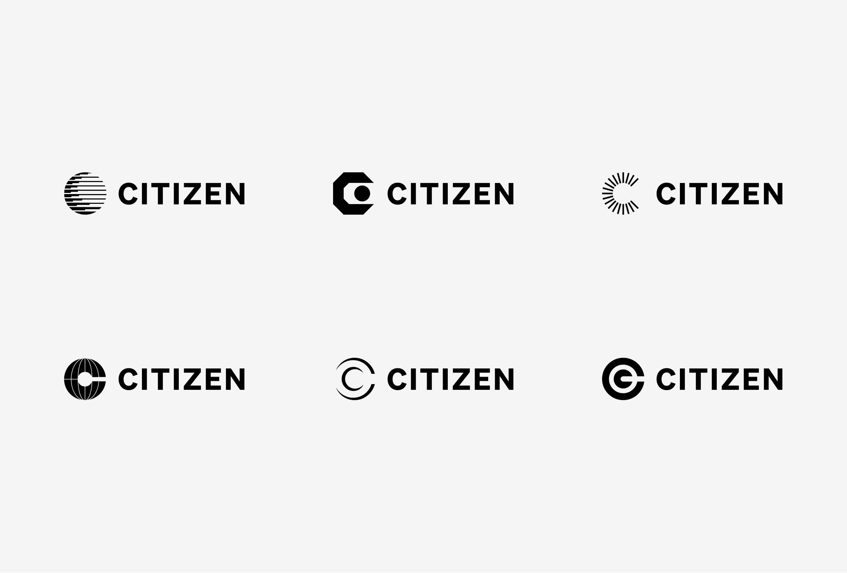
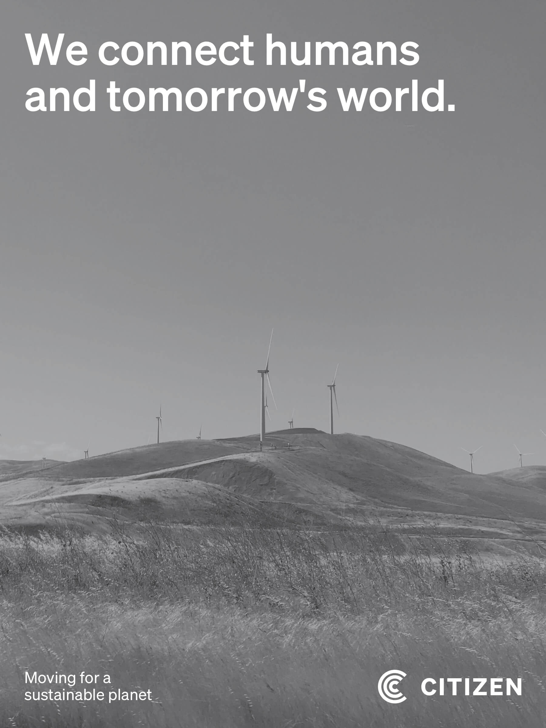
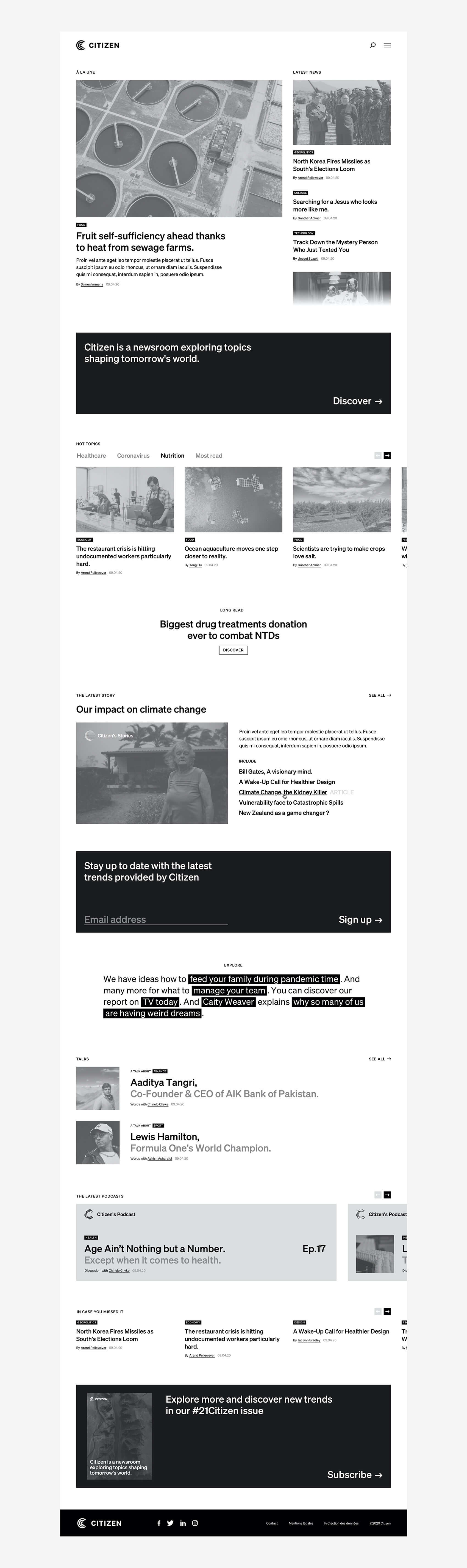
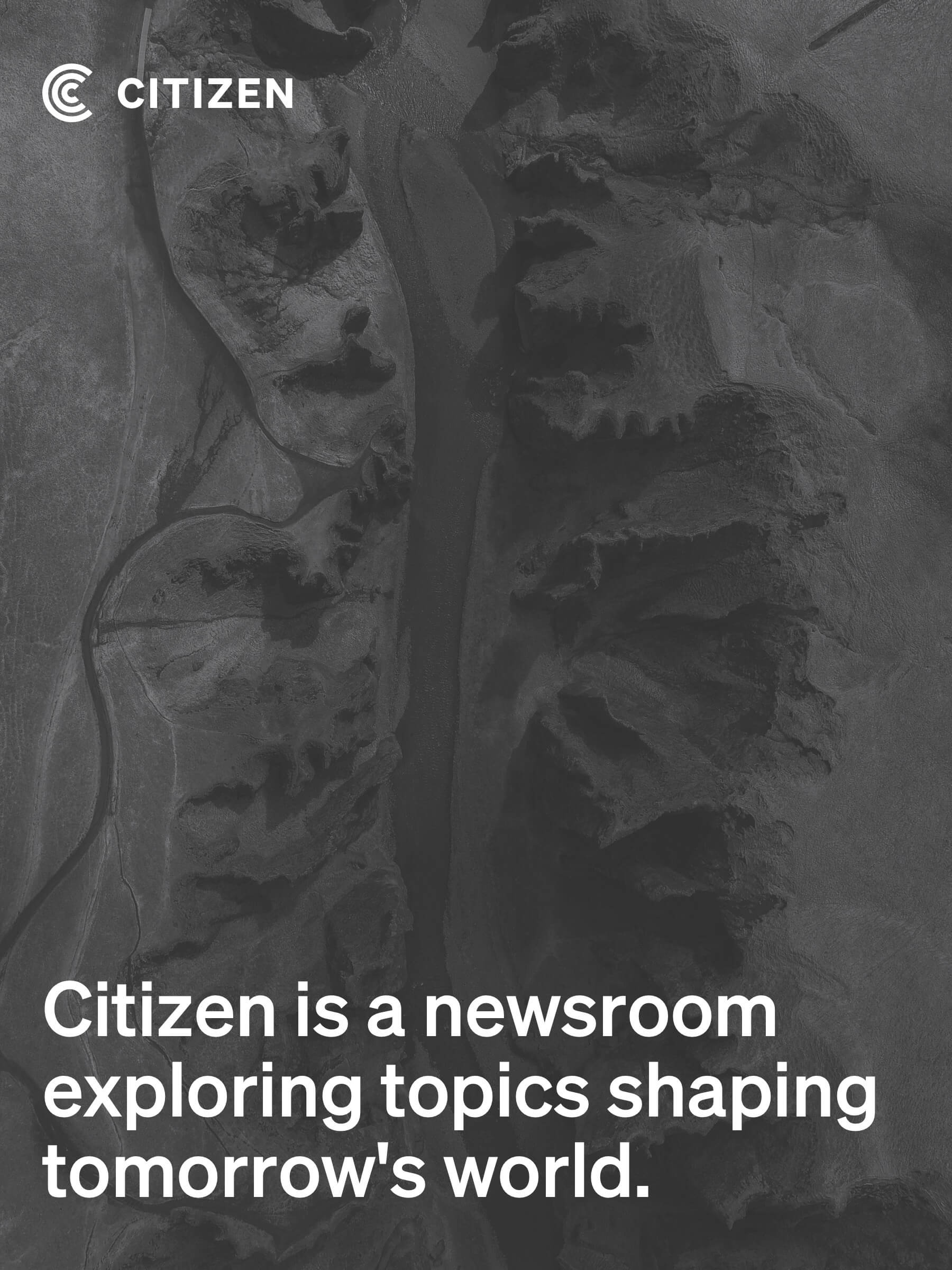
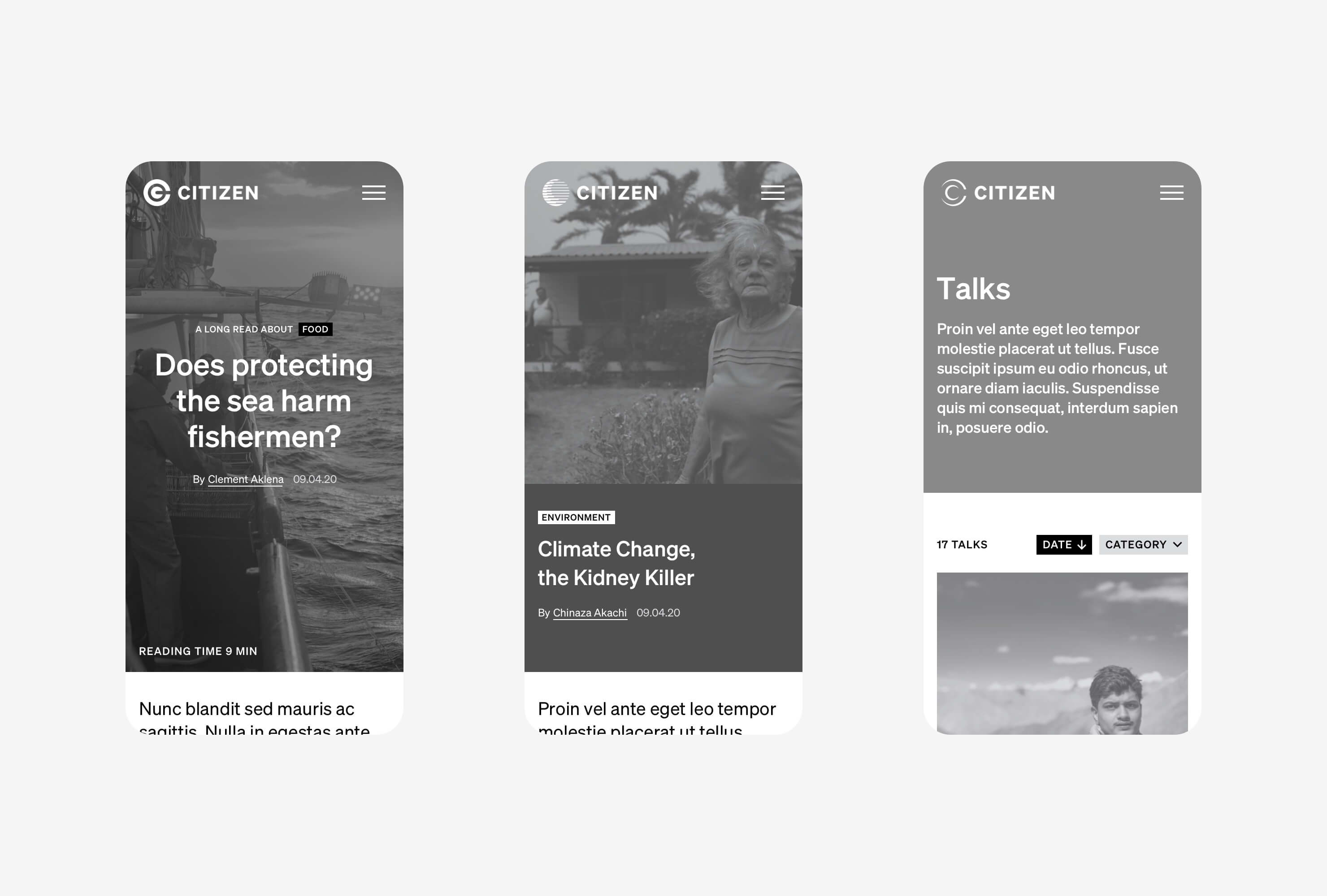
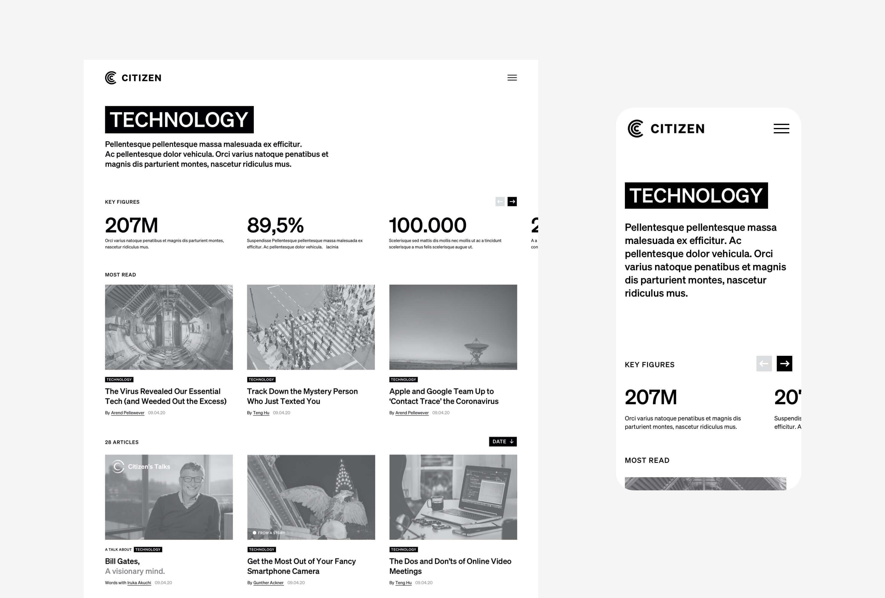
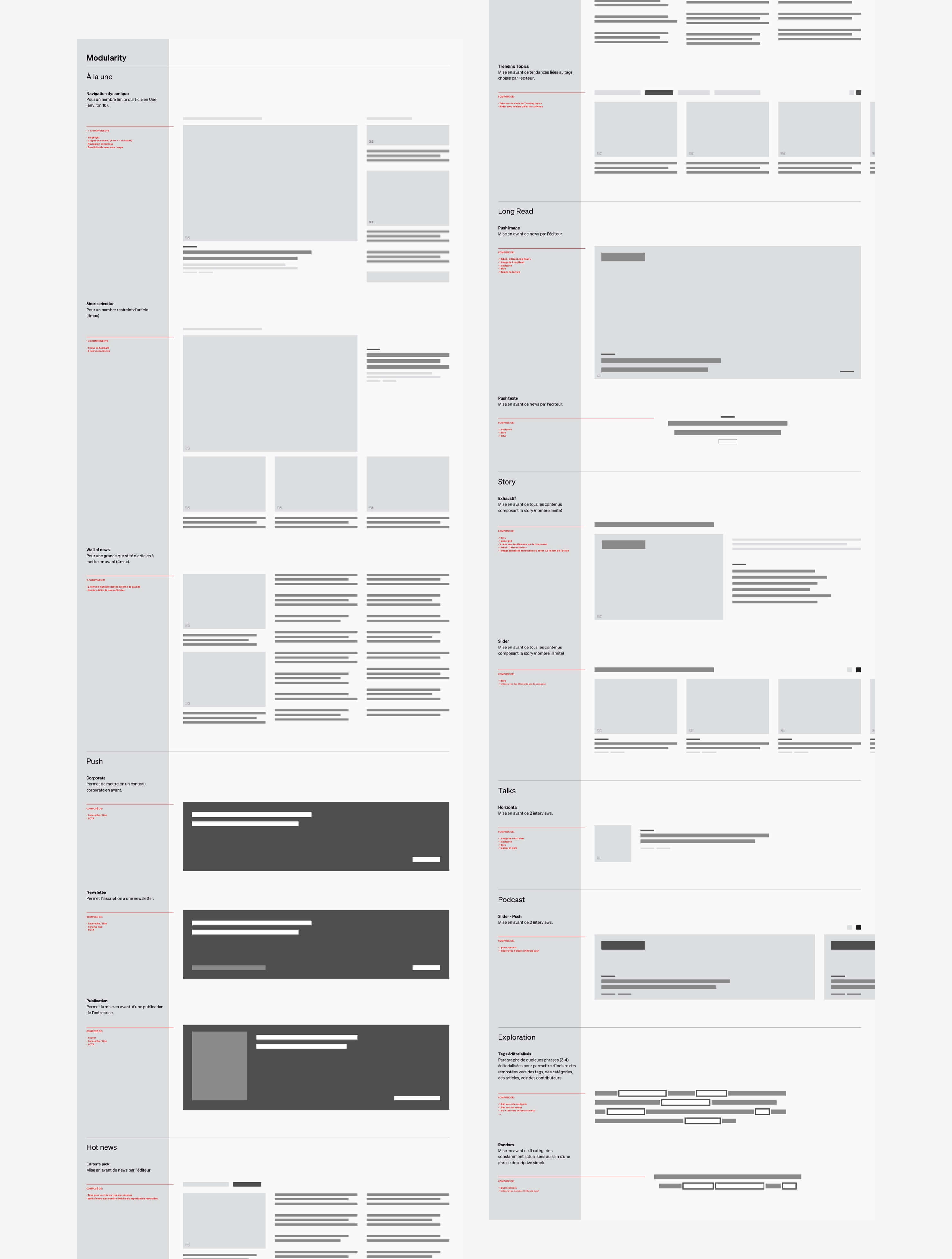
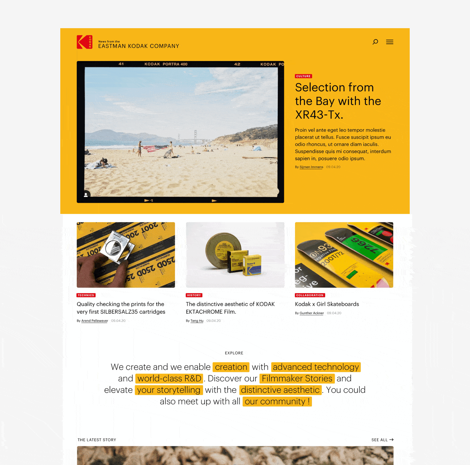
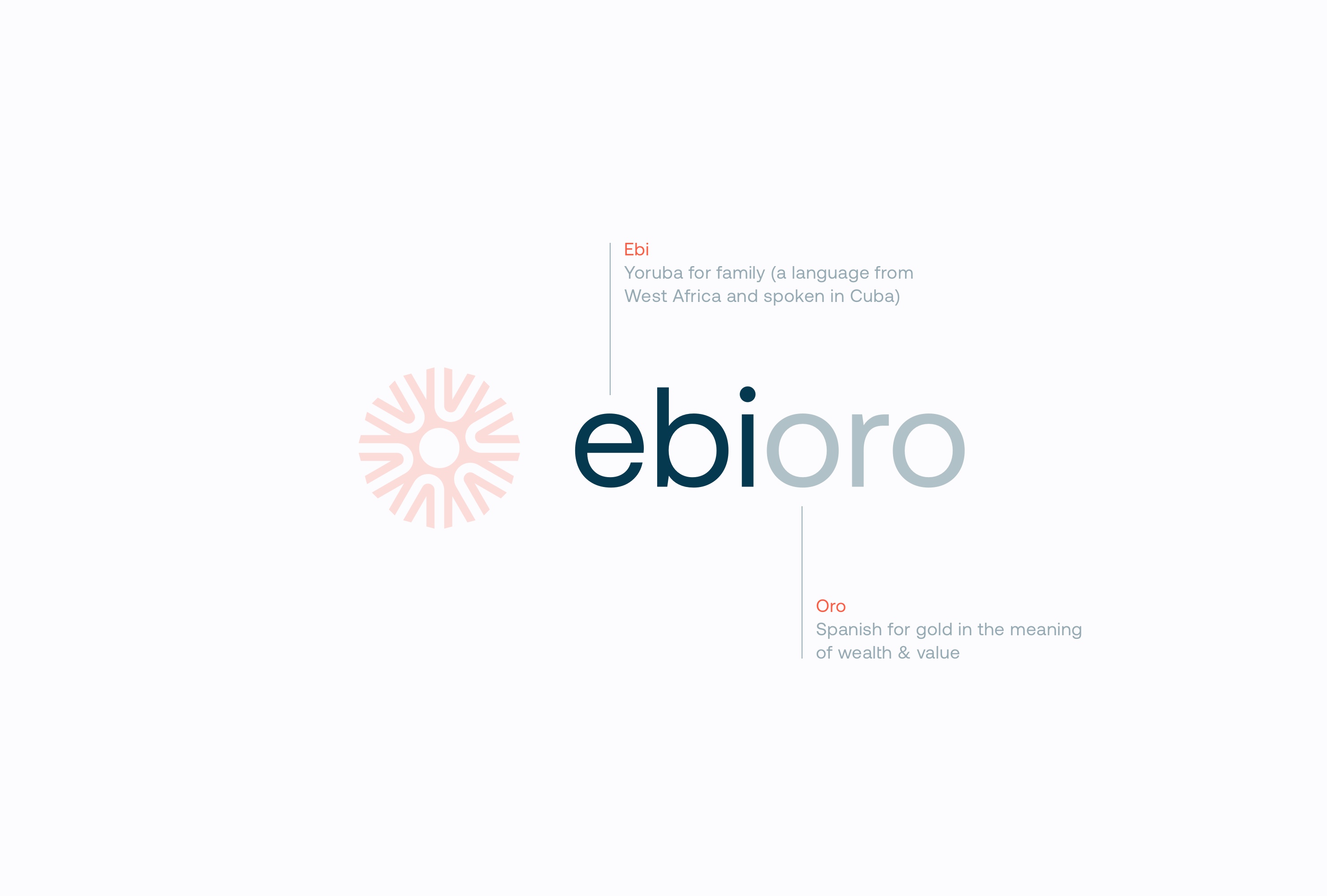
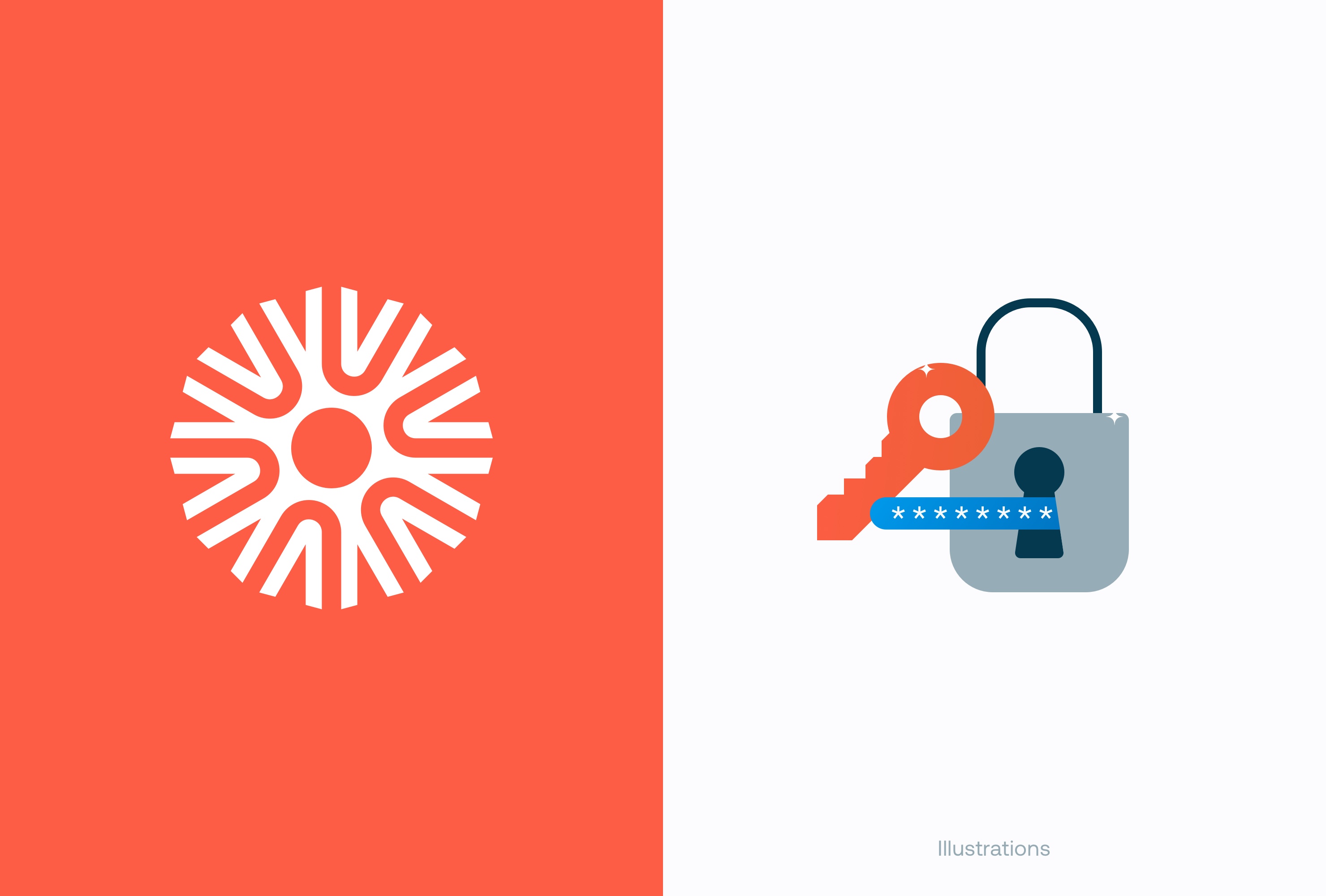
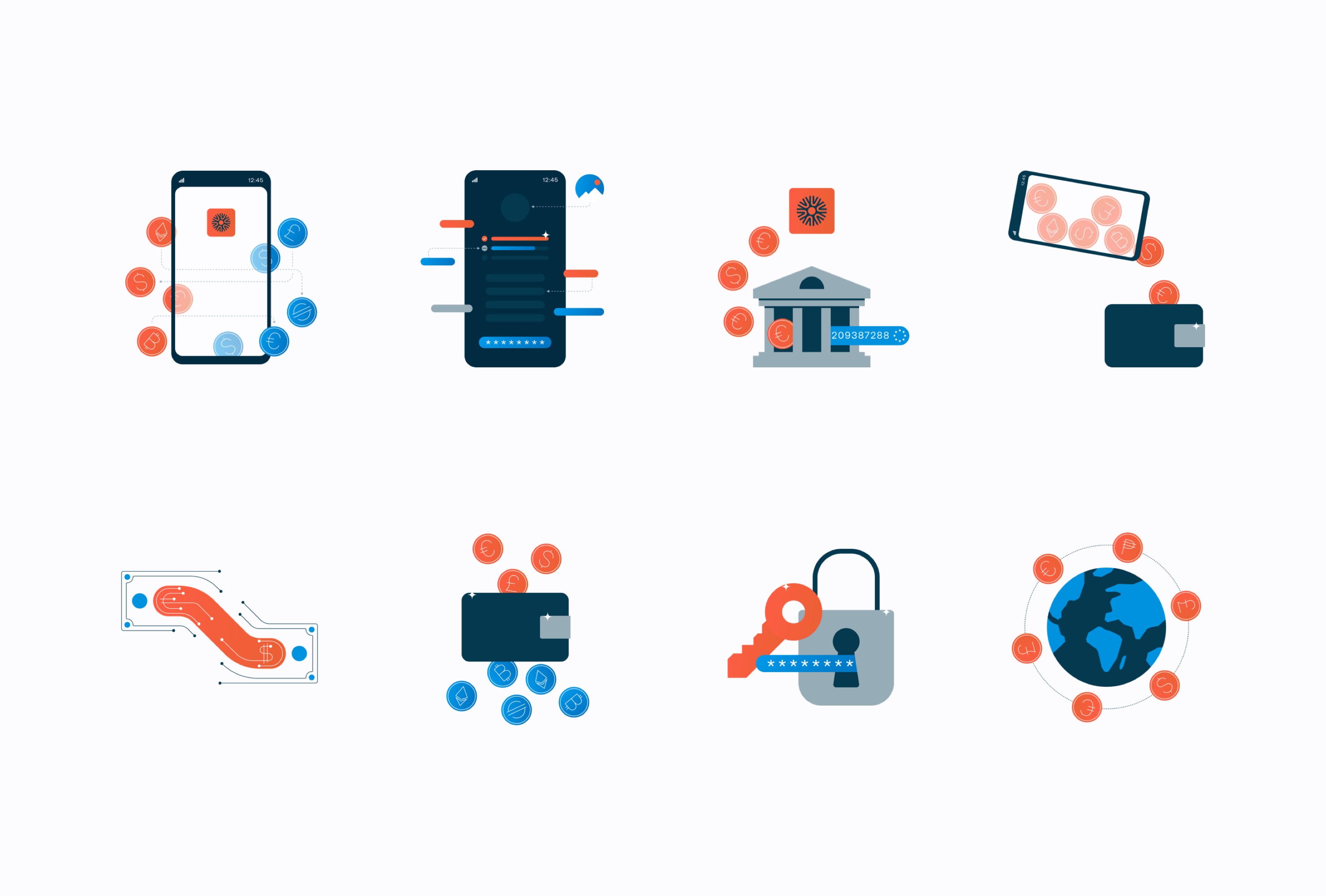
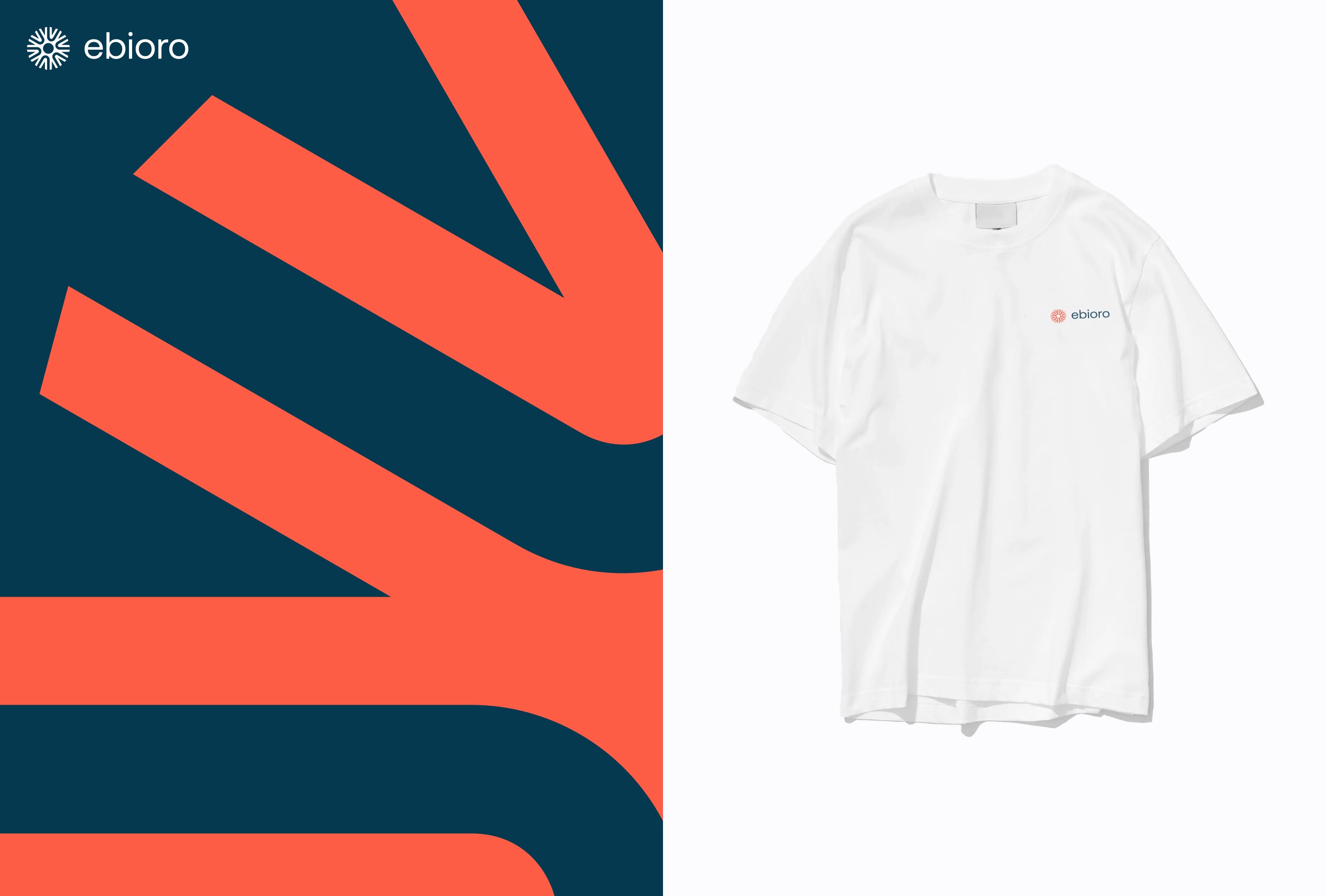
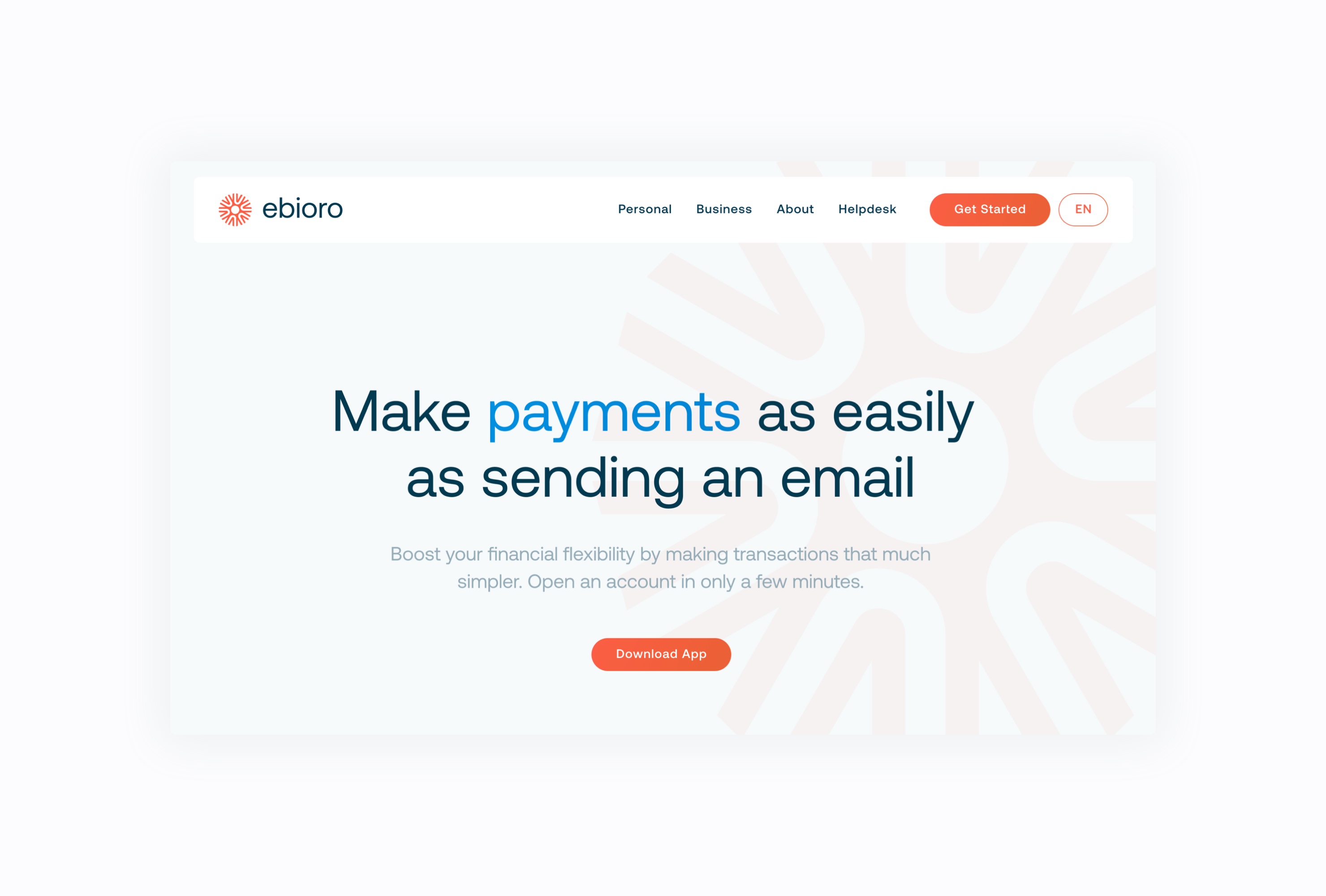
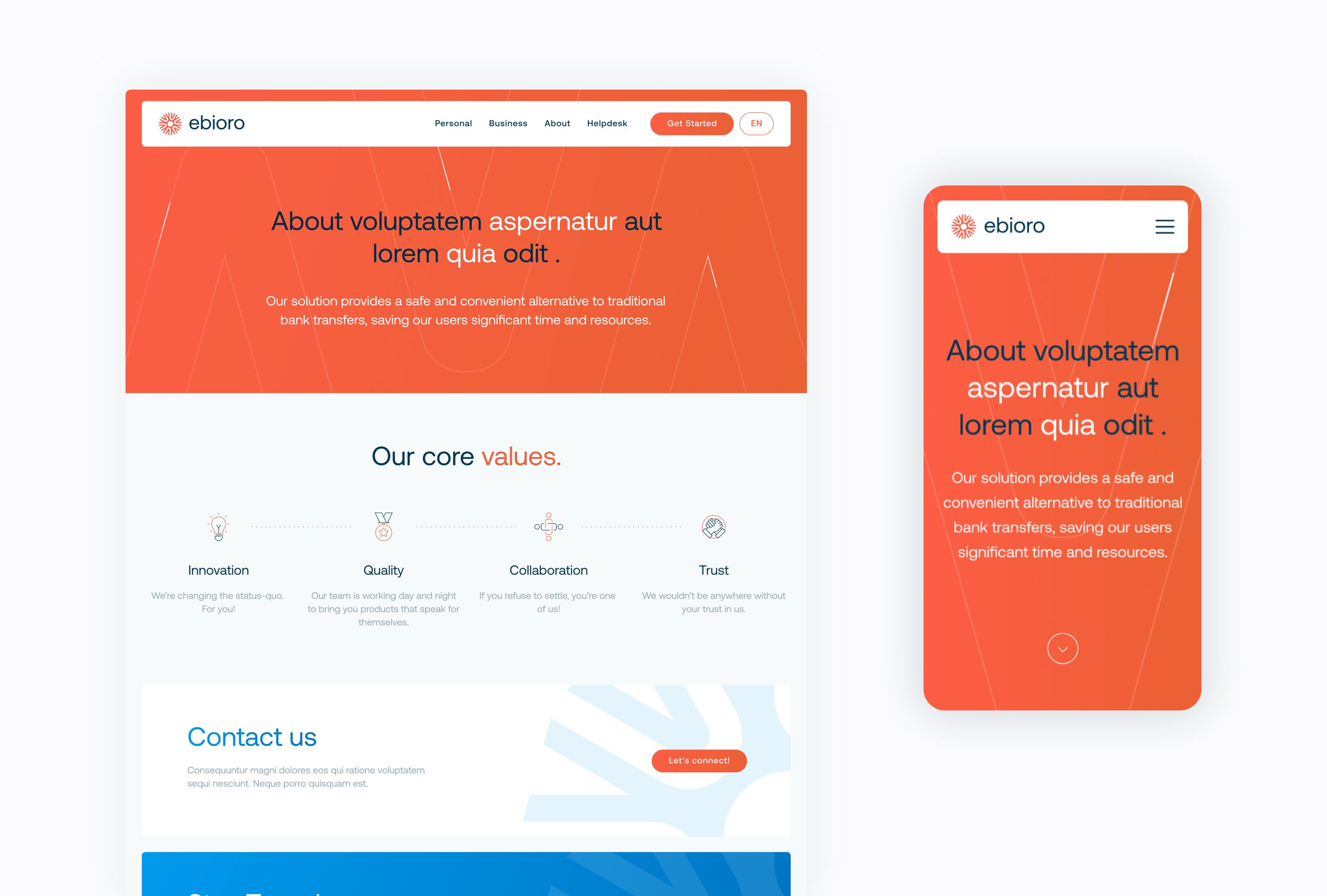
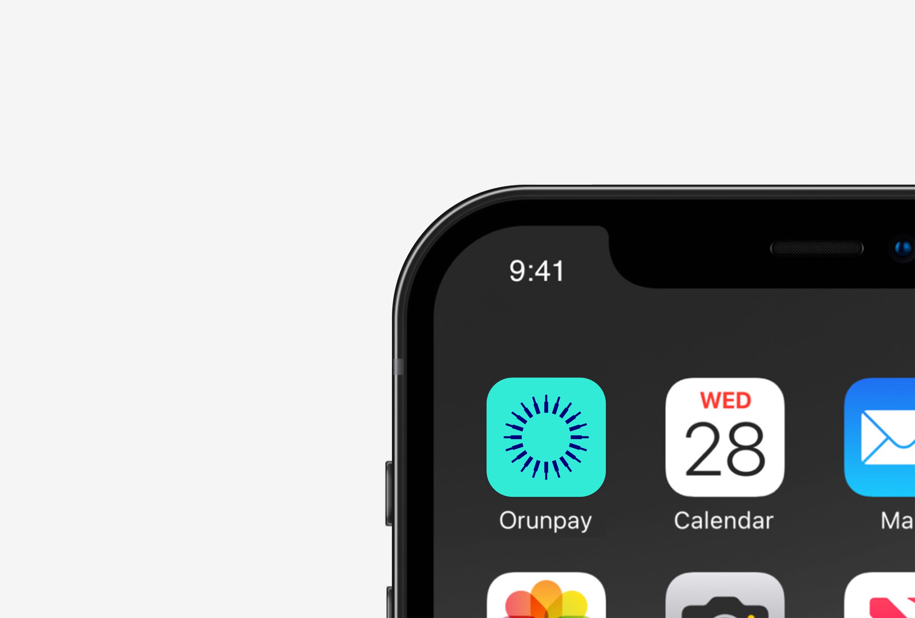
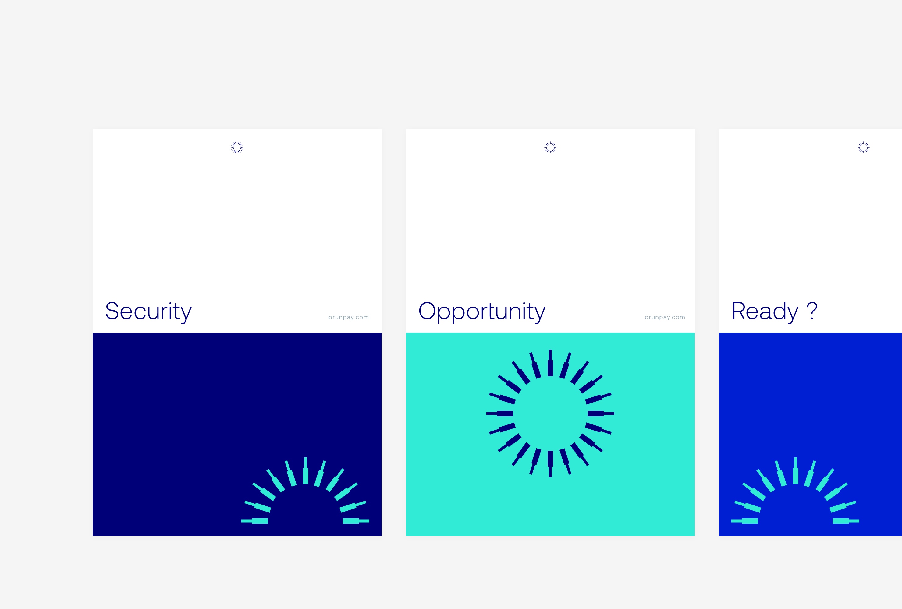
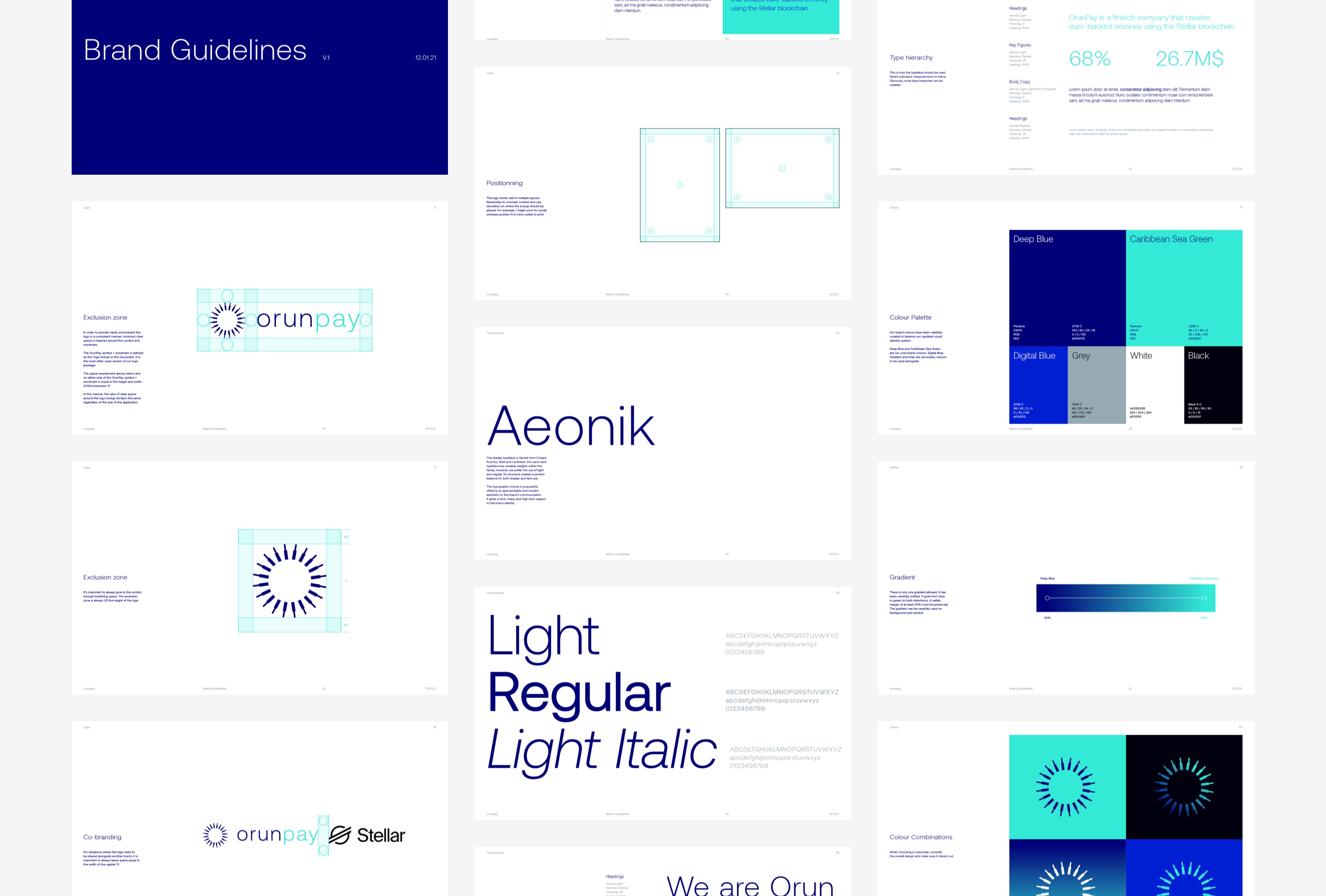
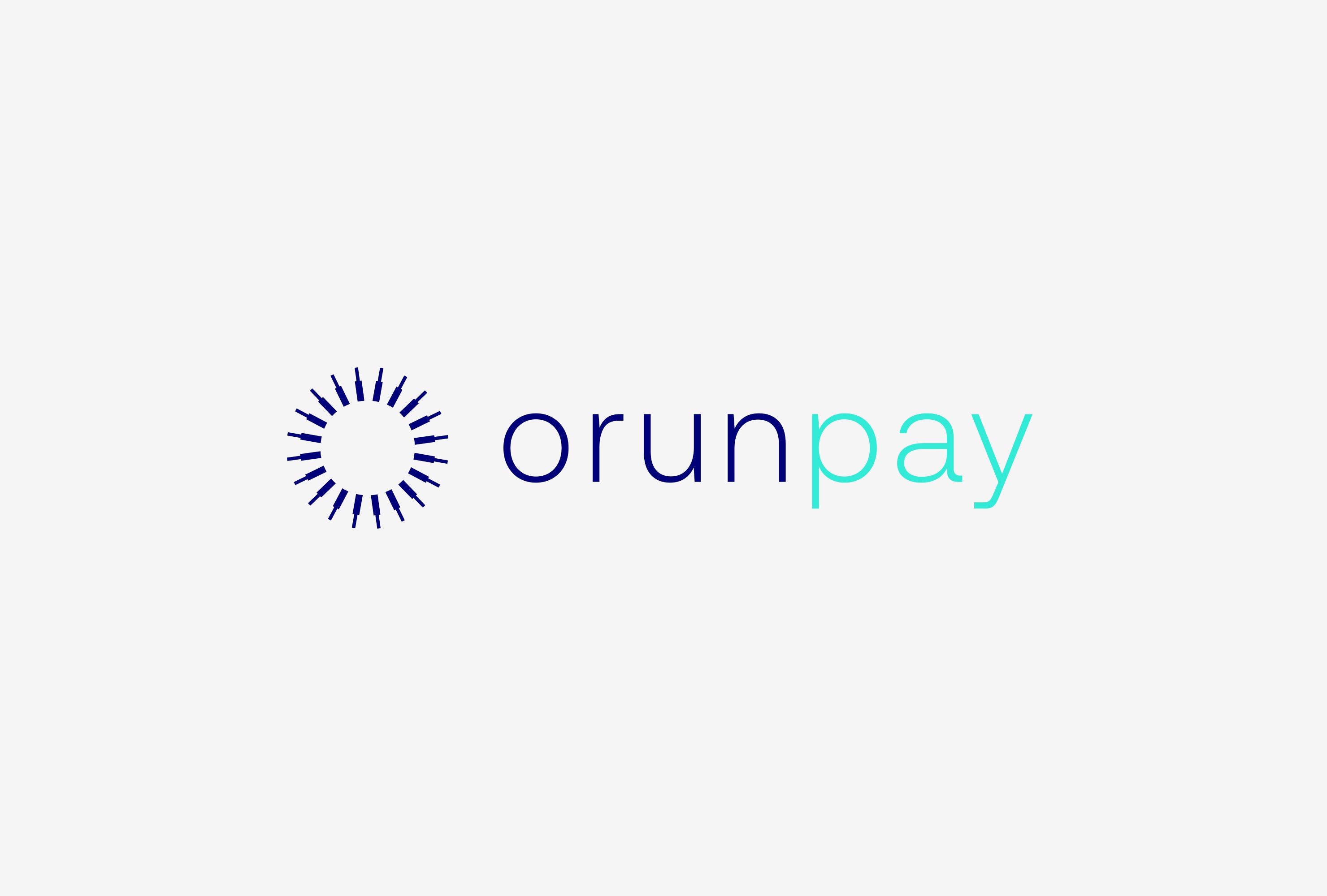
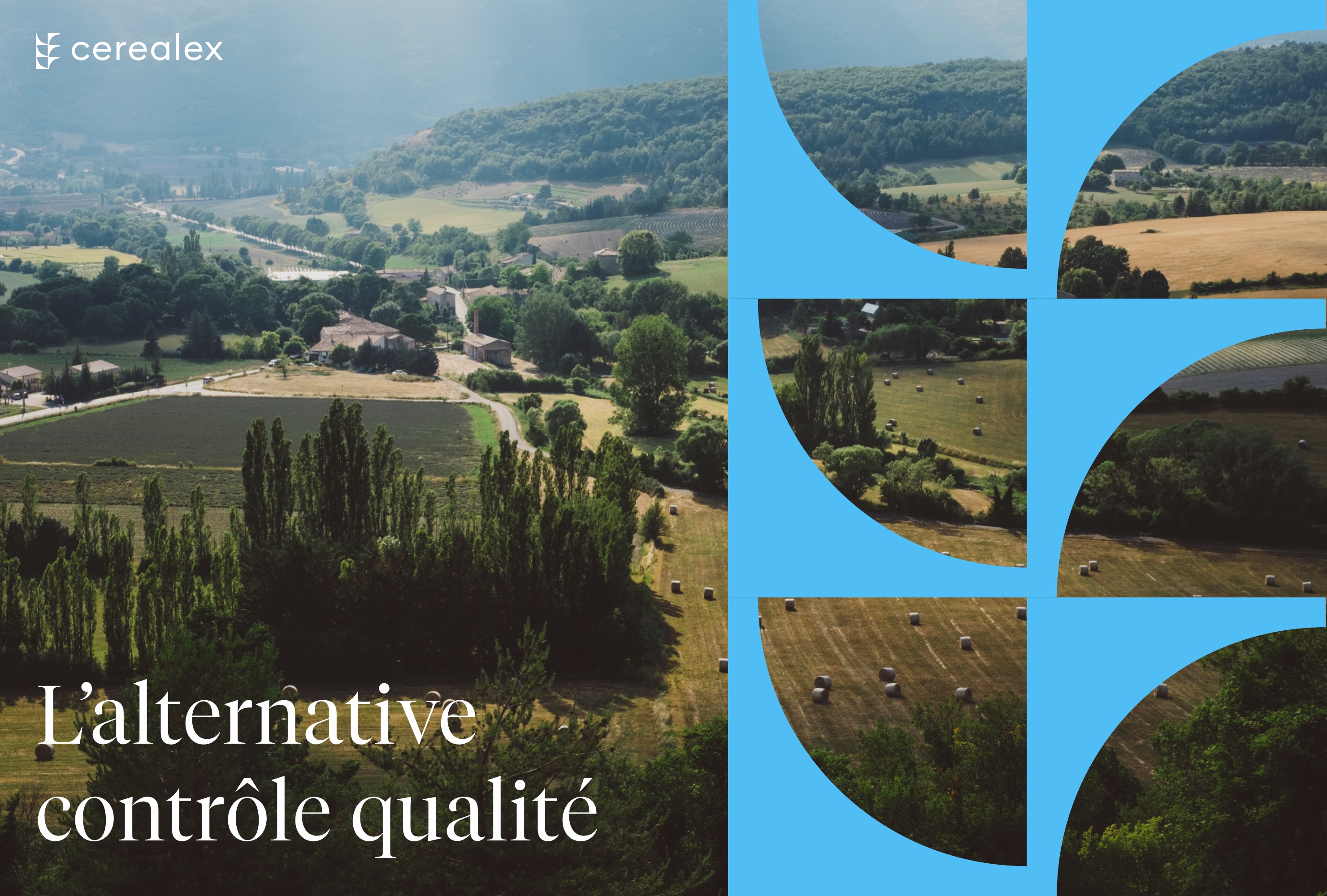
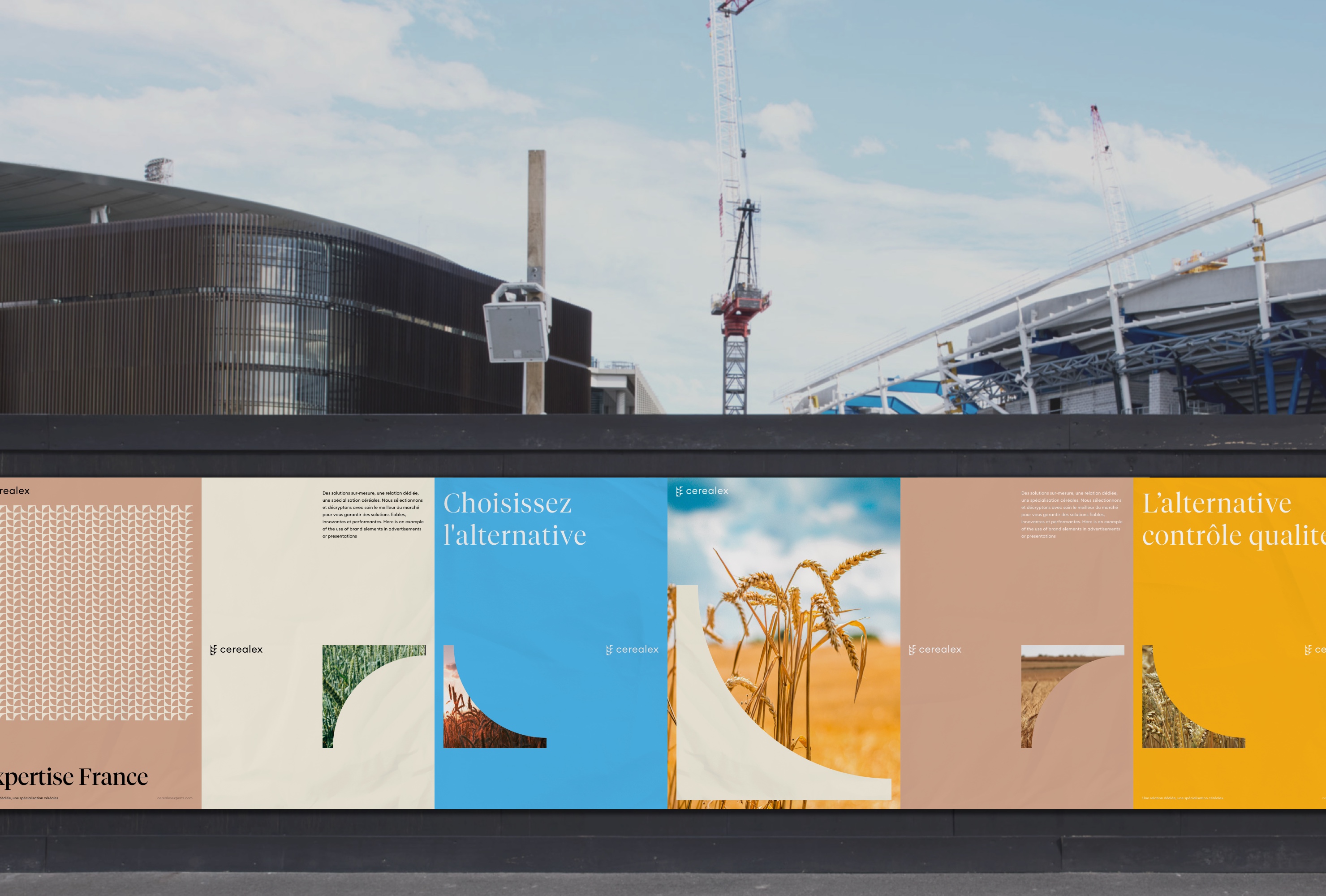
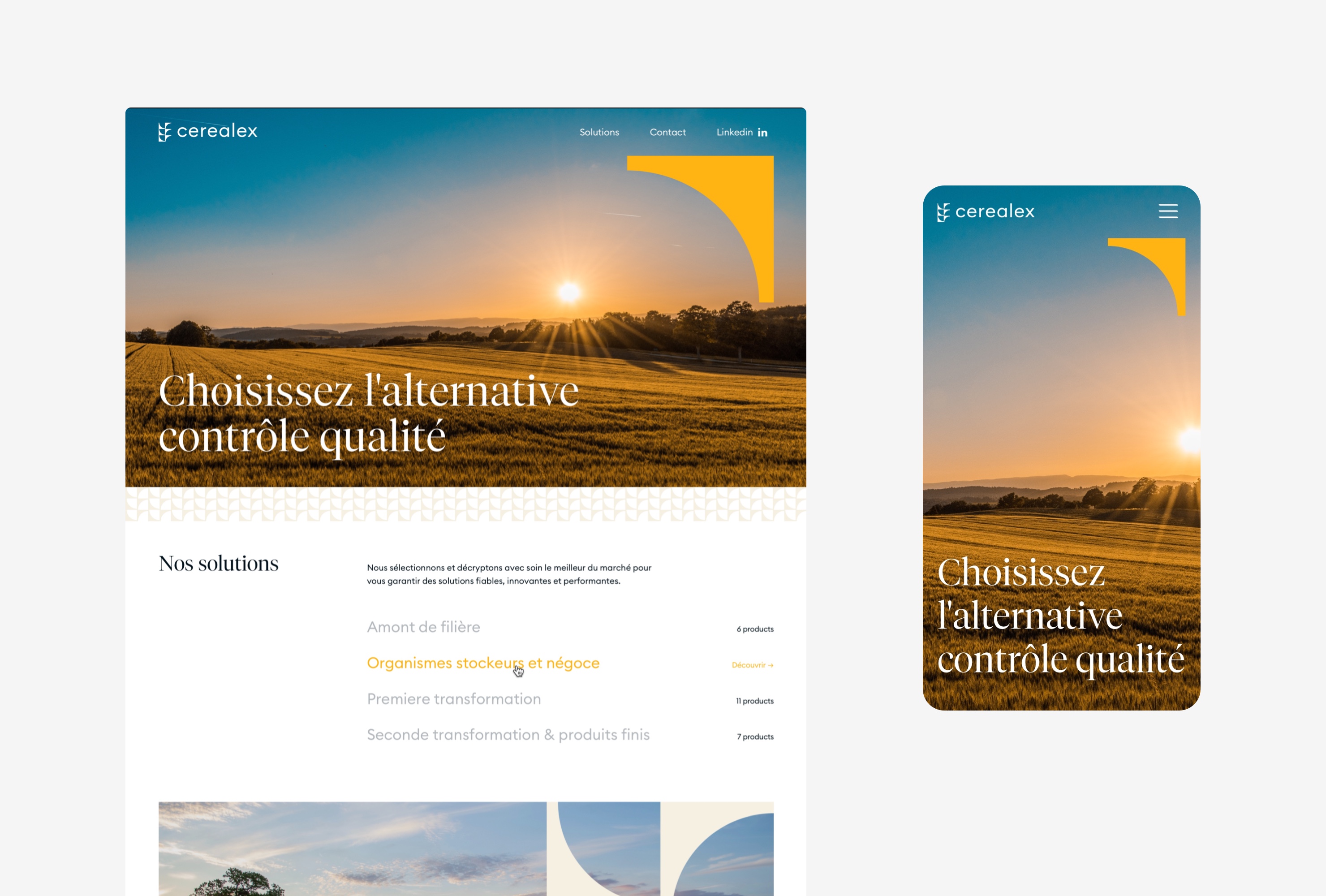
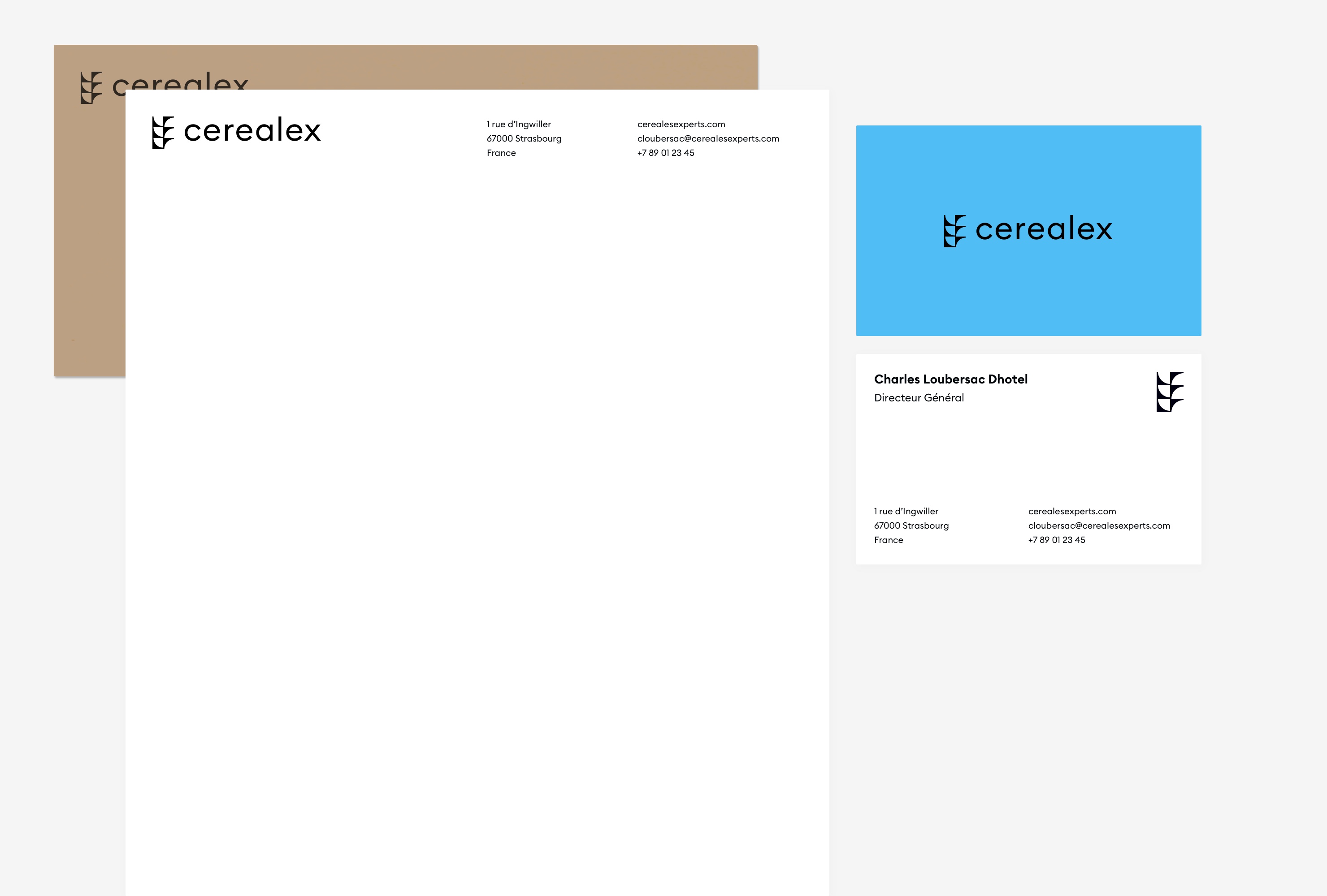
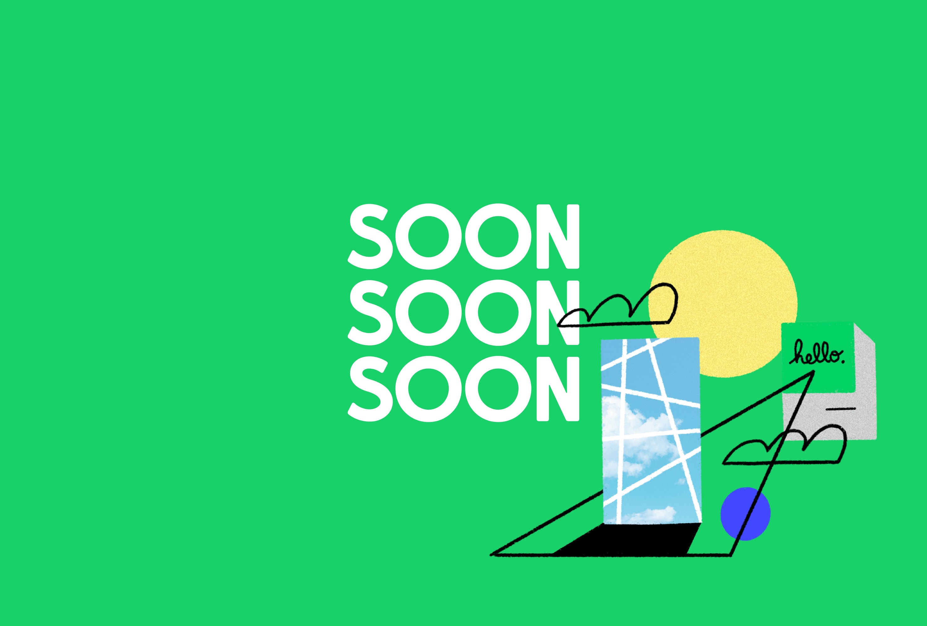
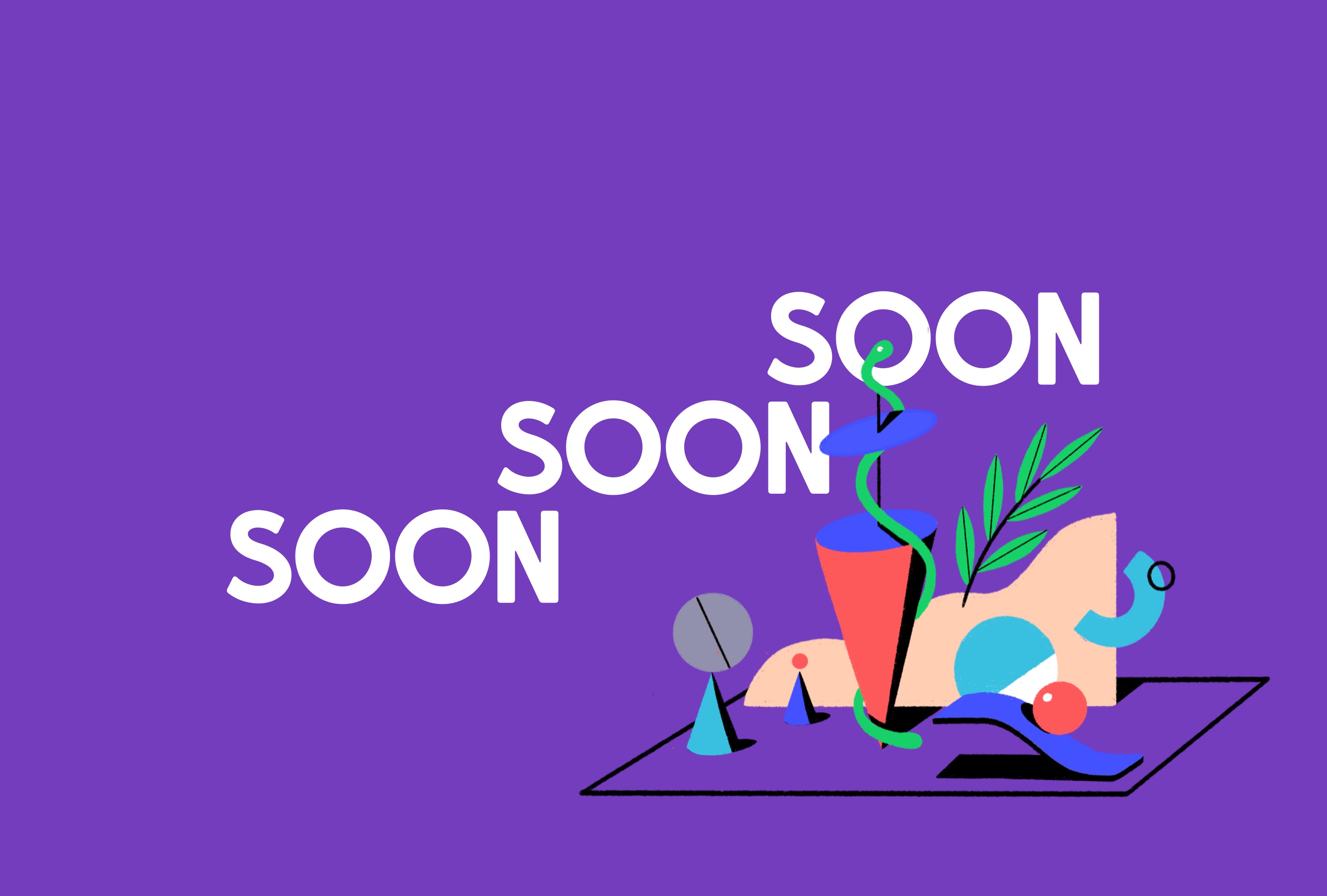
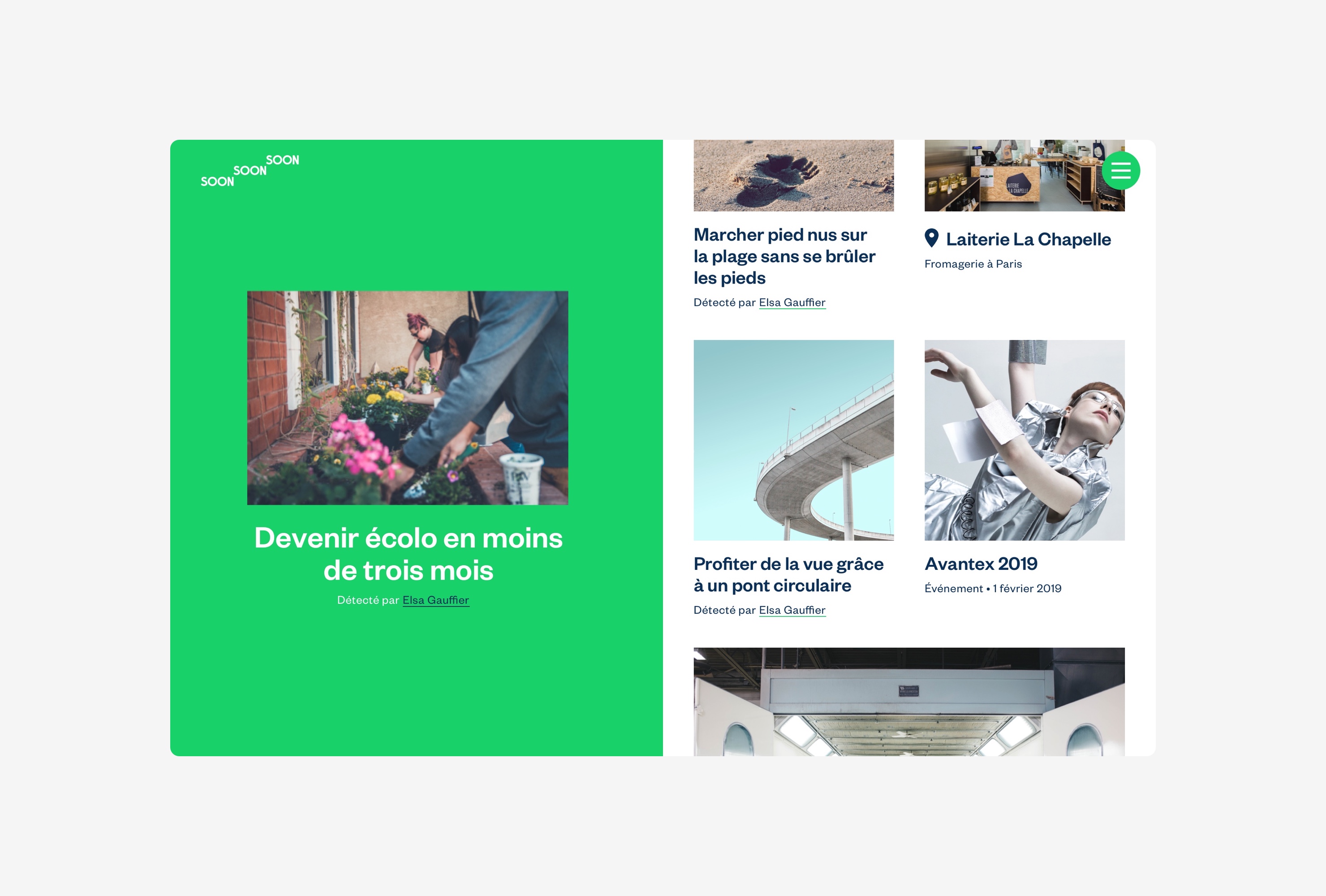
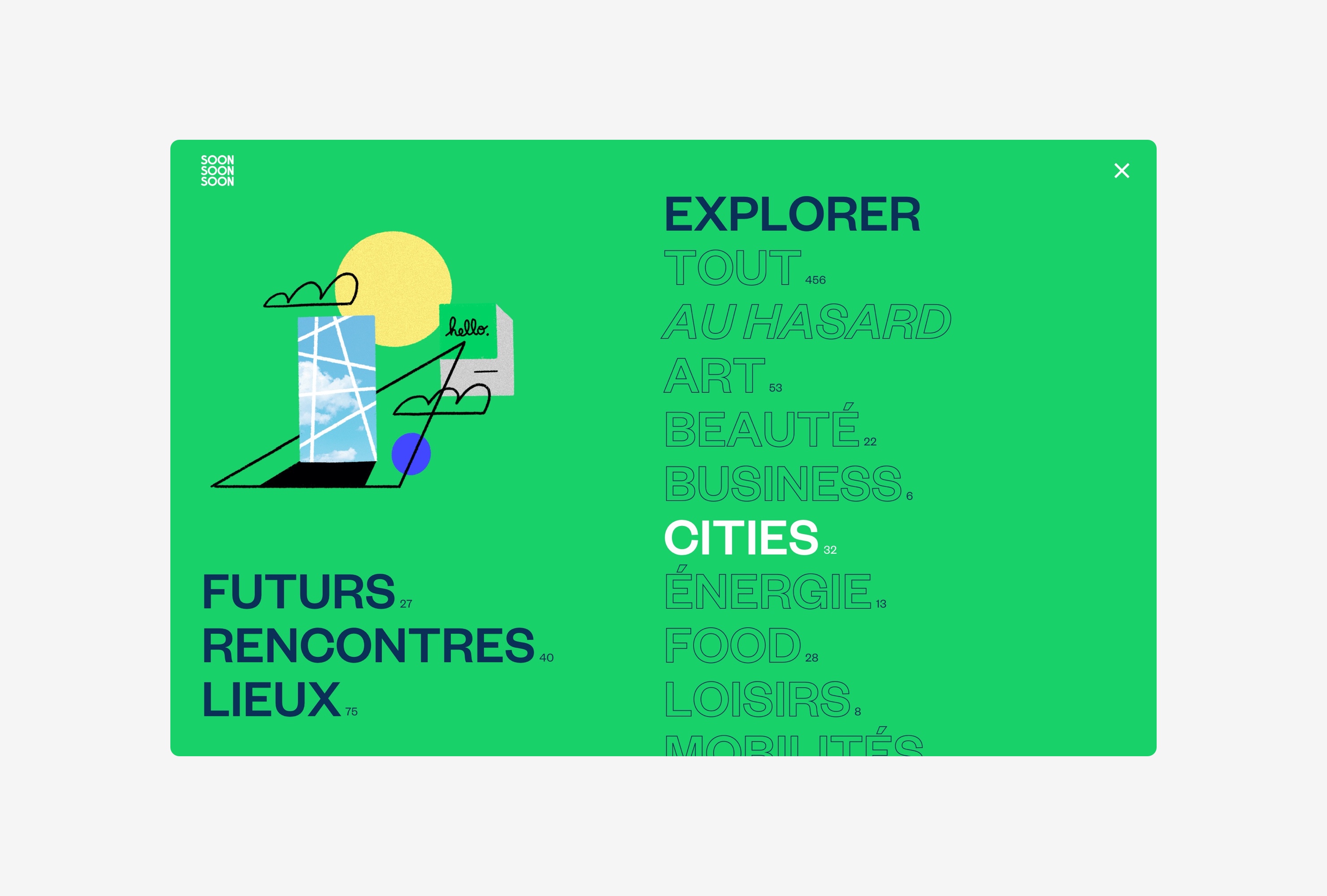
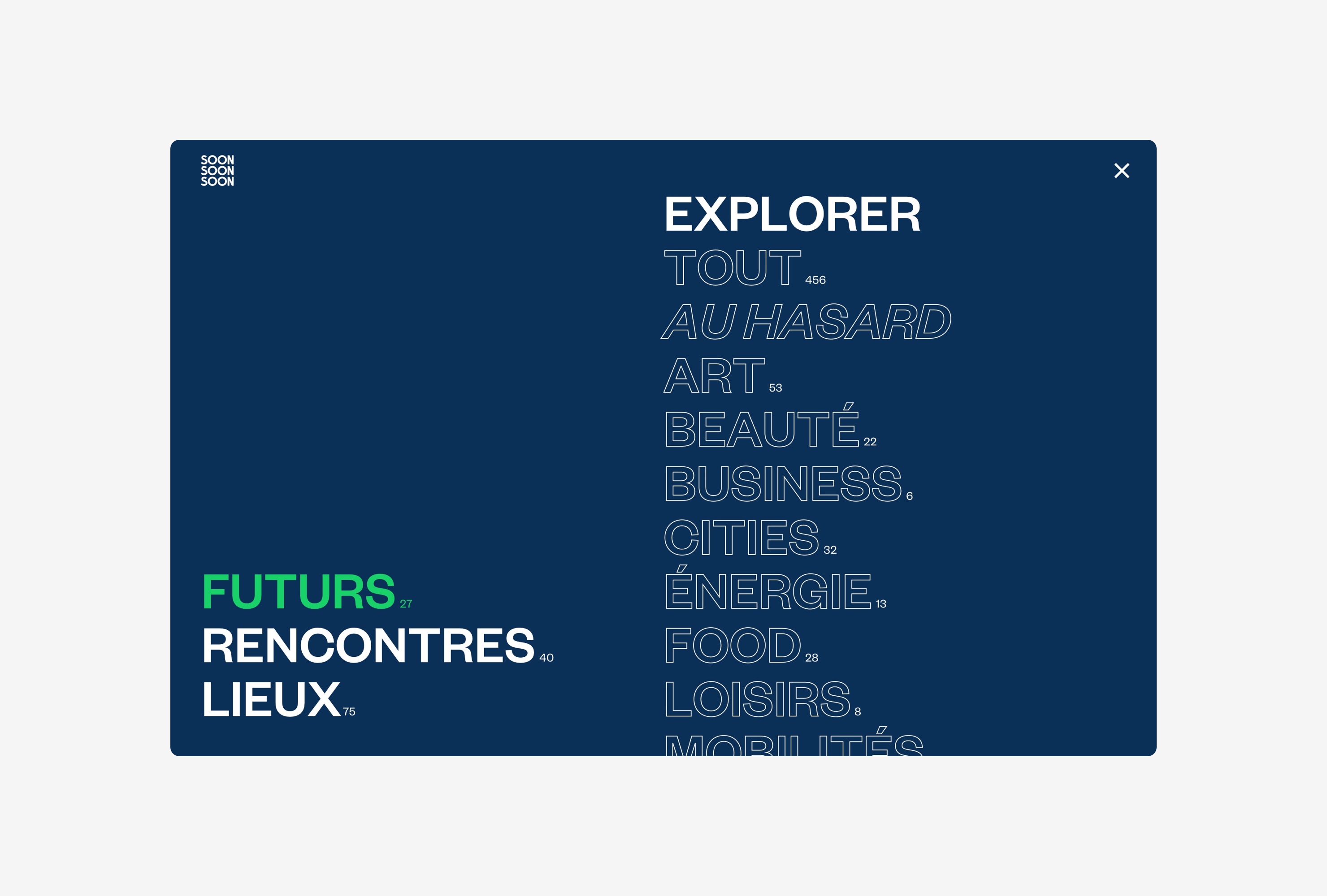
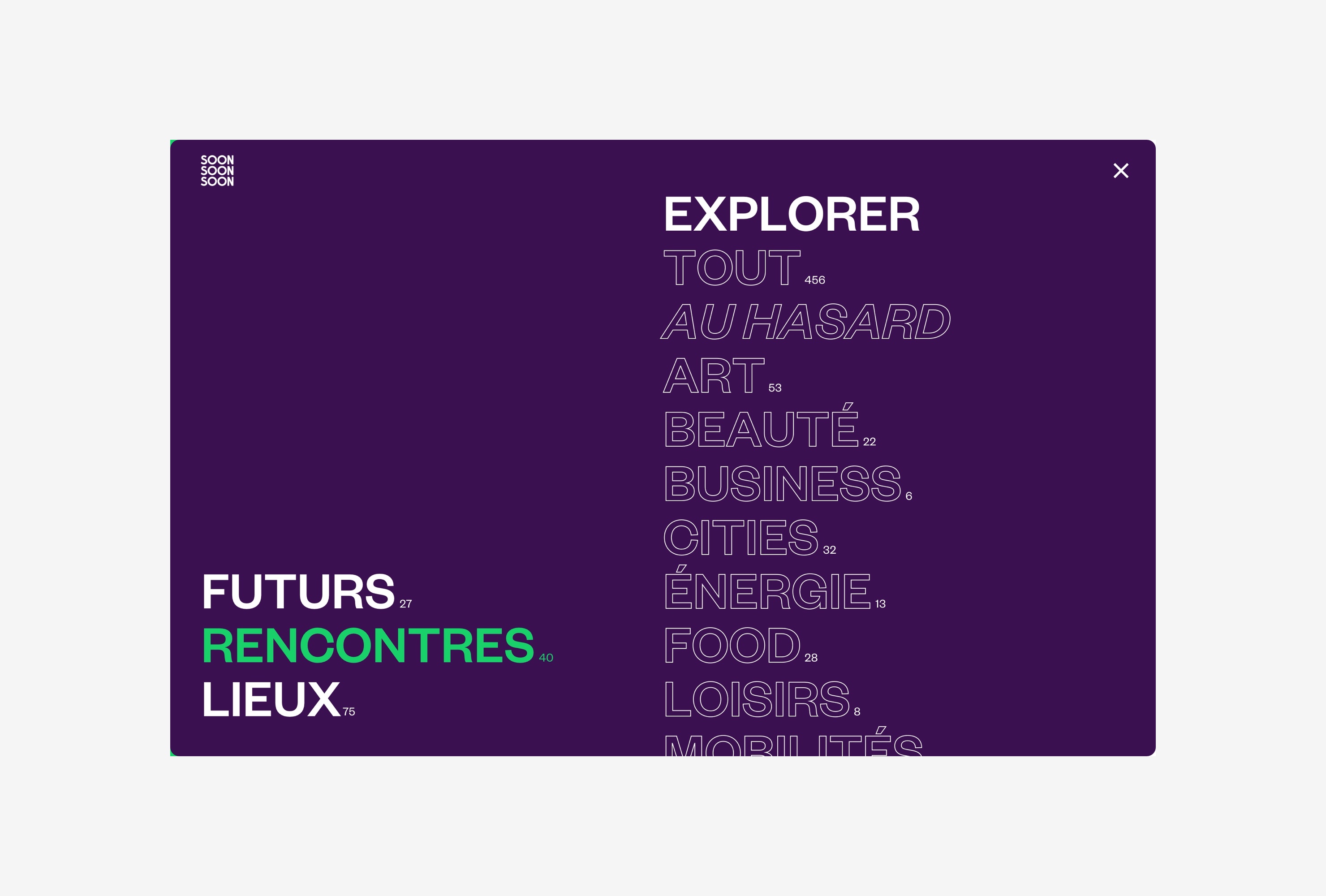
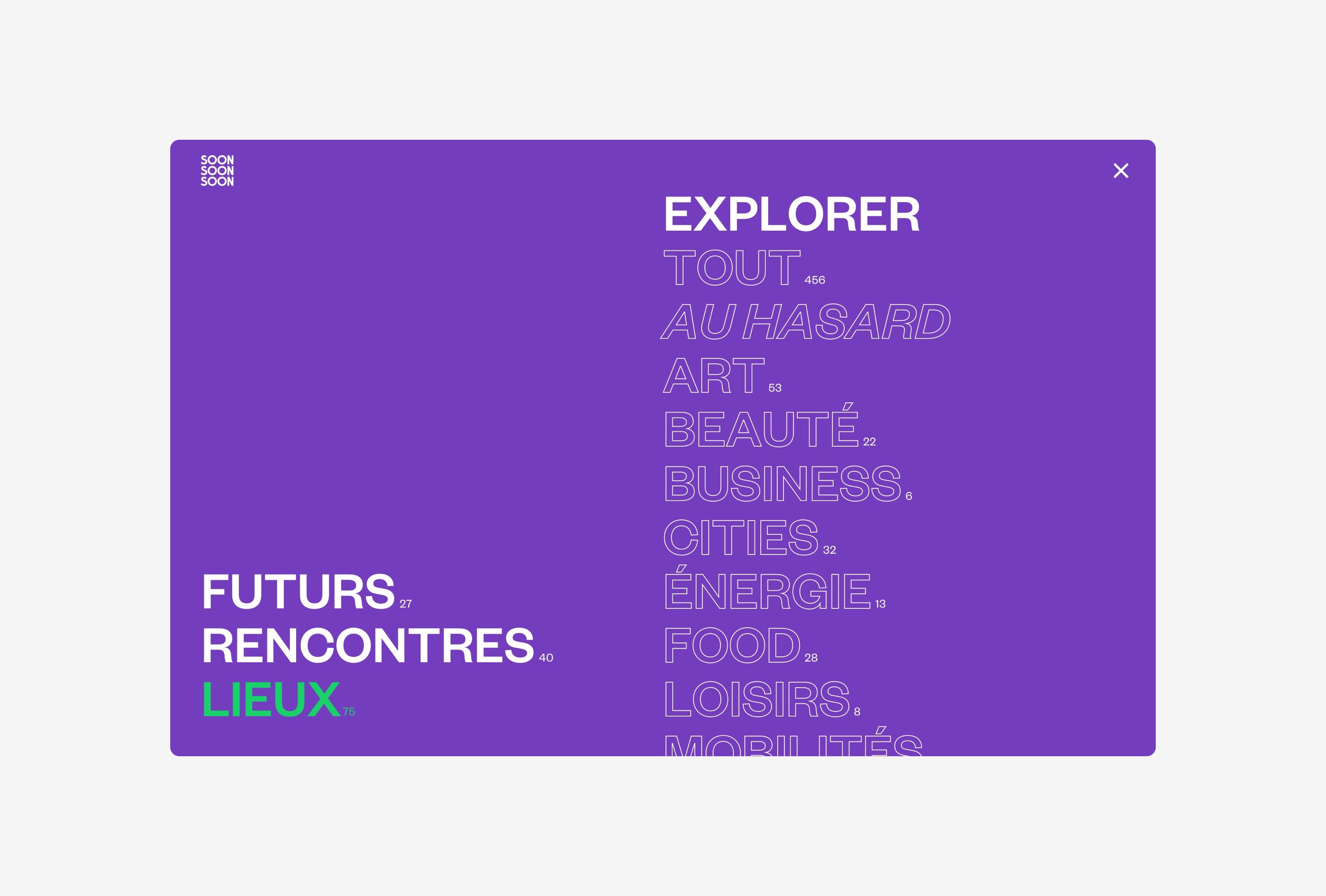
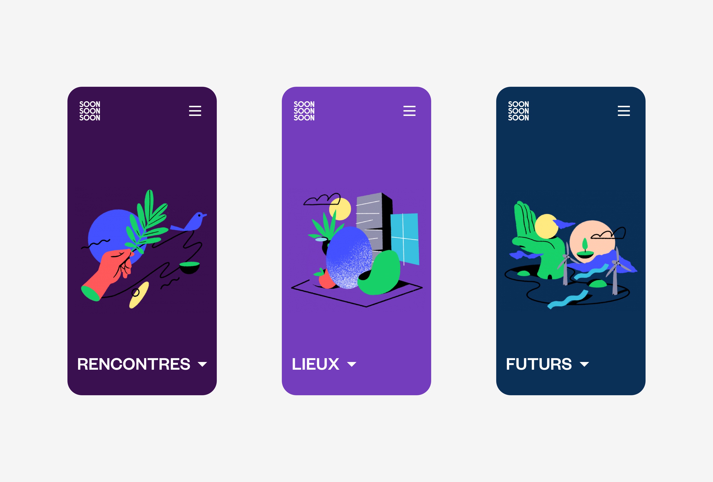
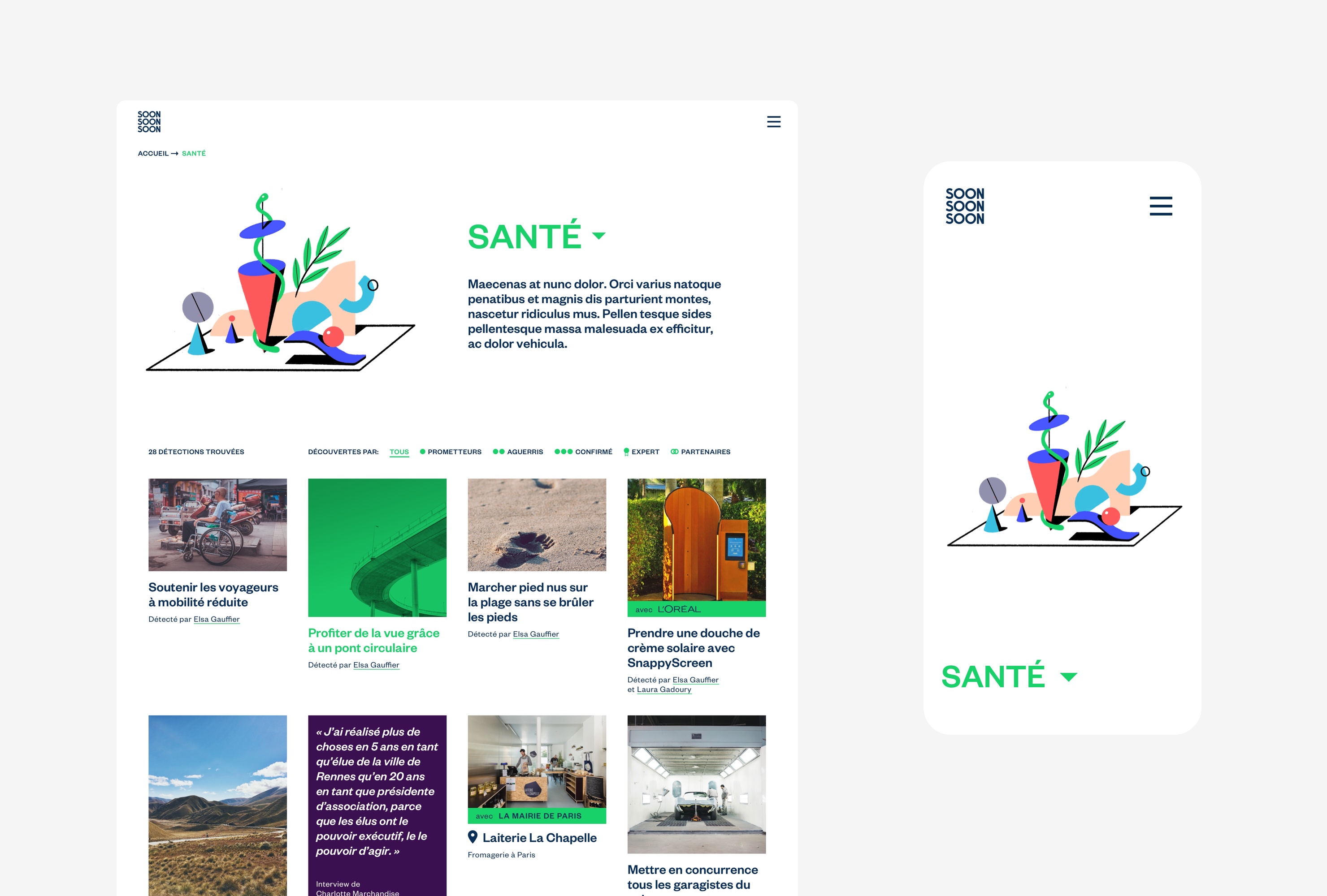
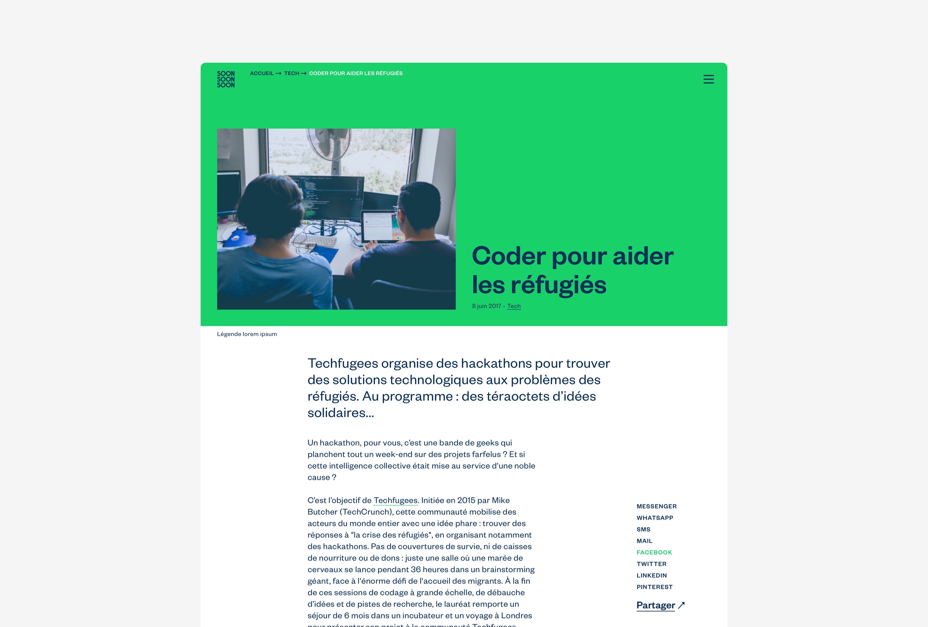
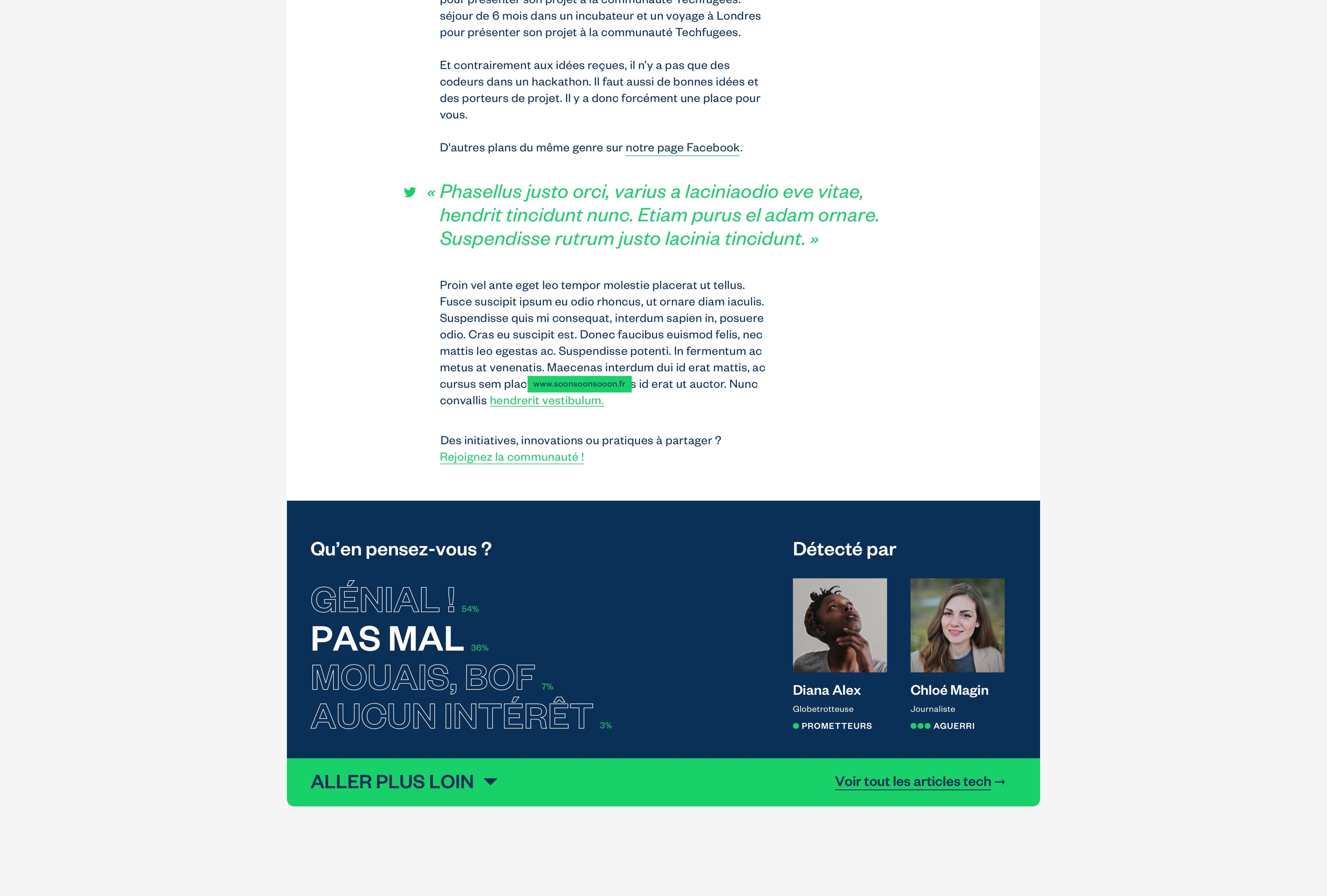
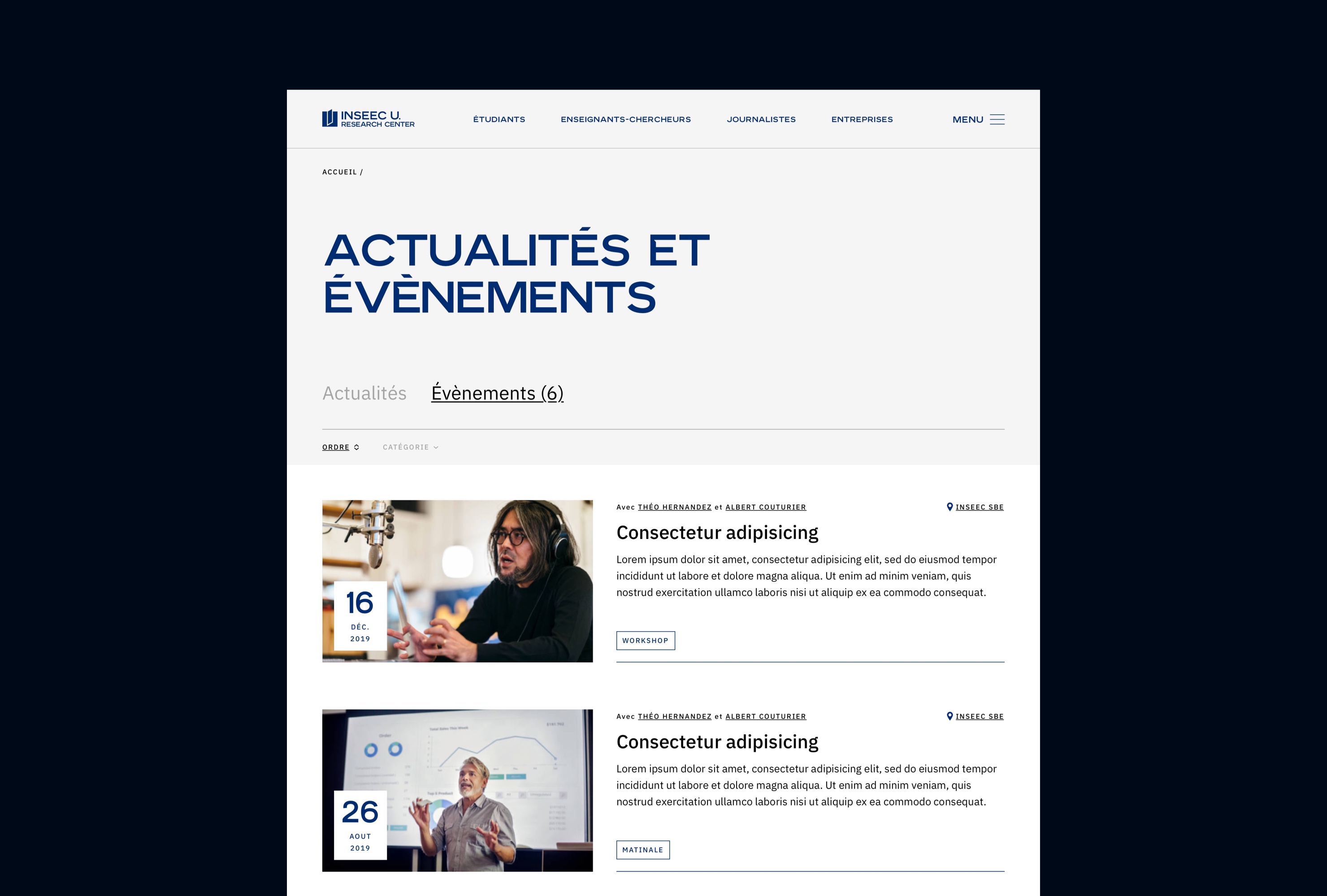
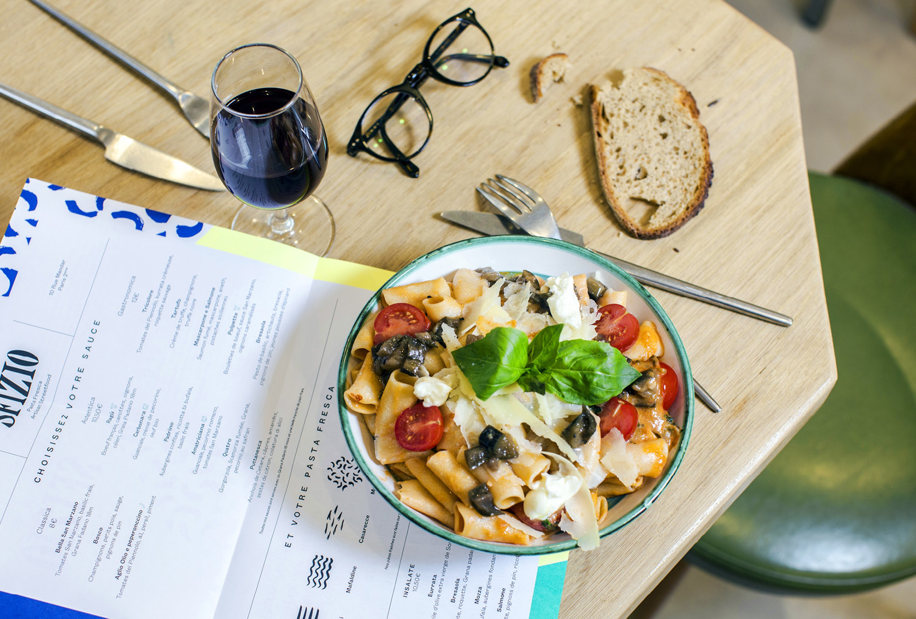
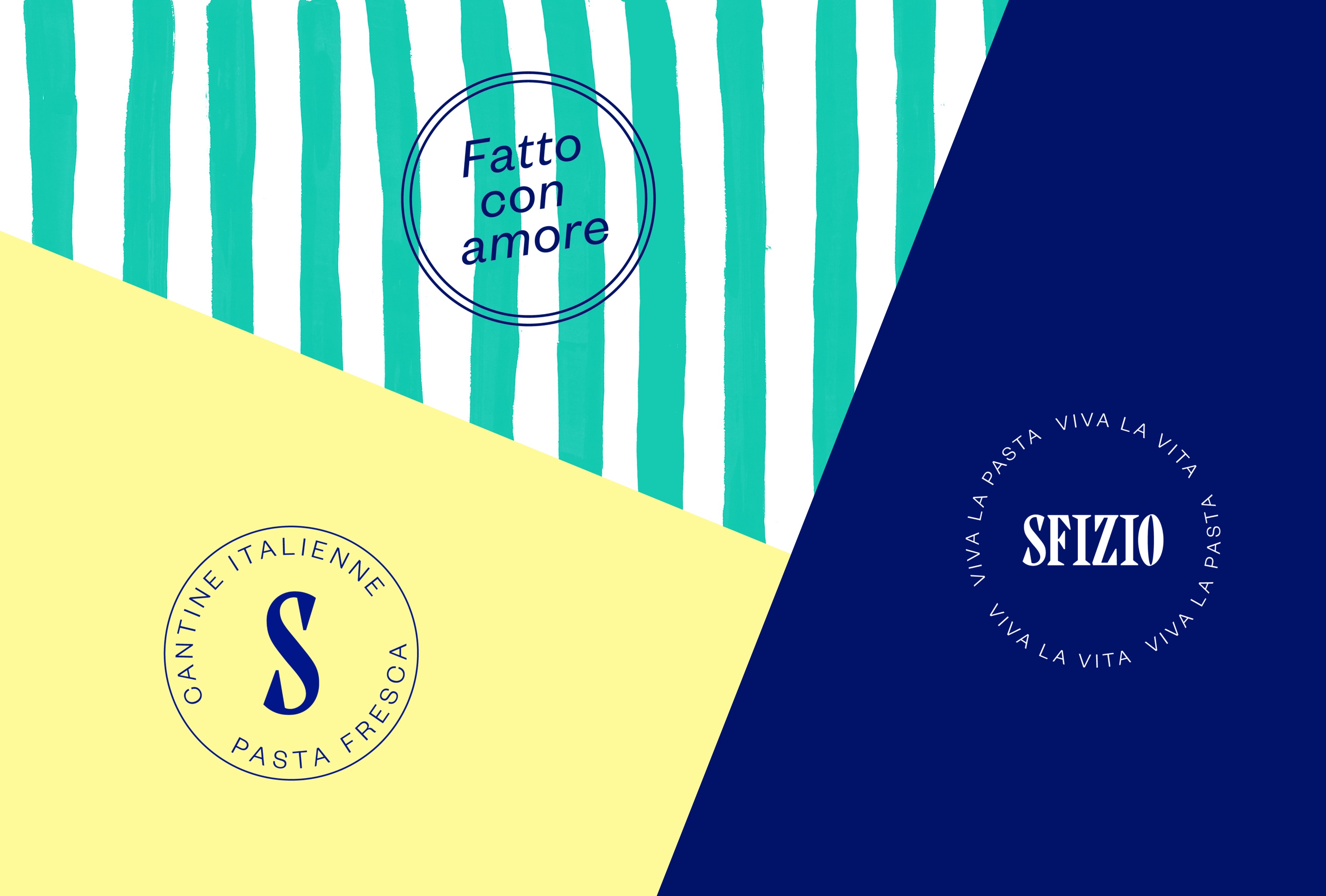
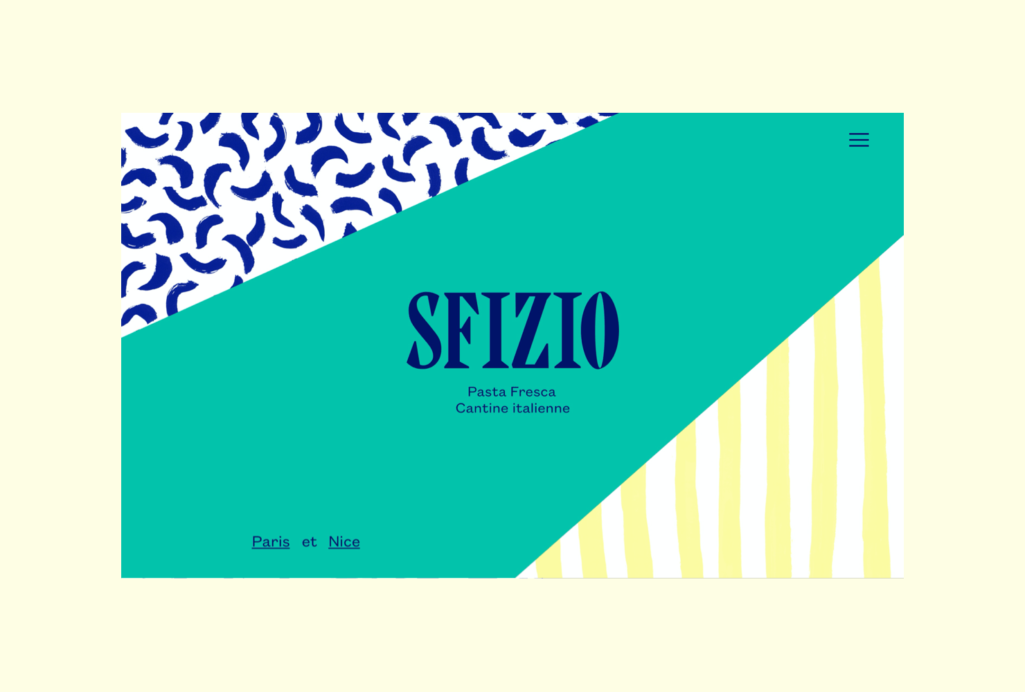
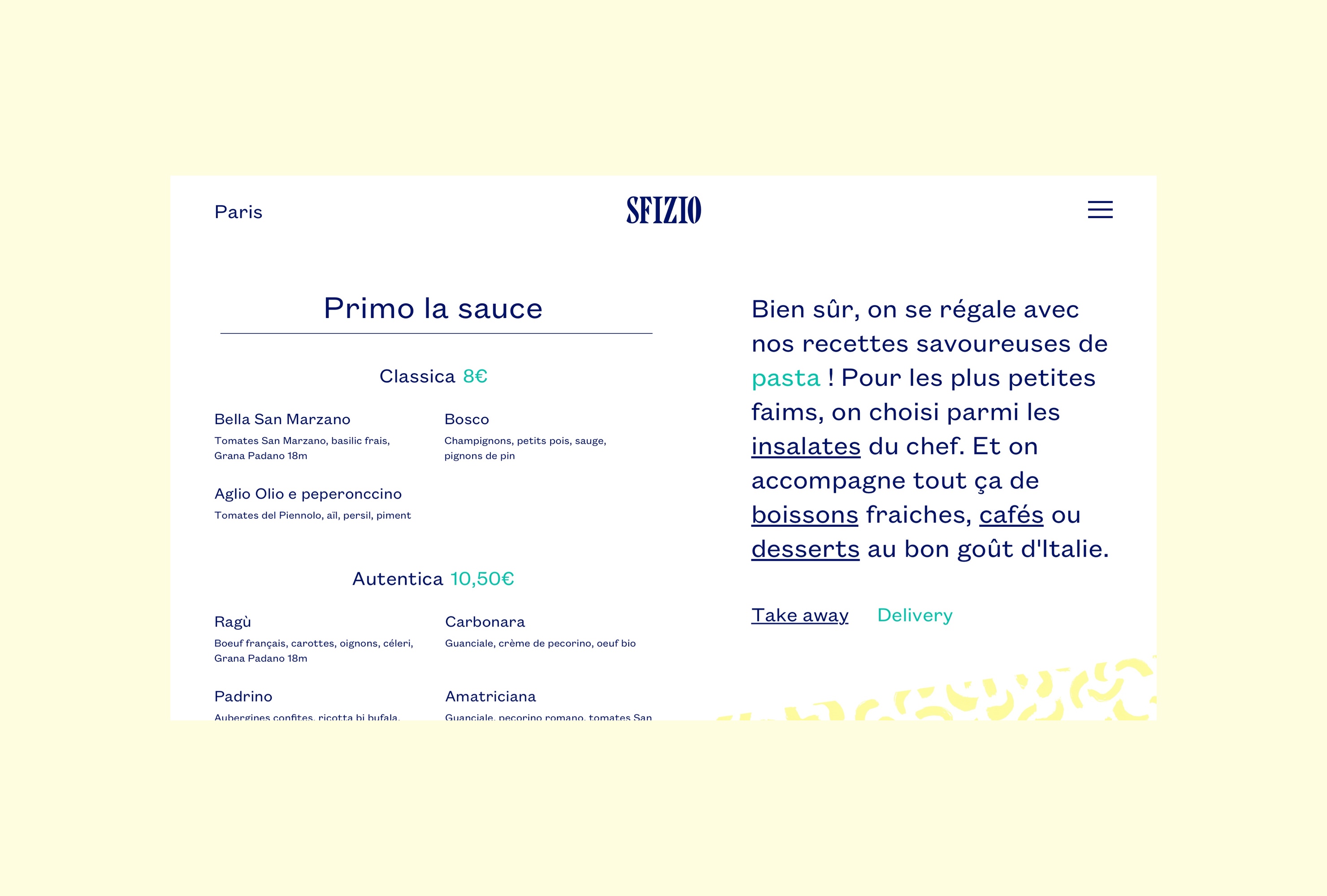
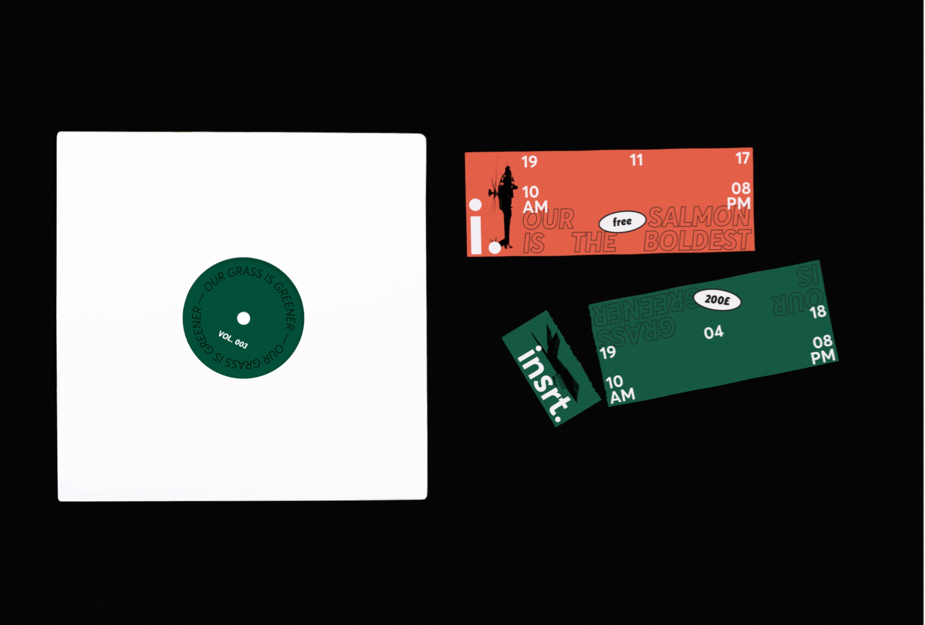
Creation and design of Citizen, a modular media website bringing together news, articles, stories, podcasts and interviews. Citizen offers a rich and easy-to-adapt template for brands wanting to express themselves on a variety of subjects related to their universe.
A branding inspired by the North American media universe. A clear and simple identity to keep graphic neutrality and allow each client to focus on functionality while projecting their own brand identity. An exercise close to no-brand branding that focus on usability, accessibility and information architecture. -
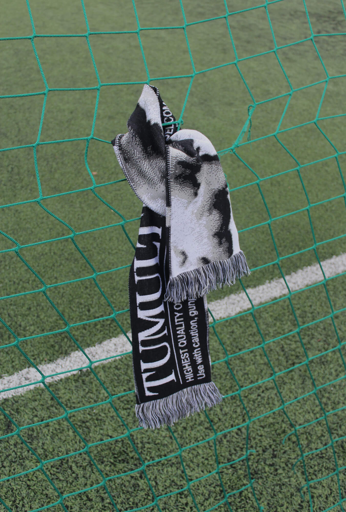
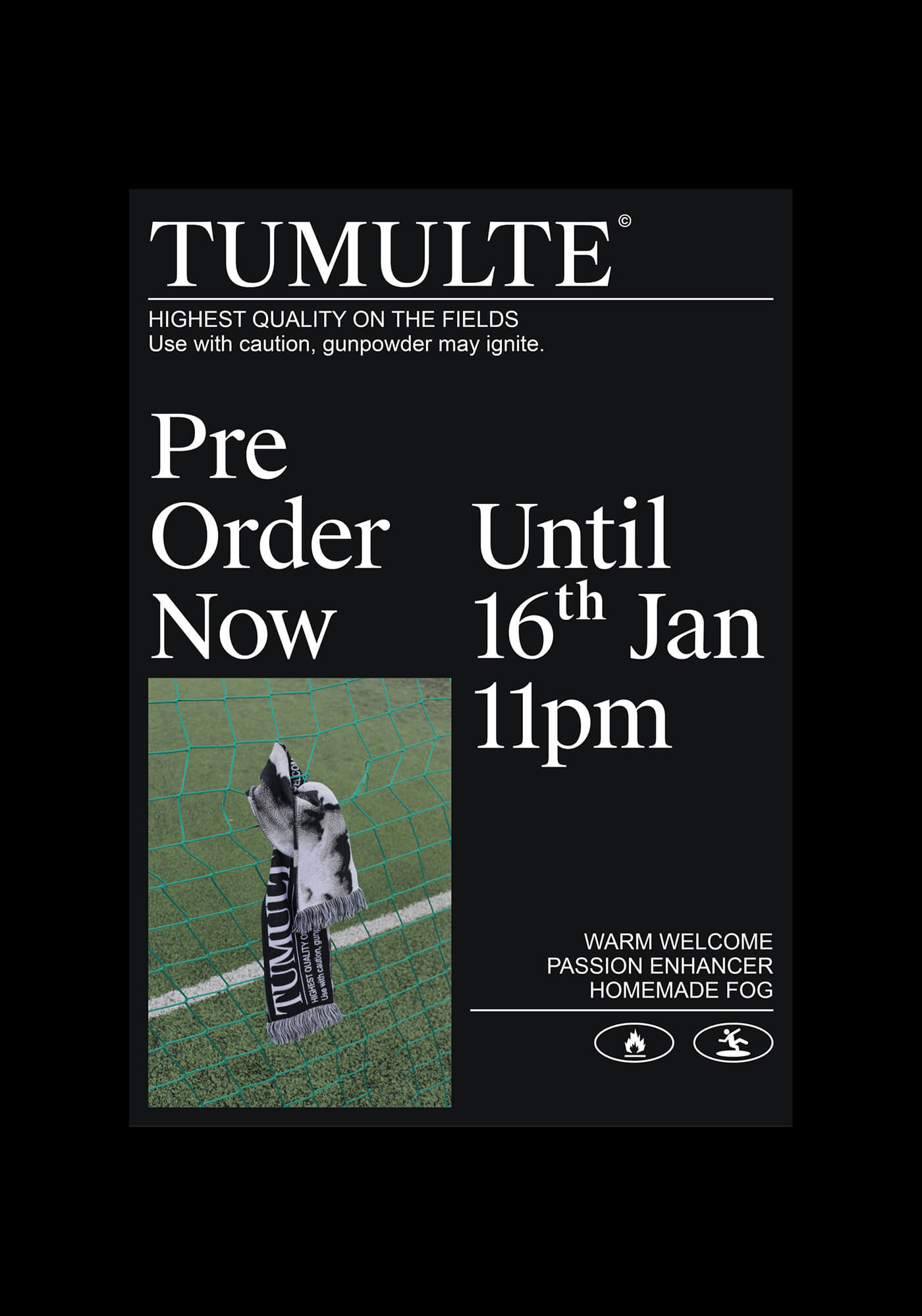
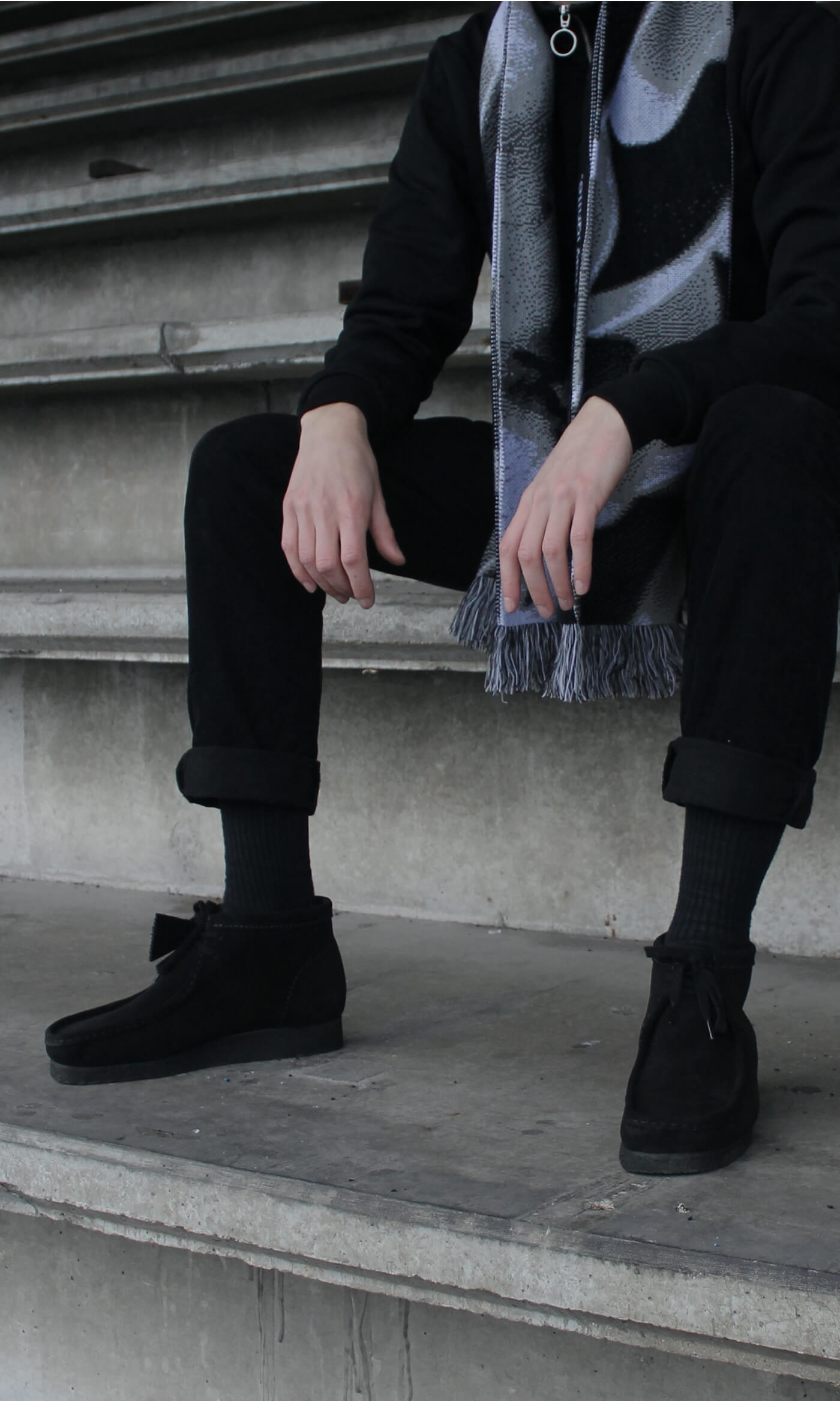
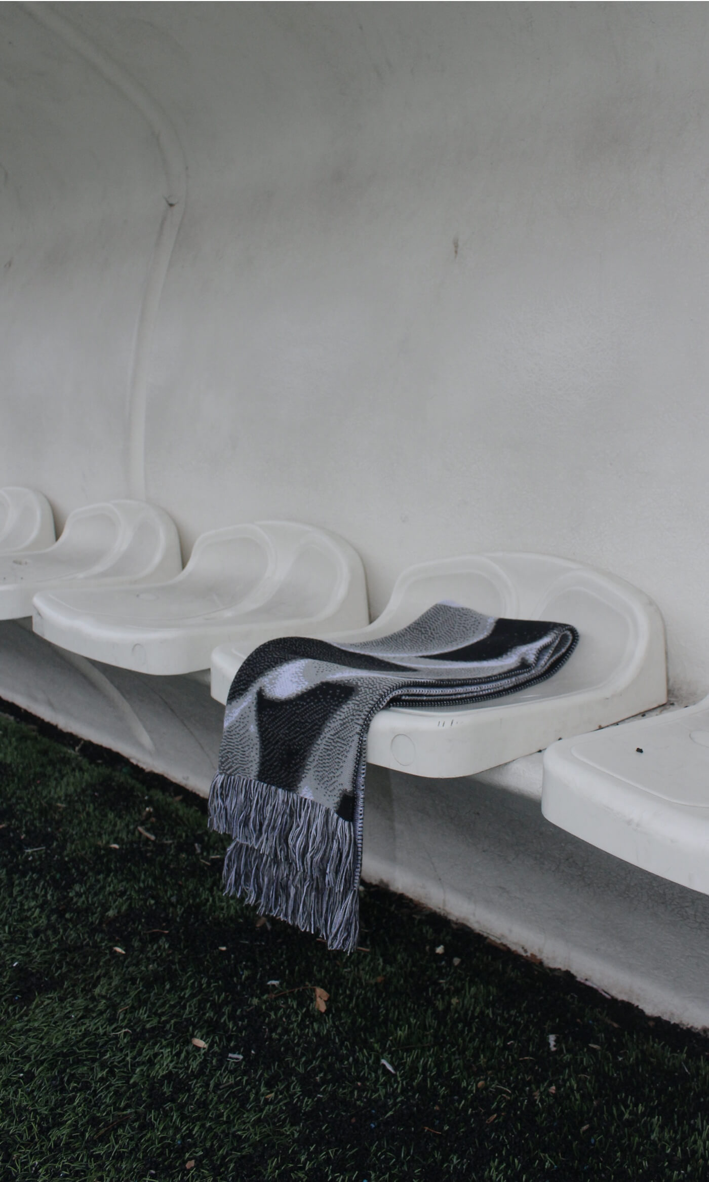
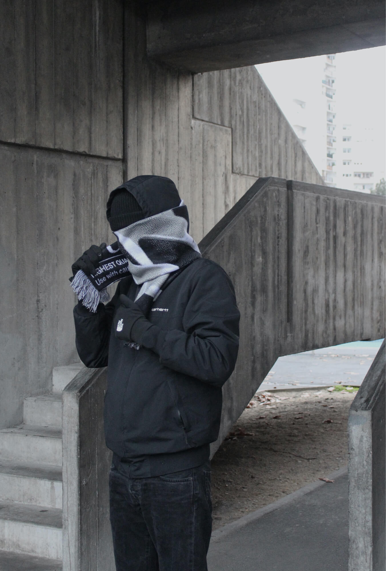
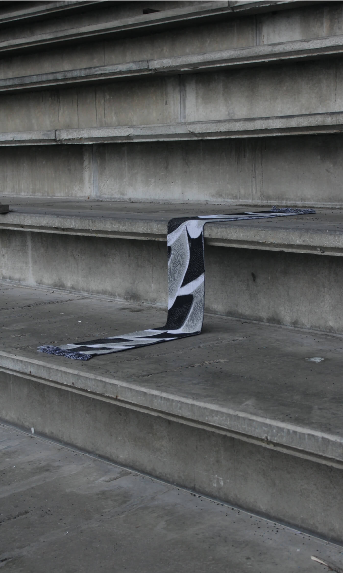
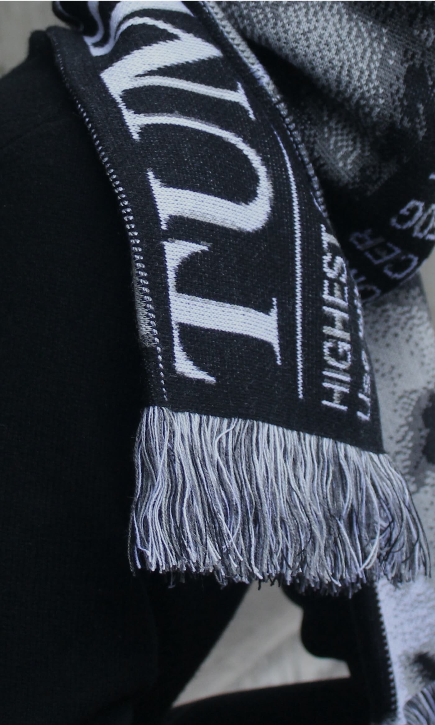
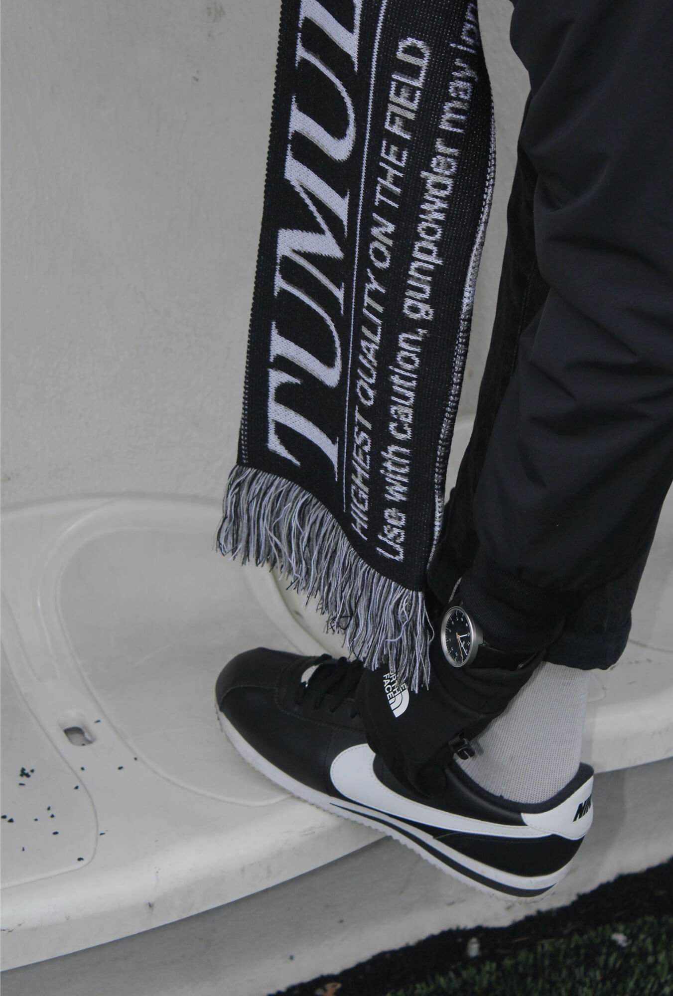
Collaboration with Renaud Dardaine to design a soccer fan scarf, the emblematic item dedicated to people who love the beautiful game. A tribute to all those who frequently visit the soccer arenas, week after week, passionate, dedicated and sometimes resigned.
This scarf is an ode to the fervor of the 12th man. Its name “Tumulte” means “Agitation” in french. This notion is represented by the fog of smoke on one side contrasting with the silence of the empty seats on the other side. The photographic direction takes place in the heart of a stadium where the soul of fans comes from. -
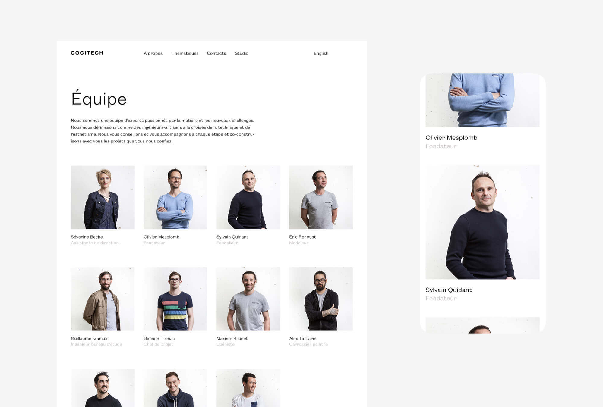
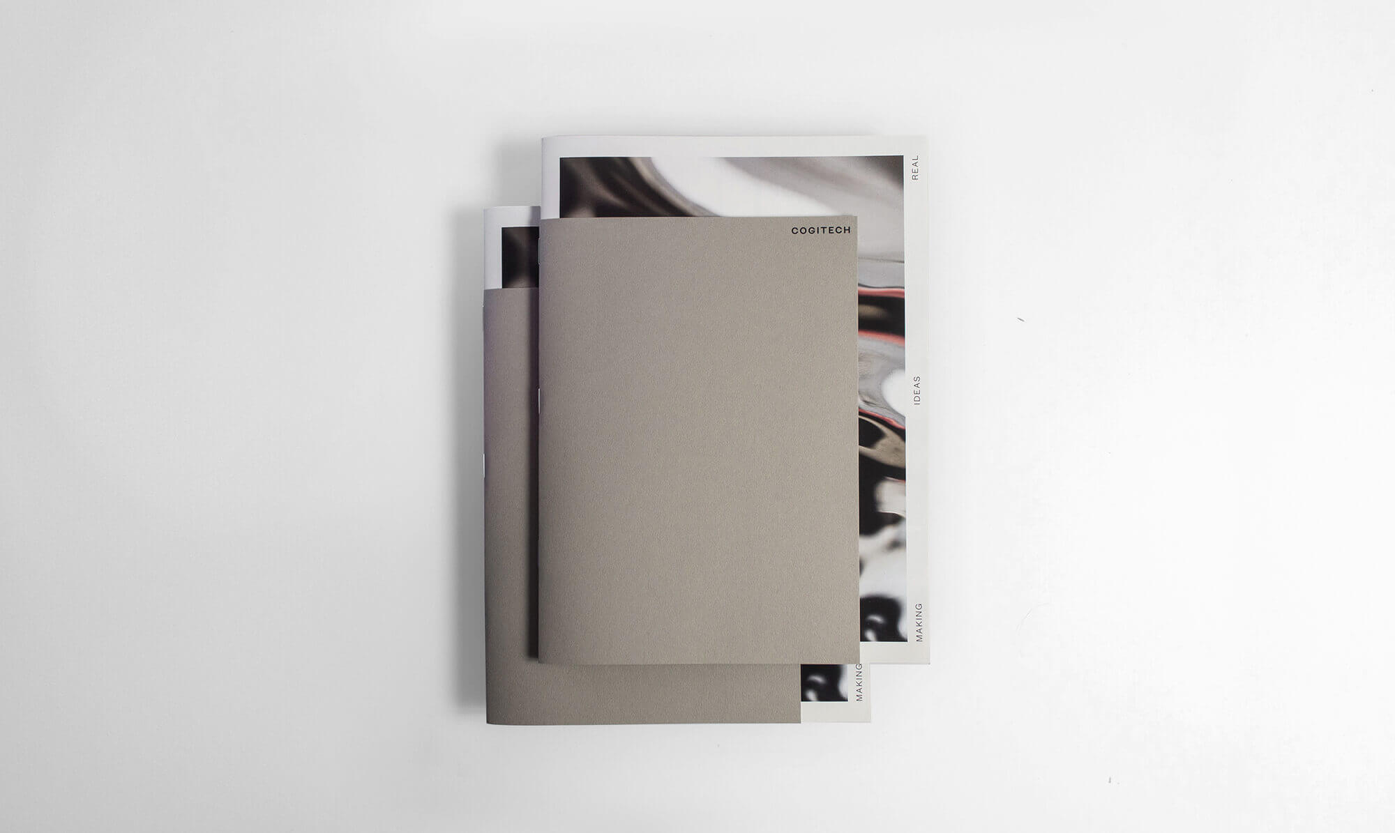
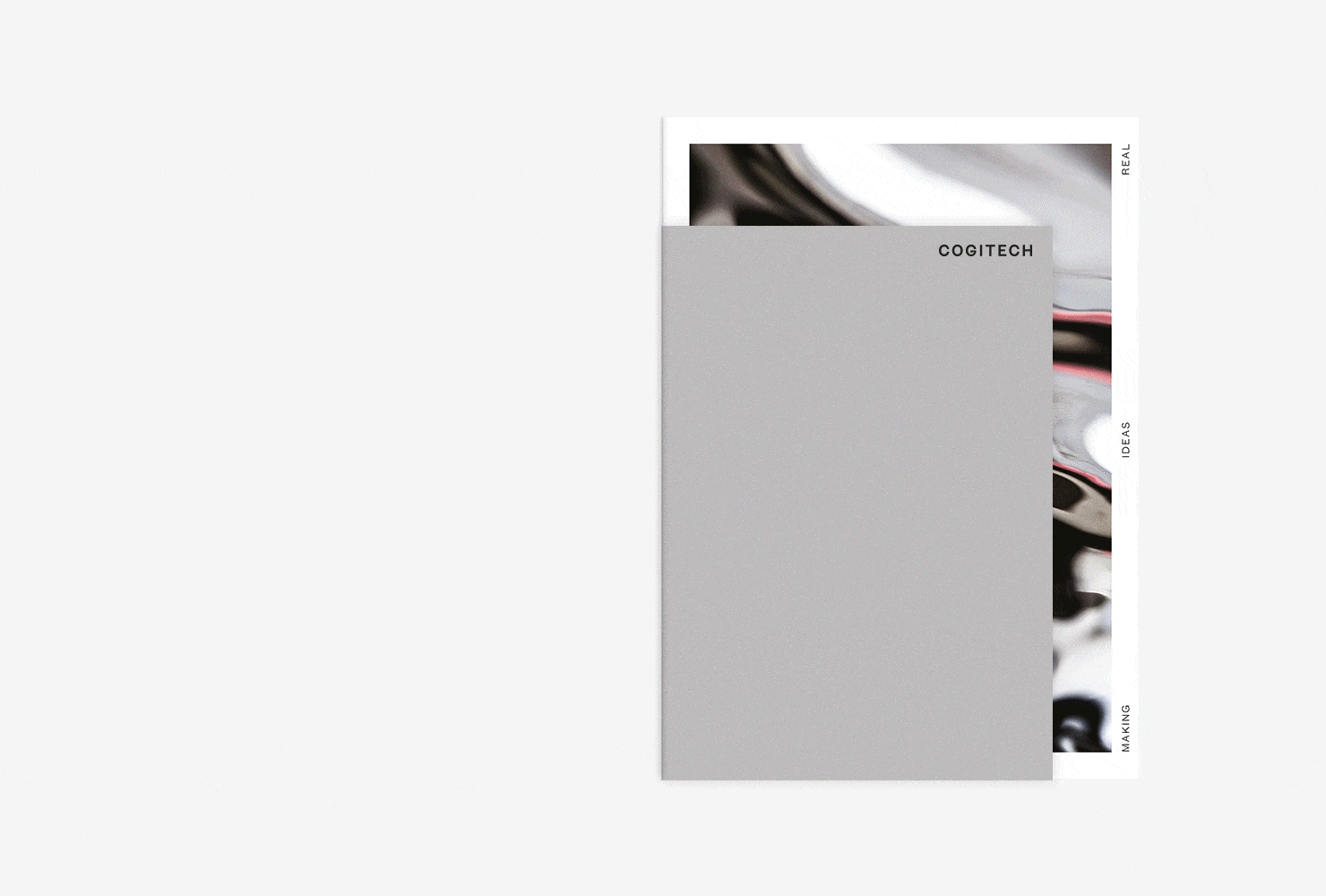
Cogitech
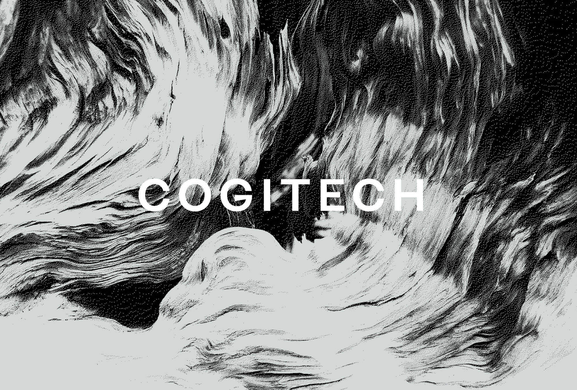
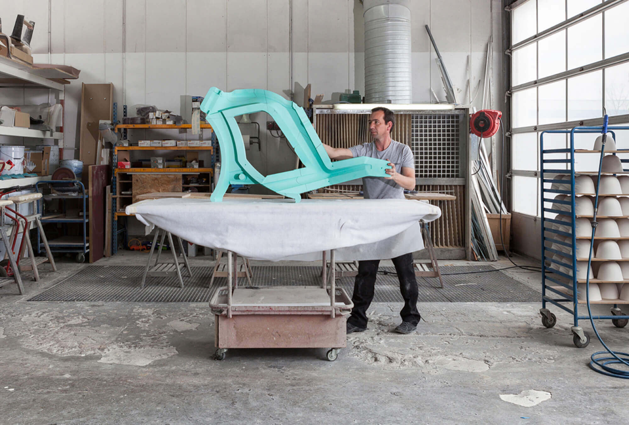
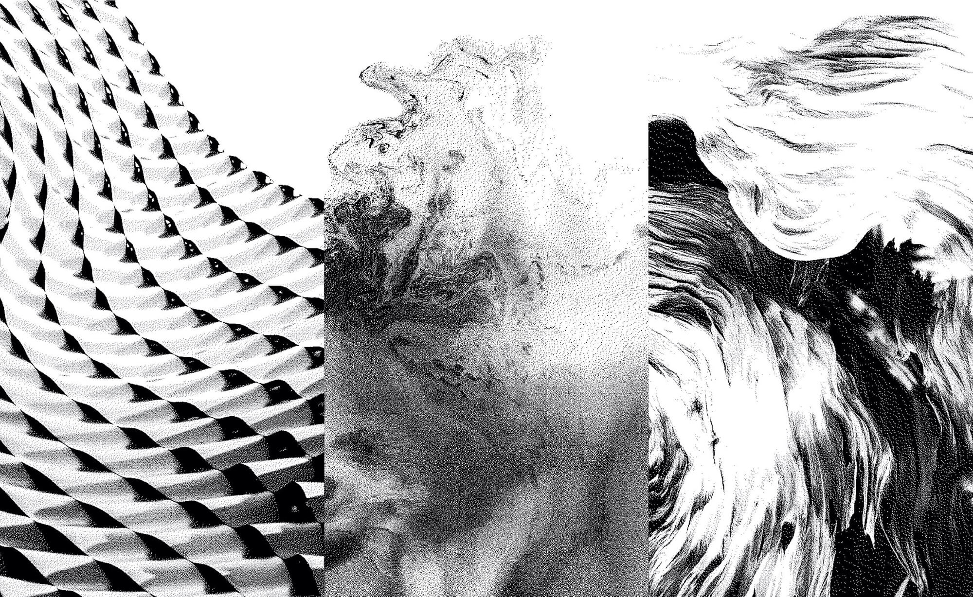
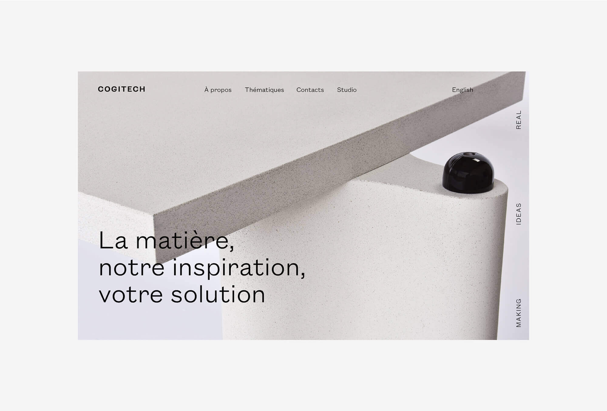
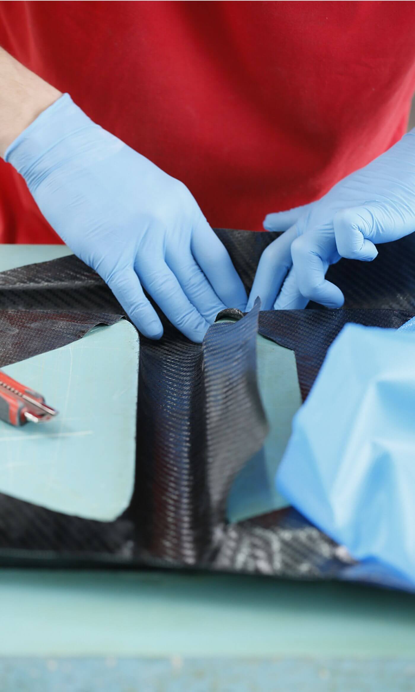
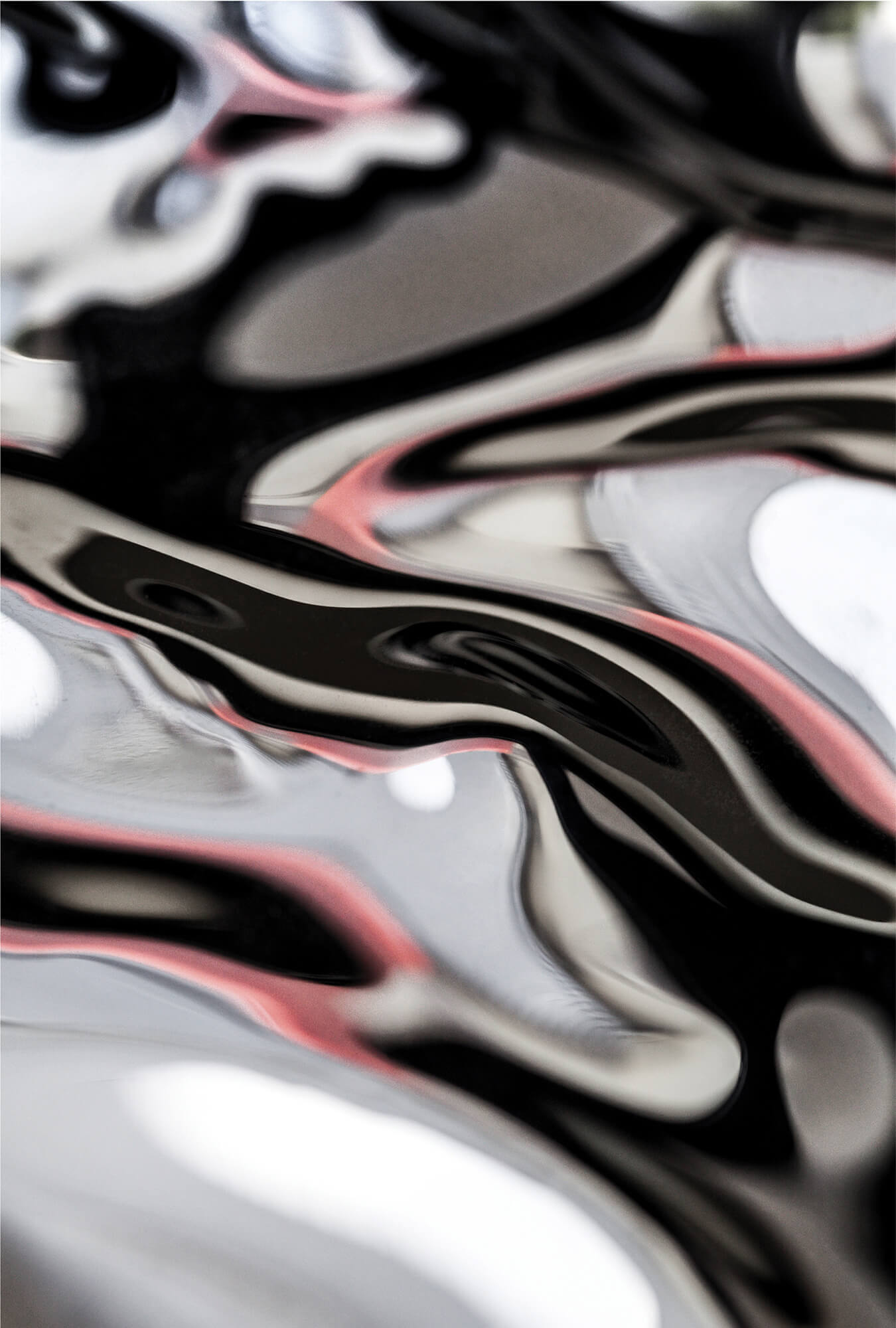
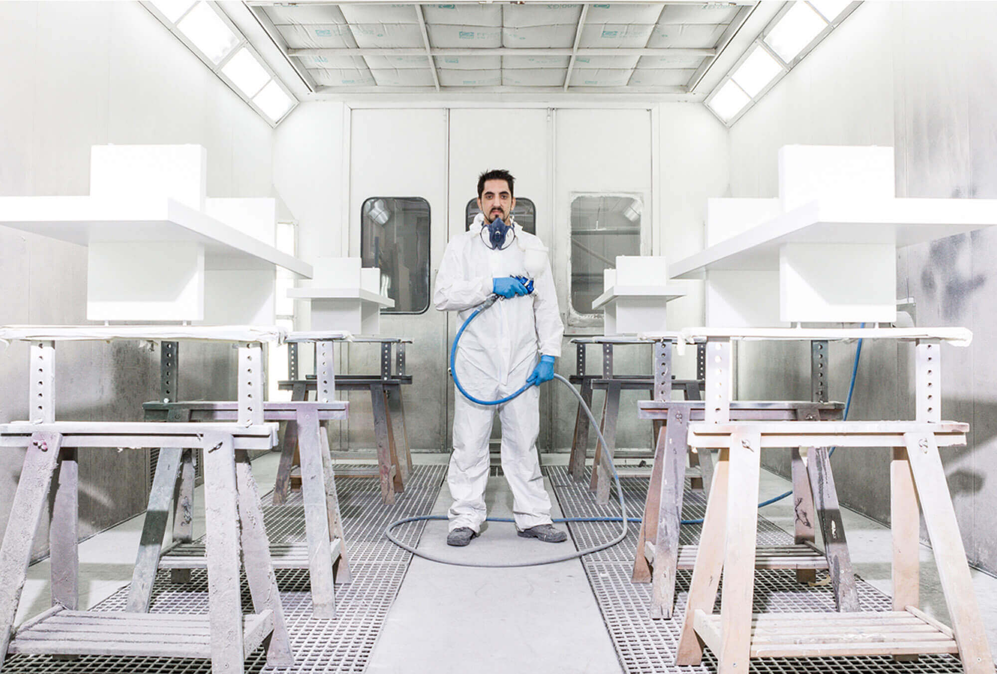
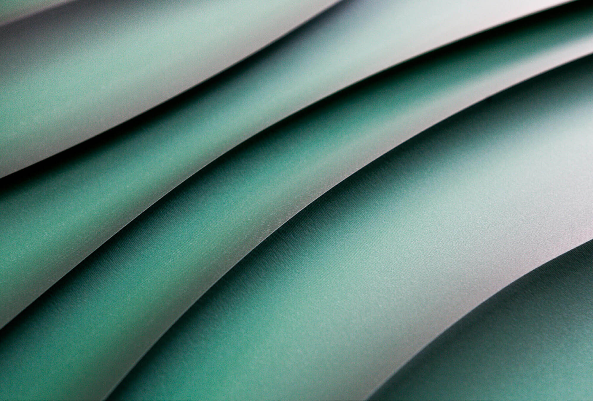
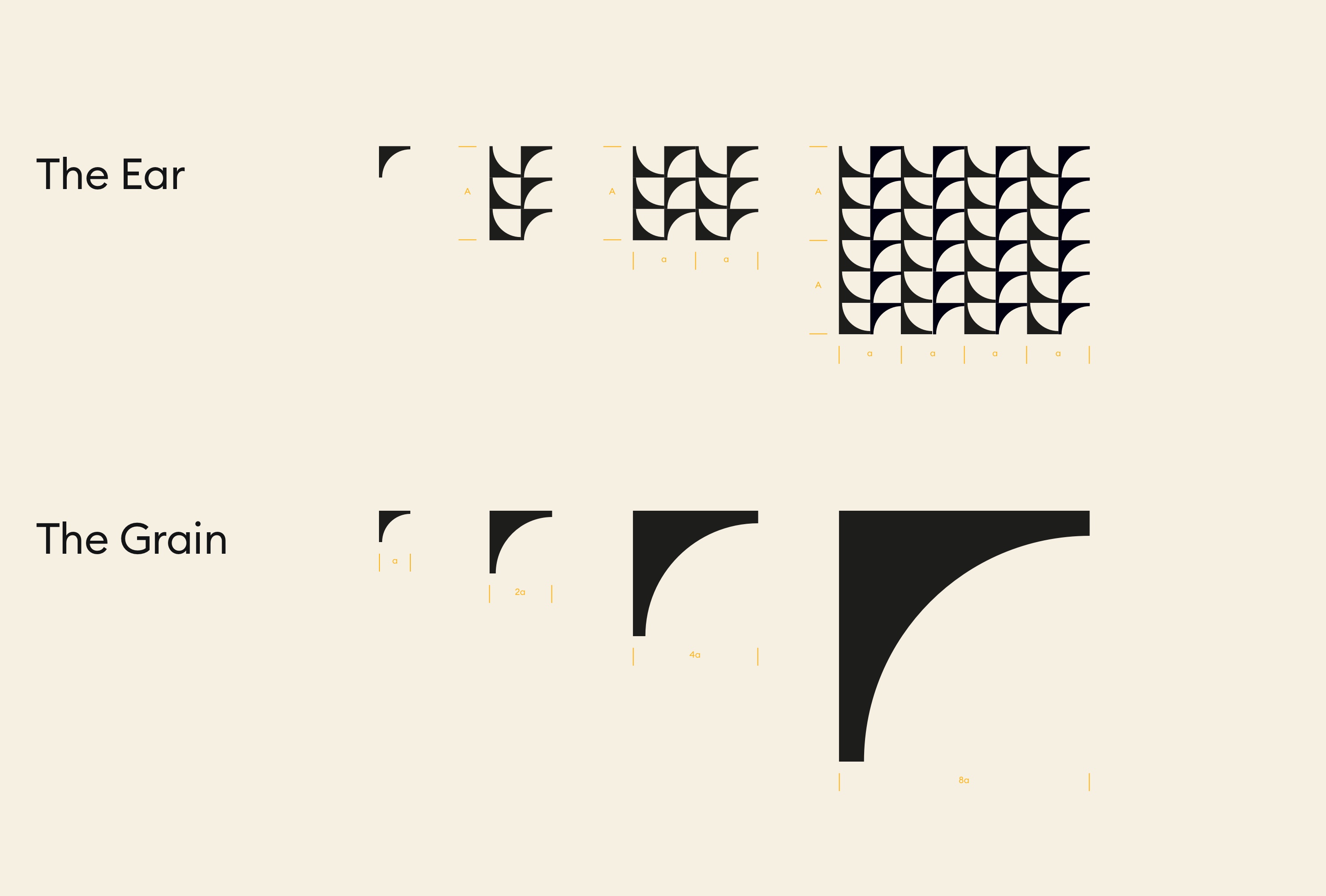
Rebranding of Cogitech, a material's expert company for conception architecture and design pieces.
The new branding aims to make its DNA more tangible: engineering and crafting, high quality and proximity. For that a new graphic territory based on textures and granularity combined to a micro/macro photography AD has been set. This work applies to a new completely redefined website to all print productions. -
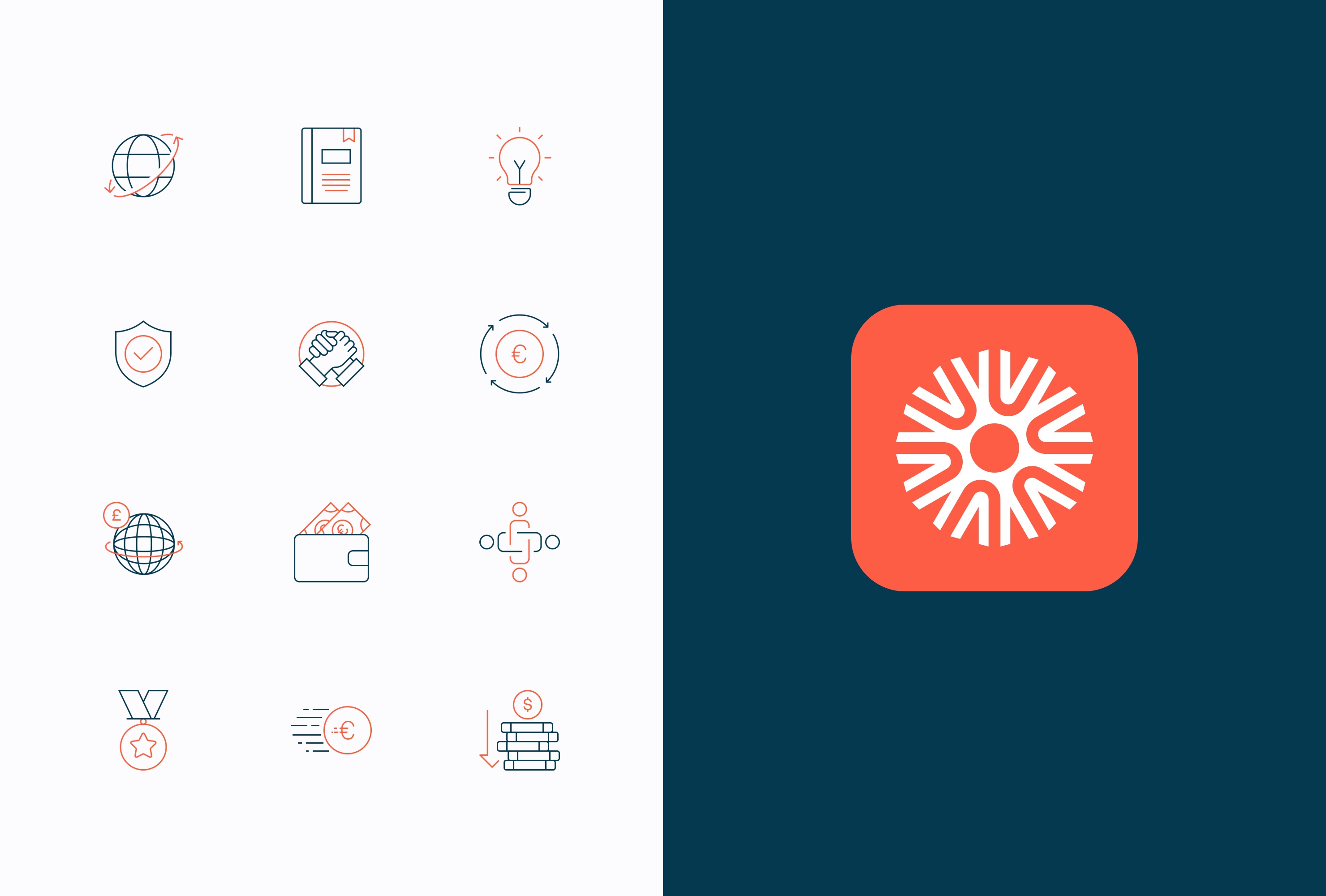
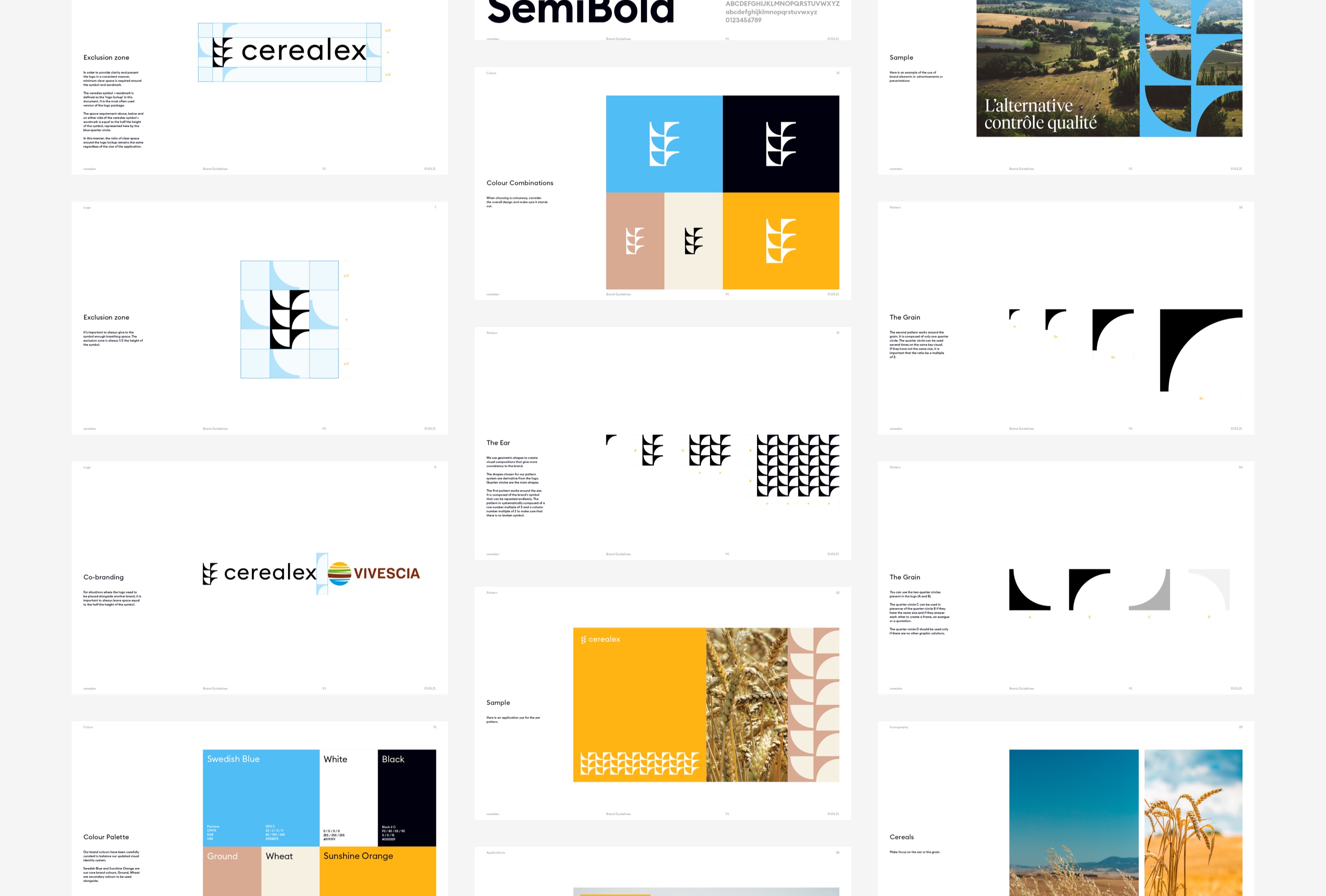
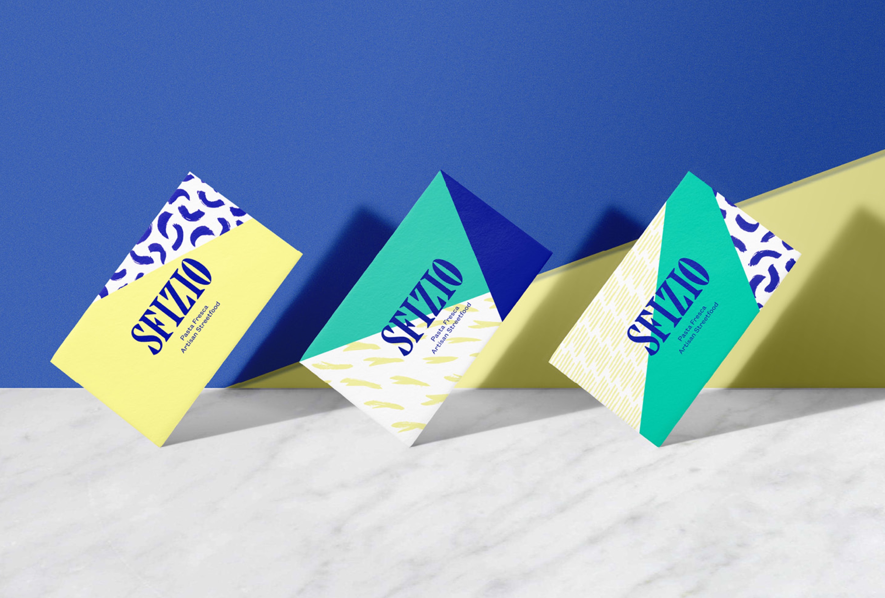
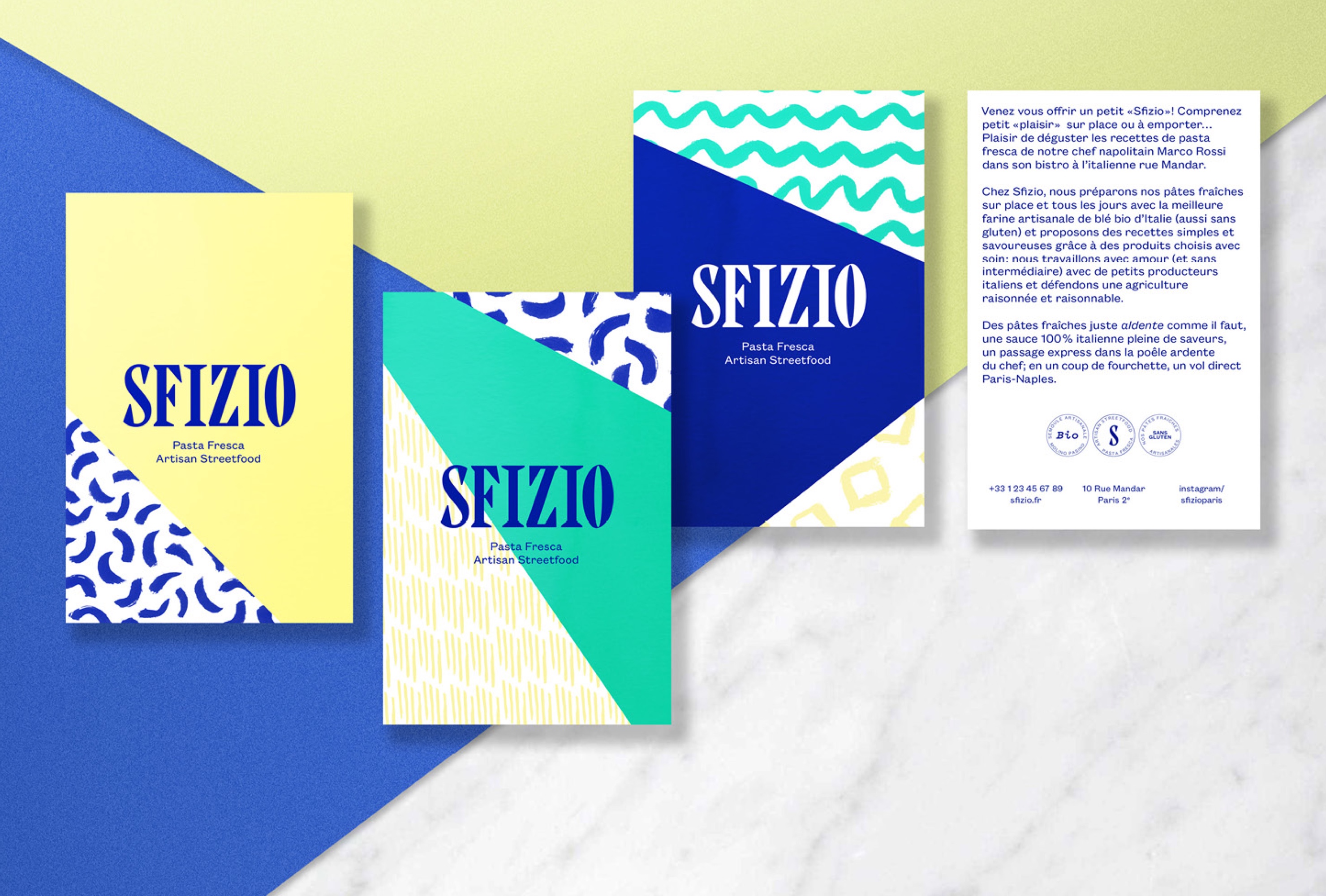
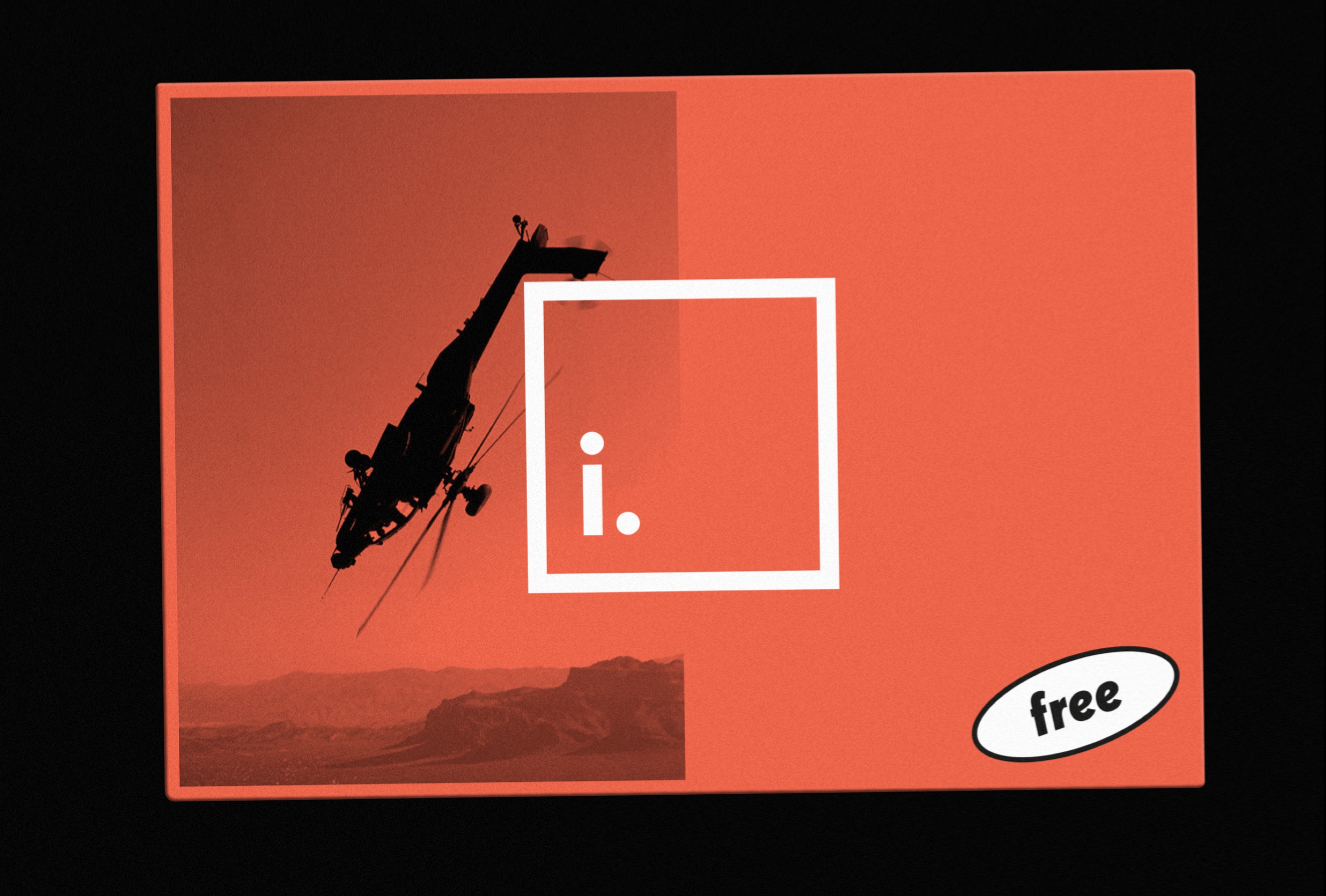
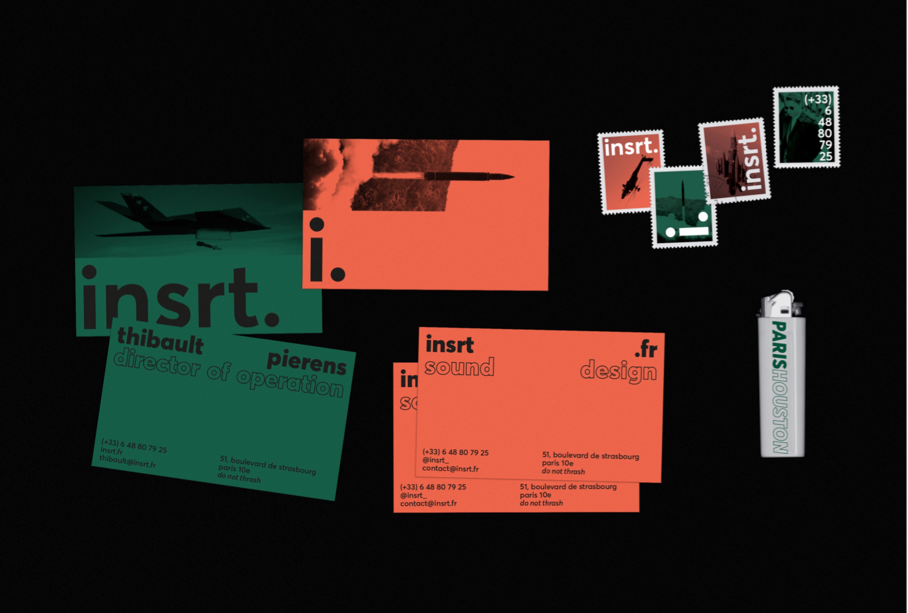
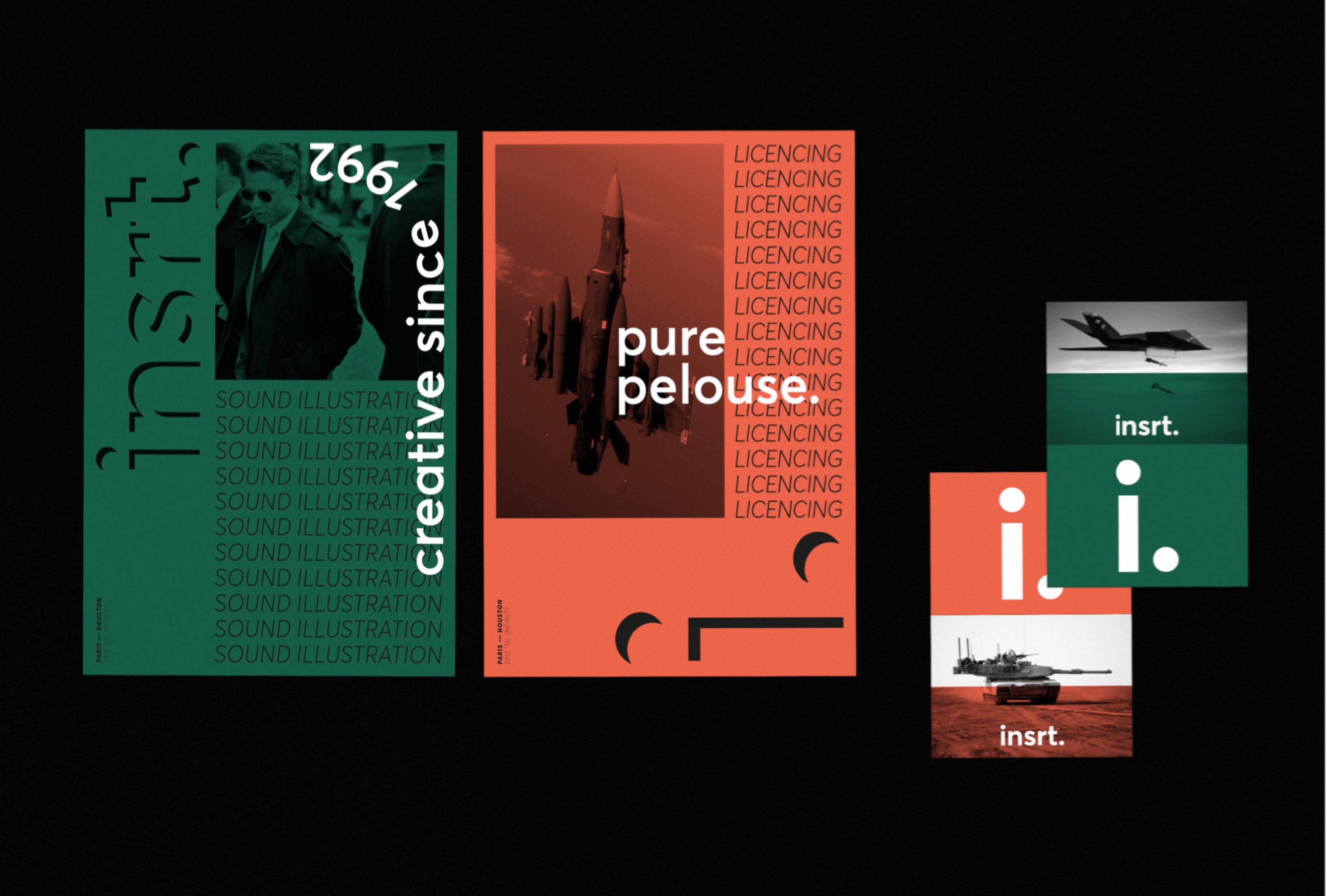
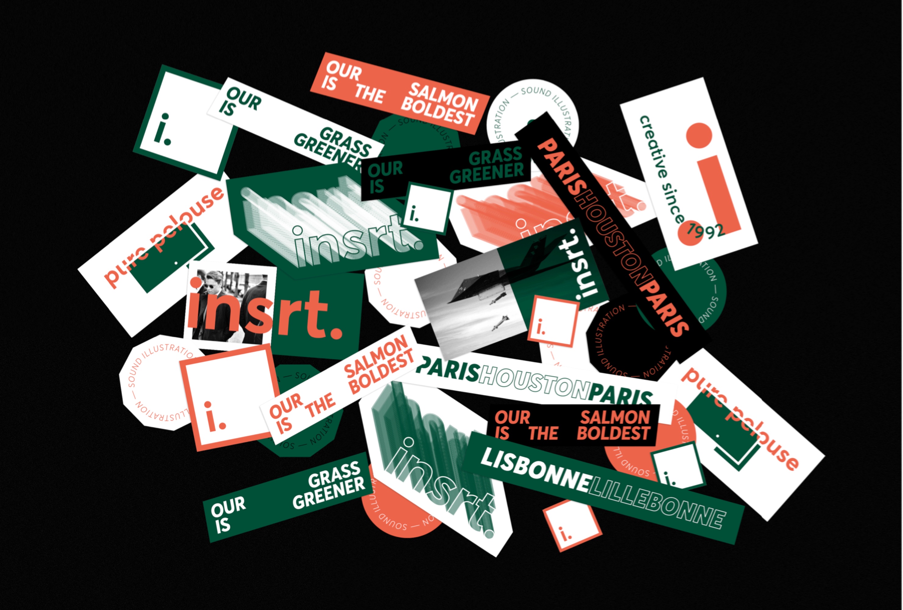
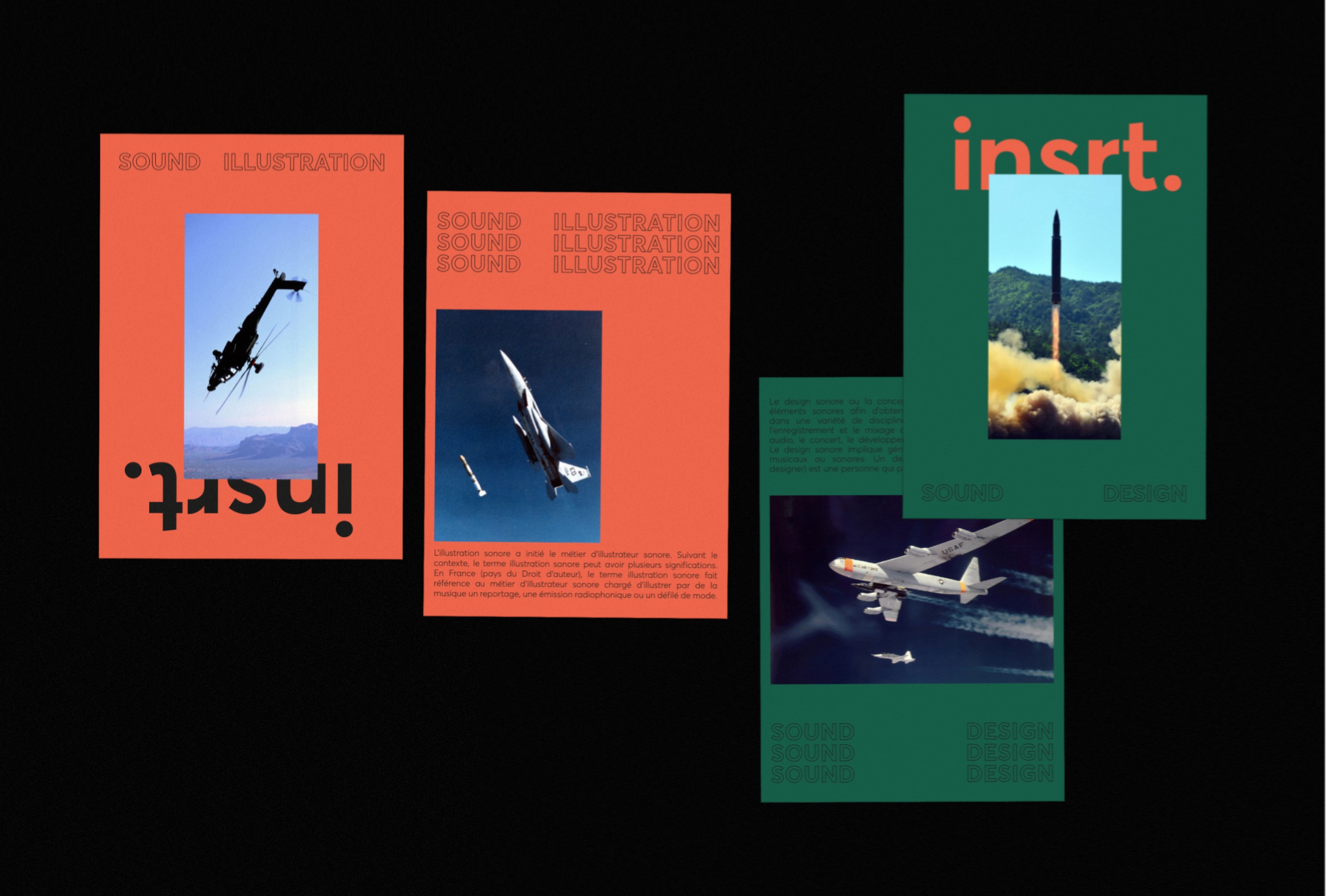
Various projects realized during the last few years, gathering branding, print and digital works in fields as varied as fashion, tech, industry, food and media.
Citizen
Creation of the branding for The Exploration Company. A company that democratizes access to space for space and non-space industries.
This branding aims to install the image of expertise of the company while adding a dose of imagination around the far journey. In order to bring singularity to this identity in an emerging graphic universe with strong competition, the inspiration around the world of air transport was predominant. This allows to bring a futuristic universe while reassuring on the short-term viability of the company's projects.
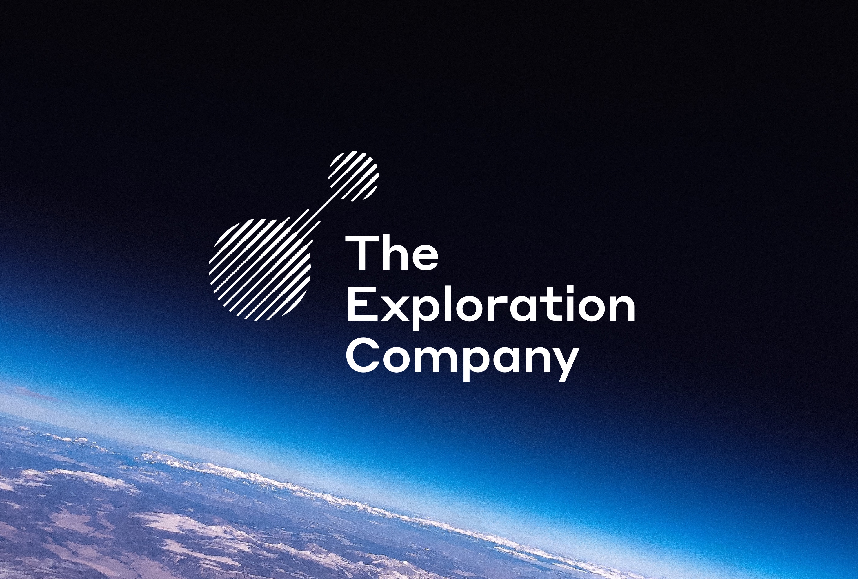
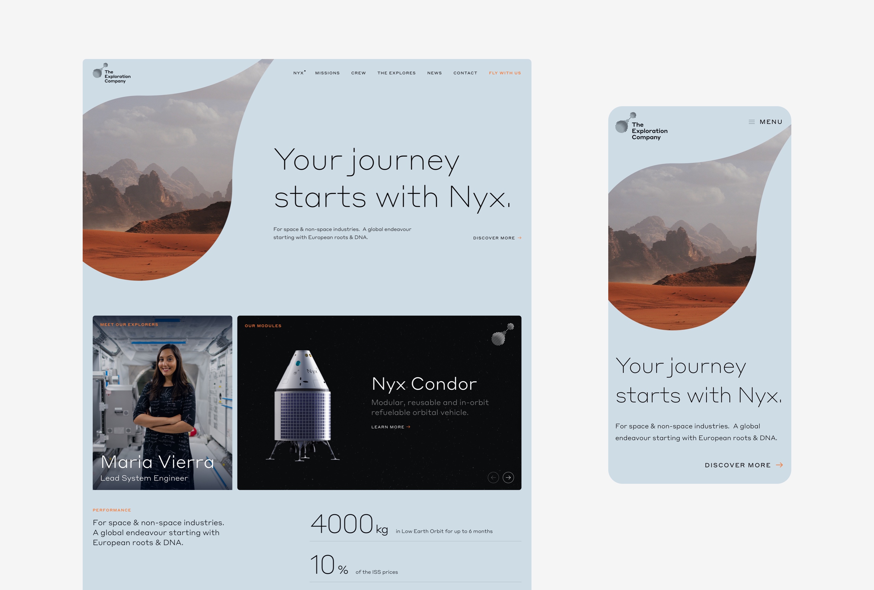
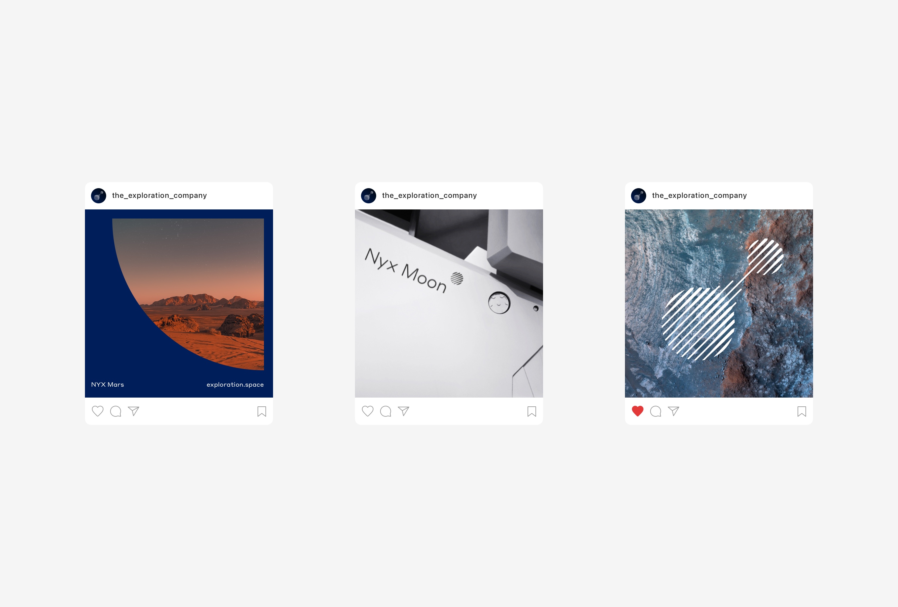
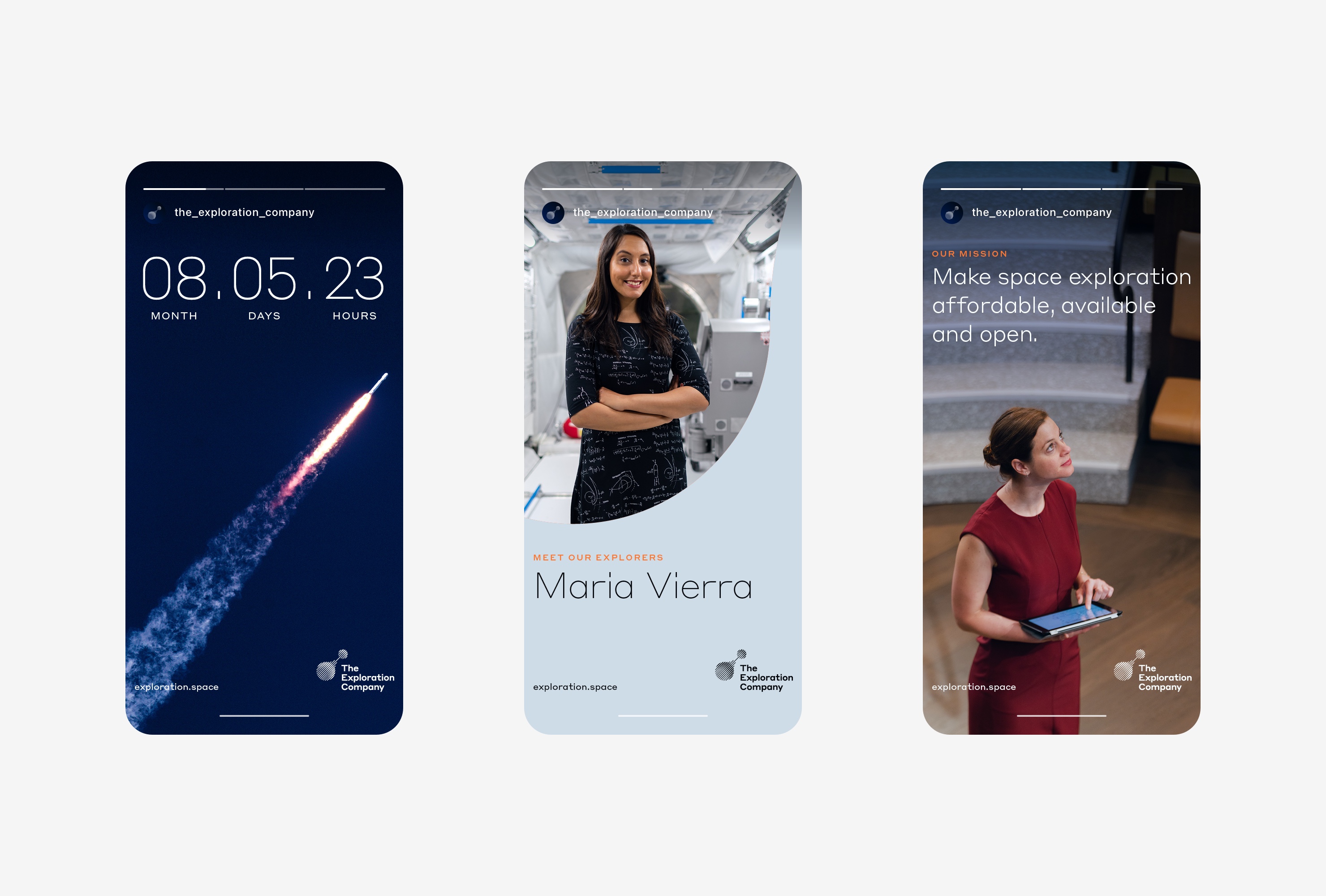
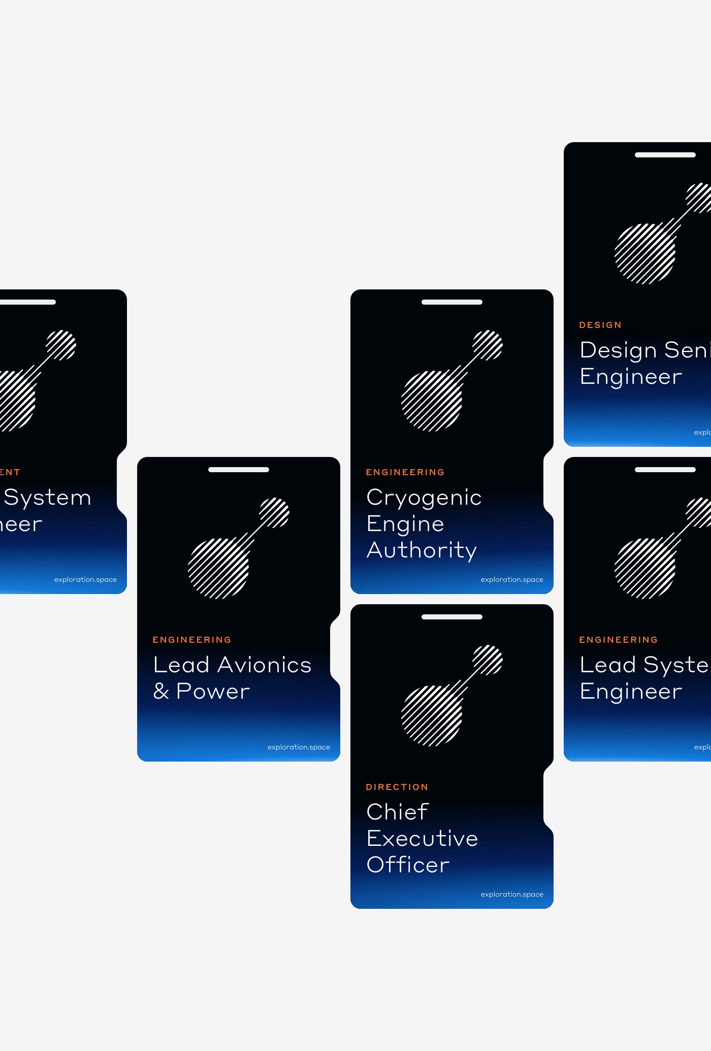
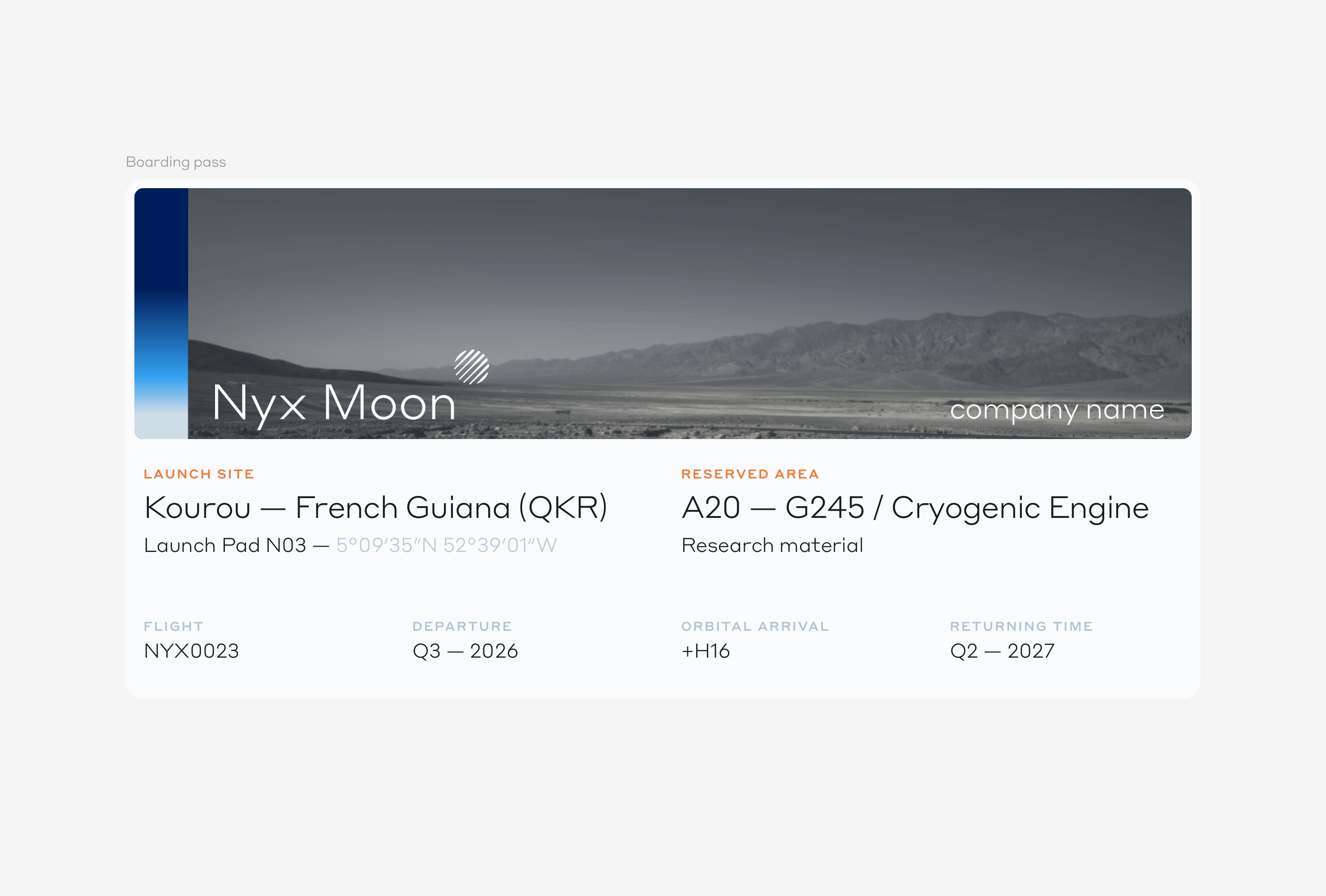
The Exploration Company
Role art direction & branding. Strategy Louis Brotel & Marc Lecerf. Typography Styrene A by Commercial Type. 3D MIP. Special thanks Hélène Huby.
Citizen
Rebranding and website creation for the Parisian digital agency Opus.
The aim of this rebranding is to move the agency's image towards a more contemporary identity that reflects their expertise in the digital field. Its Parisian roots must also be felt without falling into the trap of an identity that looks too fancy. The typographic mix allows to play on this duality while bringing dynamism and rigour. The identity remains sober and allows the graphic universes of the agency's clients to express themselves without being in the shadow of Opus.
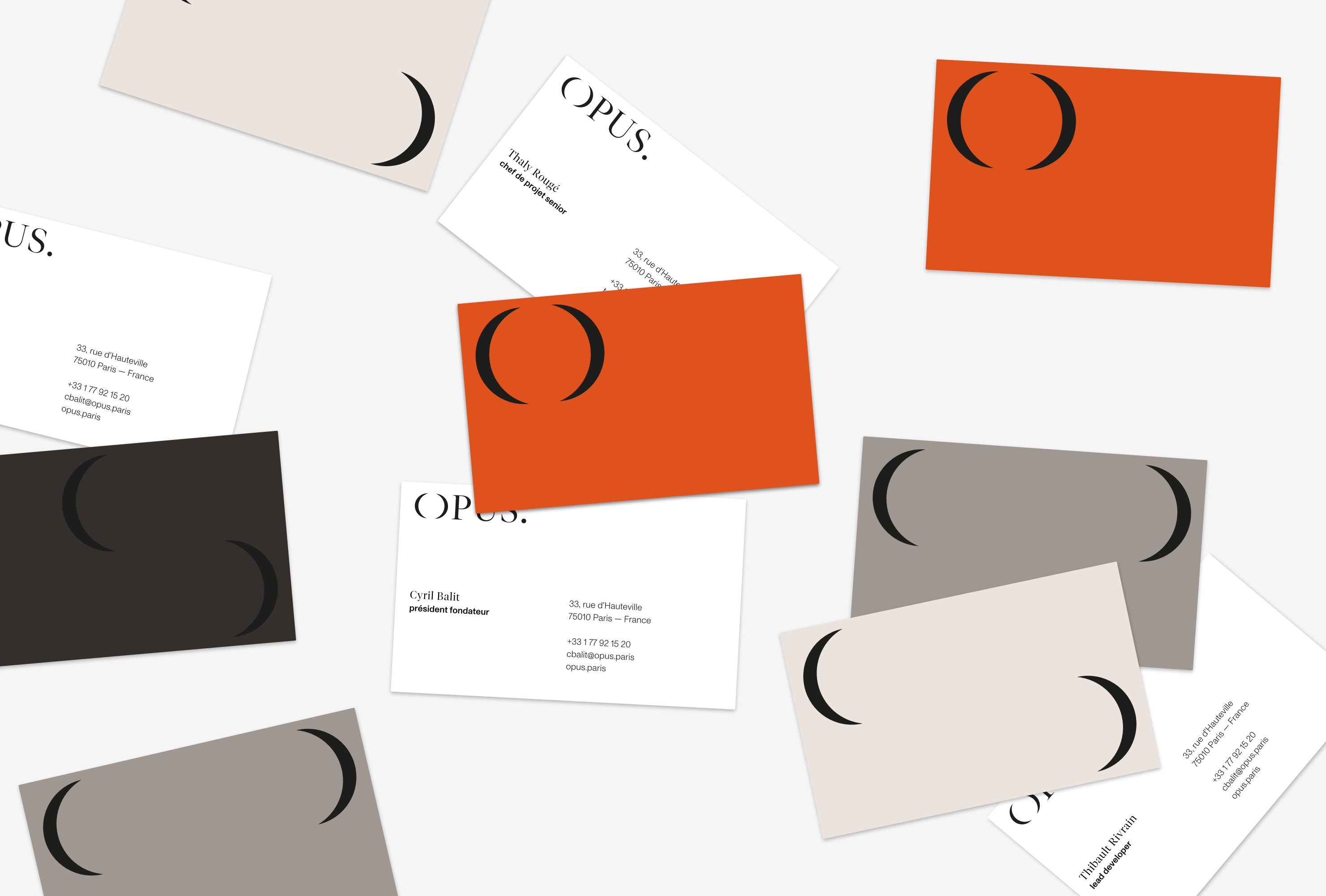
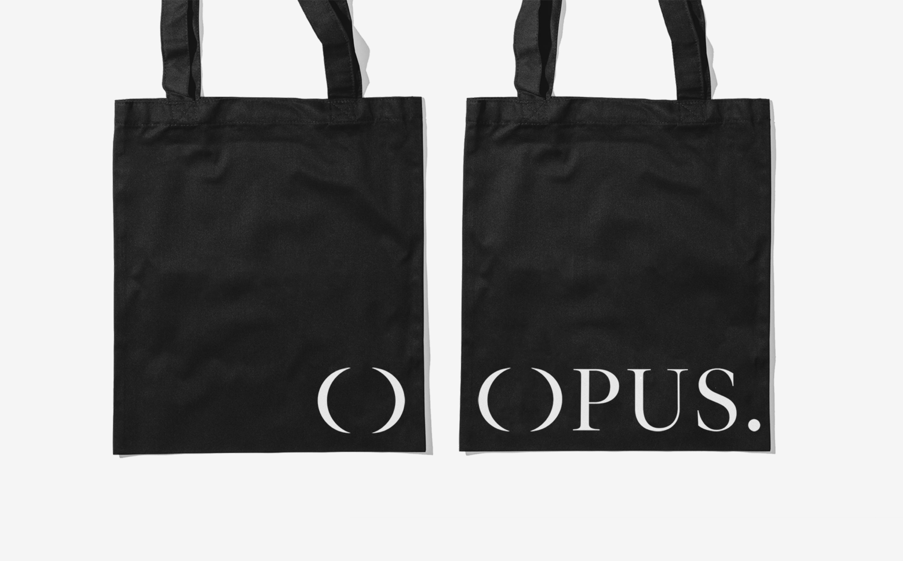
Opus
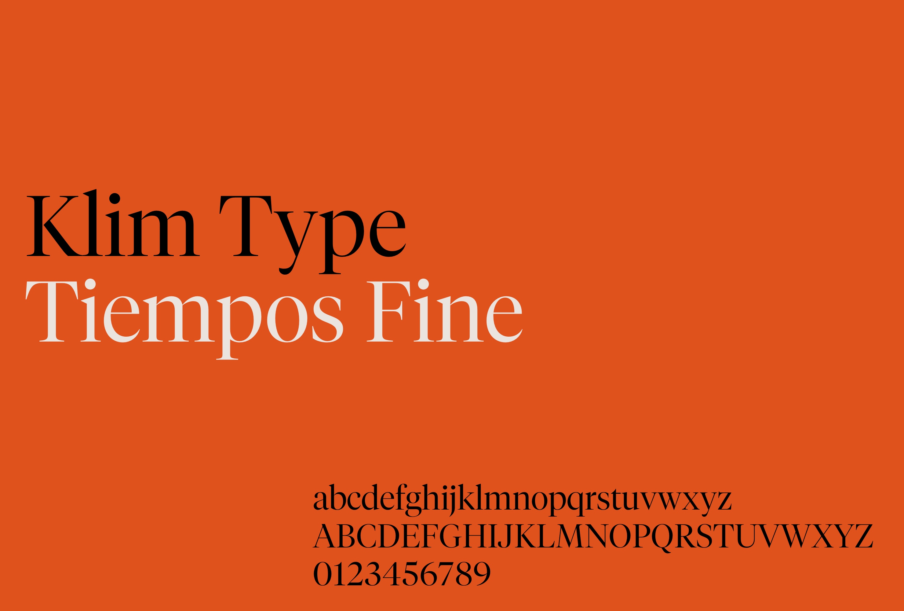
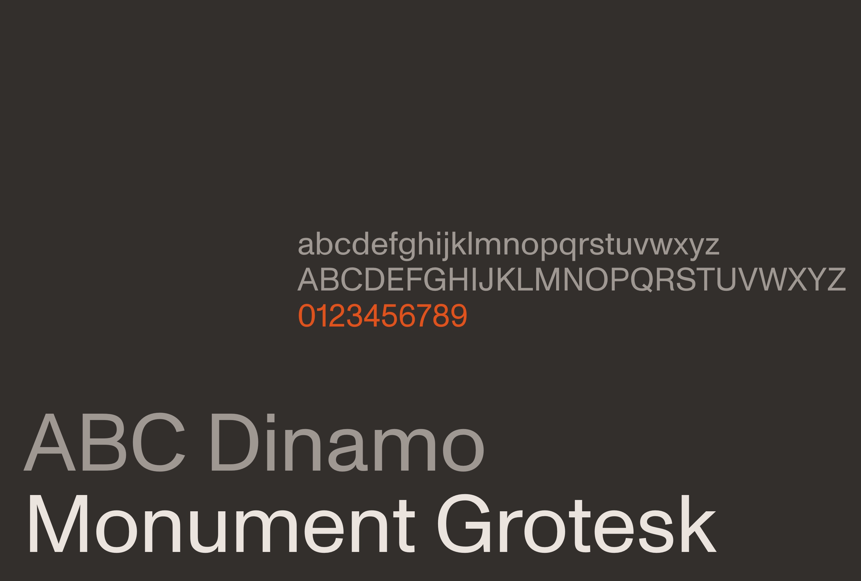
Role art direction, branding, web design. Strategy Cyril Balit, Thaly Rougé & Thibult Riverain. Development Opus. Typography Monument Grotesk by ABC Dinamo & Tiempos Fine by Klim Foundry. Special thanks Cyril Balit, Thaly Rougé & Thibult Riverain.
Citizen
Creation and design of Citizen, a modular media website bringing together news, articles, stories, podcasts and interviews. Citizen offers a rich and easy-to-adapt template for brands wanting to express themselves on a variety of subjects related to their universe.
A branding inspired by the North American media universe. A clear and simple identity to keep graphic neutrality and allow each client to focus on functionality while projecting their own brand identity. An exercise close to no-brand branding that focus on usability, accessibility and information architecture.

Citizen
Role art direction & conception. Studio OctaveOctave. Strategy Douglas Graglia & Marc Lecerf. Project Management Charlotte Avont. Typography Söhne by Klim Type Foundry. Special thanks Clément Lebau, Charlotte Avont and Douglas Graglia.
Tumulte
Collaboration with Renaud Dardaine to design a soccer fan scarf, the emblematic item dedicated to people who love the beautiful game. A tribute to all those who frequently visit the soccer arenas, week after week, passionate, dedicated and sometimes resigned.
This scarf is an ode to the fervor of the 12th man. Its name “Tumulte” means “Agitation” in french. This notion is represented by the fog of smoke on one side contrasting with the silence of the empty seats on the other side. The photographic direction takes place in the heart of a stadium where the soul of fans comes from.
Tumulte
Role art direction with Renaud Dardaine. Font Suisse Works by Swiss Typeface.
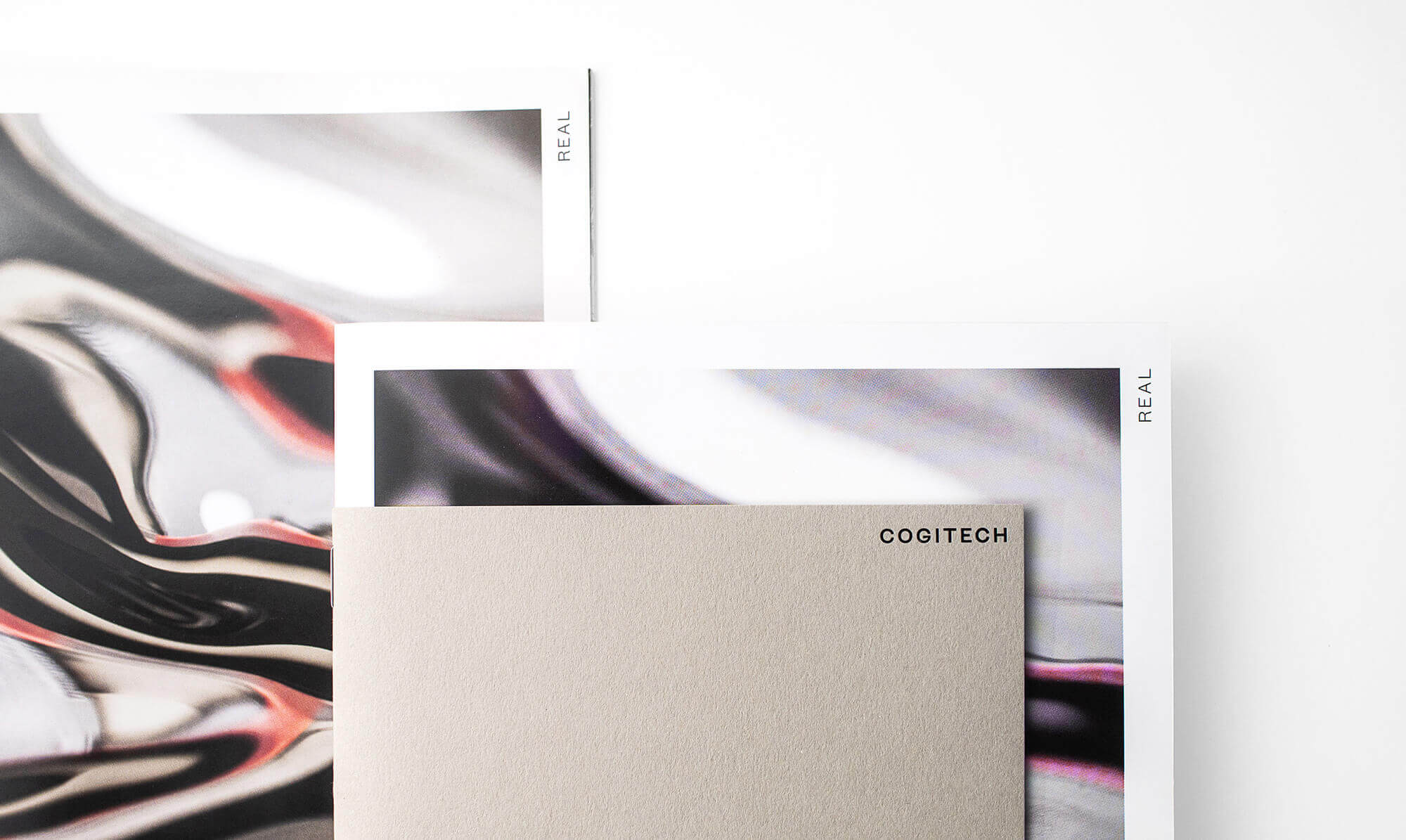
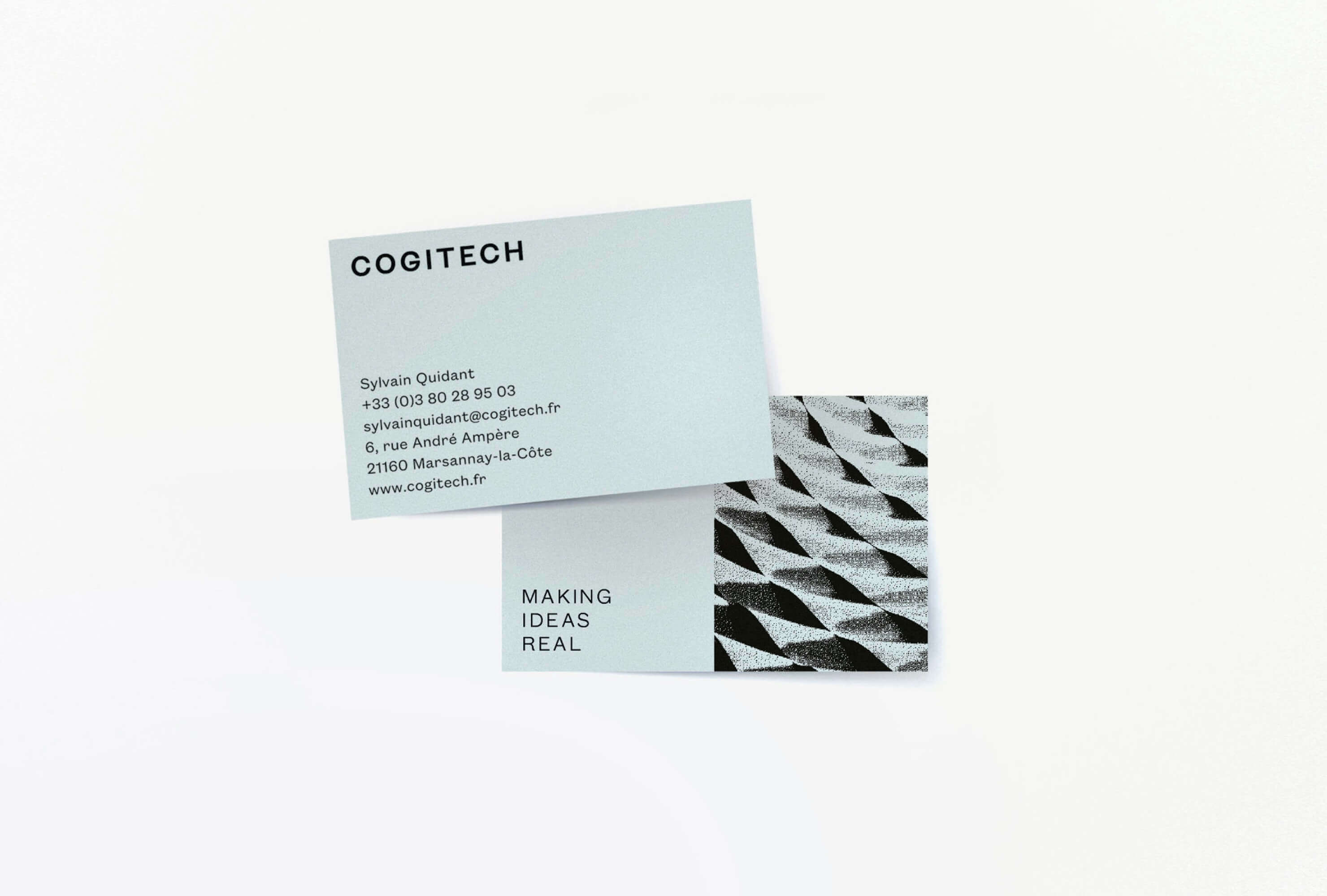
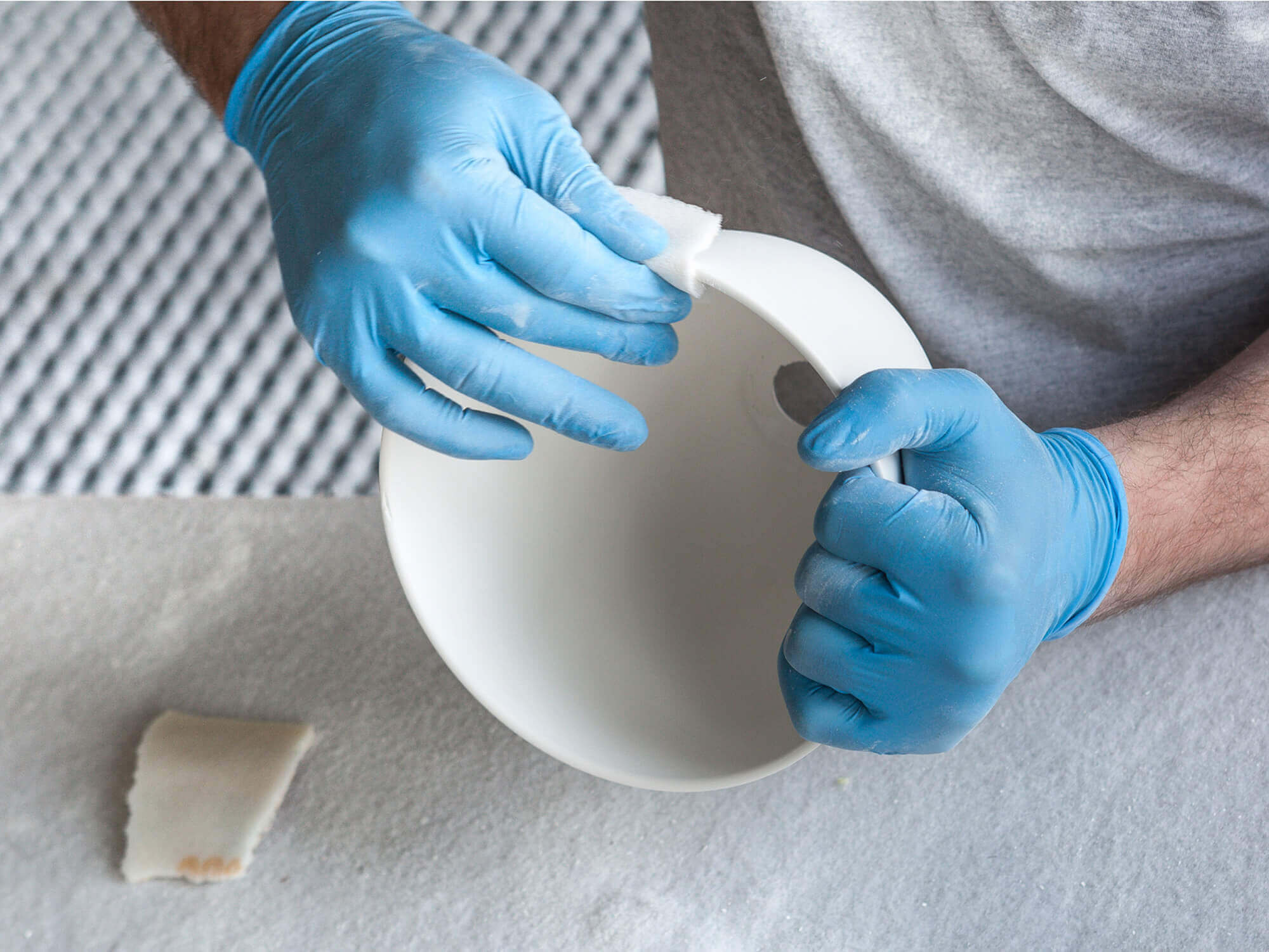
Cogitech
Rebranding of Cogitech, a material's expert company for conception architecture and design pieces.
The new branding aims to make its DNA more tangible: engineering and crafting, high quality and proximity. For that a new graphic territory based on textures and granularity combined to a micro/macro photography AD has been set. This work applies to a new completely redefined website to all print productions.
Cogitech, 2017
Role art direction, graphic design, web design. Studio Abmo. Art direction Dezyderiusz Gusta. Strategy Lise Delanoe and Sonia Cordier. Conception Marc Lecerf. Photography Sydney Léa Le Bour. Project Management Laurelise Feyeux. Development Viseth Chum. Printer Graph’imprim. Typography Founders Grotesk by Klim Type Foundry. Special thanks Sylvain Quidant, Lise Delanoe, Sonia Cordier and Dezyderiusz Gusta.
→ cogitech.frMiscellaneous & Archives
Various projects realized during the last few years, gathering branding, print and digital works in fields as varied as fashion, tech, industry, food and media.
Special thanks Lise Delanöe, Sonia Cordier, Dez Gusta, Douglas Graglia and all the others.